DEVOURED
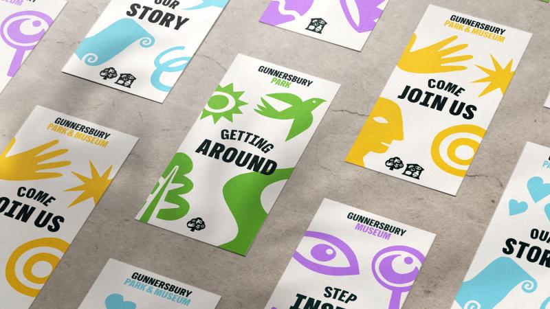
For 100 years no one noticed it, but this rebrand finally gives Gunnersbury Museum a reason to be found
Design
Creative Boom
Wiedemann Lampe’s rebrand of Gunnersbury Museum and Park uses modular color-coded symbols to solve a century-old identity crisis.
What: The consultancy created separate identities—a green tree for the park and a purple building for the museum—that merge into a yellow identity when representing both, supported by a modular illustration library.
Why it matters: This project serves as a case study in modular branding, demonstrating how to maintain distinct organizational identities while unifying them under a shared umbrella without relying on generic 'hero' imagery.
Original article
Gunnersbury Museum and Park has introduced a new modular identity by Wiedemann Lampe to solve a long-standing visibility problem: most people knew the park but not the museum. The system uses separate symbols and colors—a green tree for the park and a purple building for the museum—that combine into a yellow identity when representing both together, giving each its own voice while maintaining a cohesive brand. Supported by flexible illustrations, human-focused photography, and intuitive yellow wayfinding, the rebrand is designed to increase awareness, encourage exploration, and help the historic site become a more recognizable cultural destination.
Explore all 67 articles in today's digest
Fresh dev news, AI-digested daily. Never miss a trend at devoured.fyi