DEVOURED
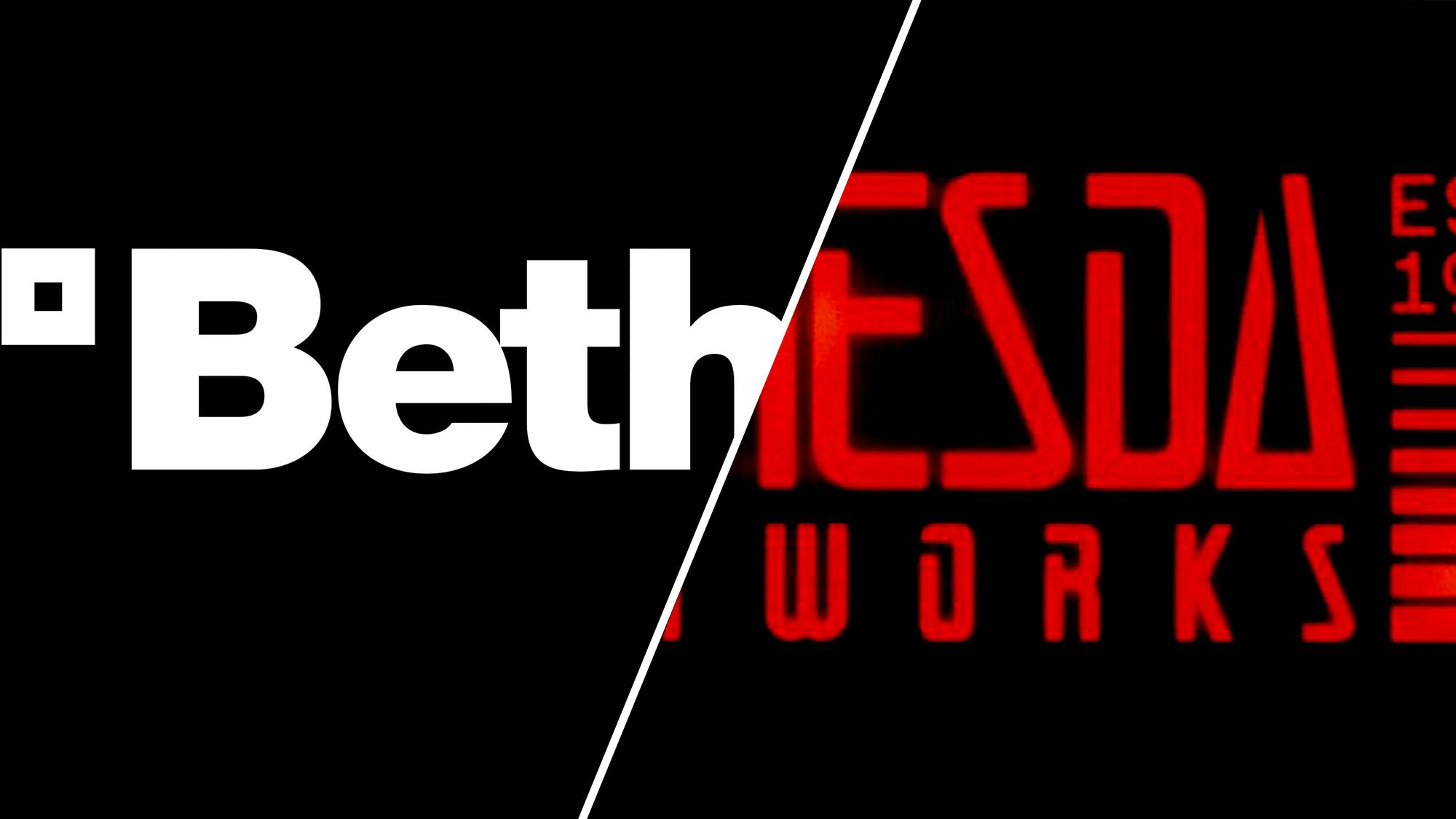
Bethesda's new logo design brings peak gaming nostalgia with a nod to its iconic original branding
Design
Creative Bloq
Bethesda’s new logo marks its 40th anniversary by abandoning corporate minimalism for a retro-futuristic style inspired by its 90s-era branding.
What: The redesigned logo reintroduces the 'Softworks' suffix and uses angular, geometric typography reminiscent of the studio’s early titles like Daggerfall.
Why it matters: The shift highlights a growing reaction against 'bland' corporate minimalism, with established brands increasingly mining their own history to build brand personality and fan goodwill.
Original article
To celebrate its 40th anniversary, Bethesda has introduced a new retro-futuristic logo that replaces its clean, corporate identity with one inspired by the company's original 1980s and 1990s branding. The redesign brings back the "Bethesda Softworks" name, uses an angular cyberpunk-inspired typeface reminiscent of its early years, and aims to better reflect the publisher's long history and personality. Fans have overwhelmingly praised the change, seeing it as a welcome return to Bethesda's roots and a reminder that distinctive branding can be more memorable than generic minimalism.
Explore all 67 articles in today's digest
Fresh dev news, AI-digested daily. Never miss a trend at devoured.fyi