DEVOURED
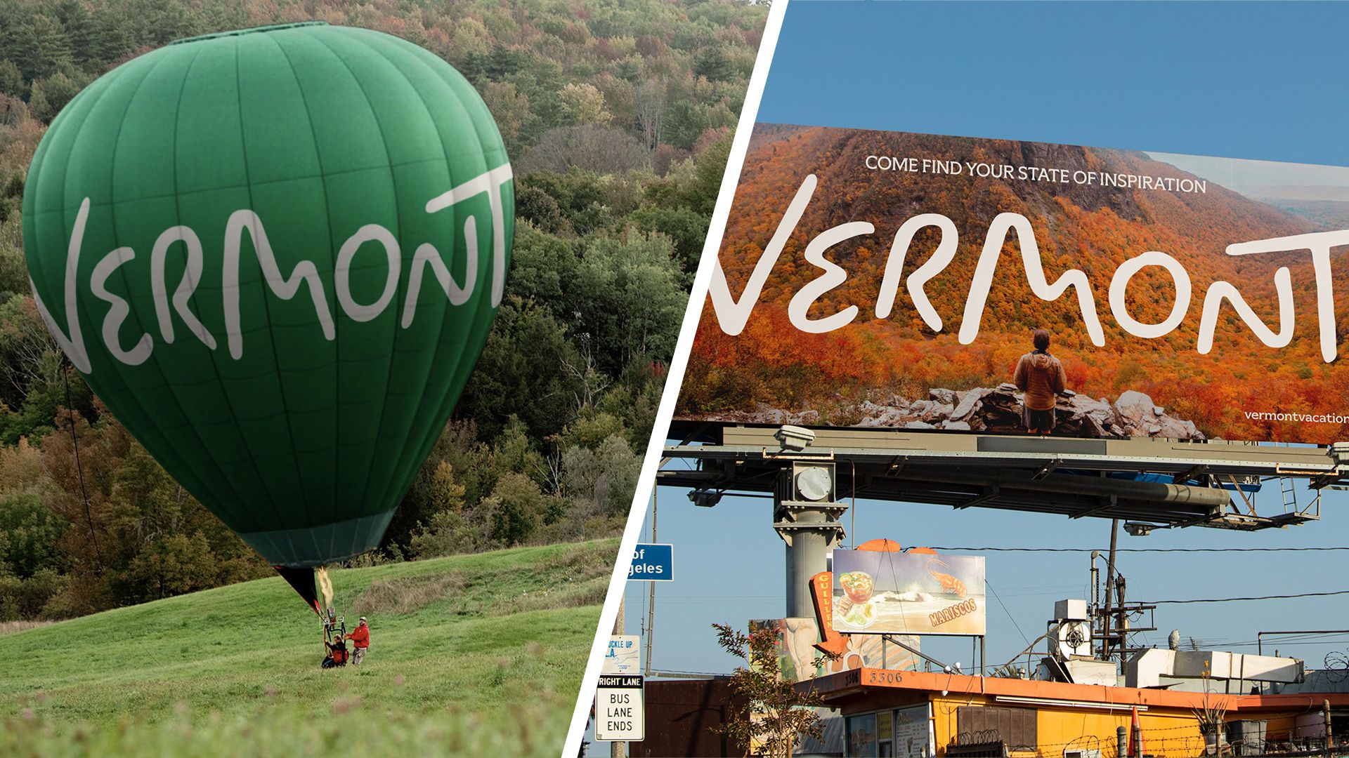
No, Vermont's new logo design isn't Comic Sans
Design
Creativebloq
Vermont's new tourism branding, created by DNCO, uses a custom typeface designed to mirror the state's physical geography rather than generic stock imagery.
What: Vermont Tourism launched a new visual identity featuring a bespoke wordmark by lettering artist Rob Clarke. The design includes specific nods to local landmarks, such as the Horn of the Moon Road, and uses a modular system of icons and colors inspired by Vermont’s six distinct seasons, rather than typical travel tropes.
Original article
Vermont Tourism has unveiled its first dedicated brand identity, created by DNCO, with a custom wordmark inspired by the state's hand-painted signs, landscapes and cultural heritage. Rather than relying on generic travel imagery, the branding highlights Vermont as a "State of Inspiration," using a flexible design system to showcase its artistic community, natural beauty and local traditions. While some critics compared the logo to Comic Sans, the design's details intentionally reference Vermont's hills, roads, moonlit landscapes and folklore, making it part of a broader identity rather than a standalone logo.
Explore all 55 articles in today's digest
Fresh dev news, AI-digested daily. Never miss a trend at devoured.fyi