DEVOURED
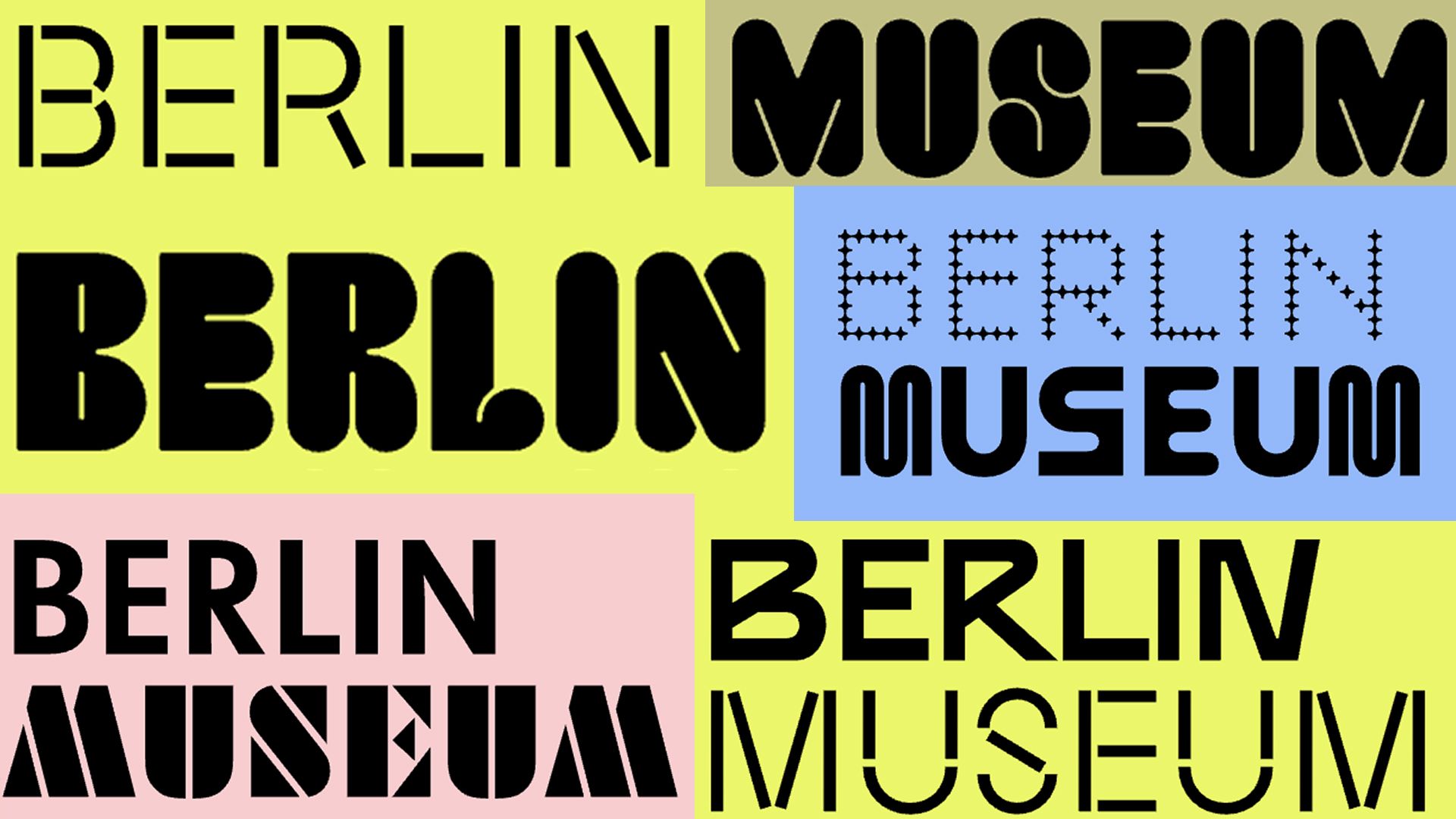
Berlin Museum breaks the rules of branding with EIGHTY-ONE different logos
Design
Creative Bloq
The Berlin Museum has abandoned a singular brand identity in favor of 81 interchangeable wordmarks based on the city's typographic heritage.
What: Designed by Stan Hema, the new visual identity for the Berlin Museum rotates between nine typefaces, including Moskau Grotesk and Futura Black Stencil, to reflect the diverse design history of Berlin.
Why it matters: This shift toward 'evolving branding' acknowledges that institutions representing complex urban environments benefit more from variety than the traditional demand for a static, recognizable logo.
Decoder
- Wordmark: A distinct text-only typographic treatment of a brand's name, used as a logo.
- Typographic heritage: The collection of fonts, signage styles, and lettering techniques historically associated with a specific location or culture.
Original article
Berlin Museum's new identity replaces a single logo with 81 interchangeable wordmarks, each combining typefaces inspired by different parts of the city's typographic heritage. Rather than prioritizing consistency, the flexible system reflects Berlin's diverse voices and history, turning the museum's identity into a celebration of the city's design culture itself.
Explore all 49 articles in today's digest
Fresh dev news, AI-digested daily. Never miss a trend at devoured.fyi