DEVOURED
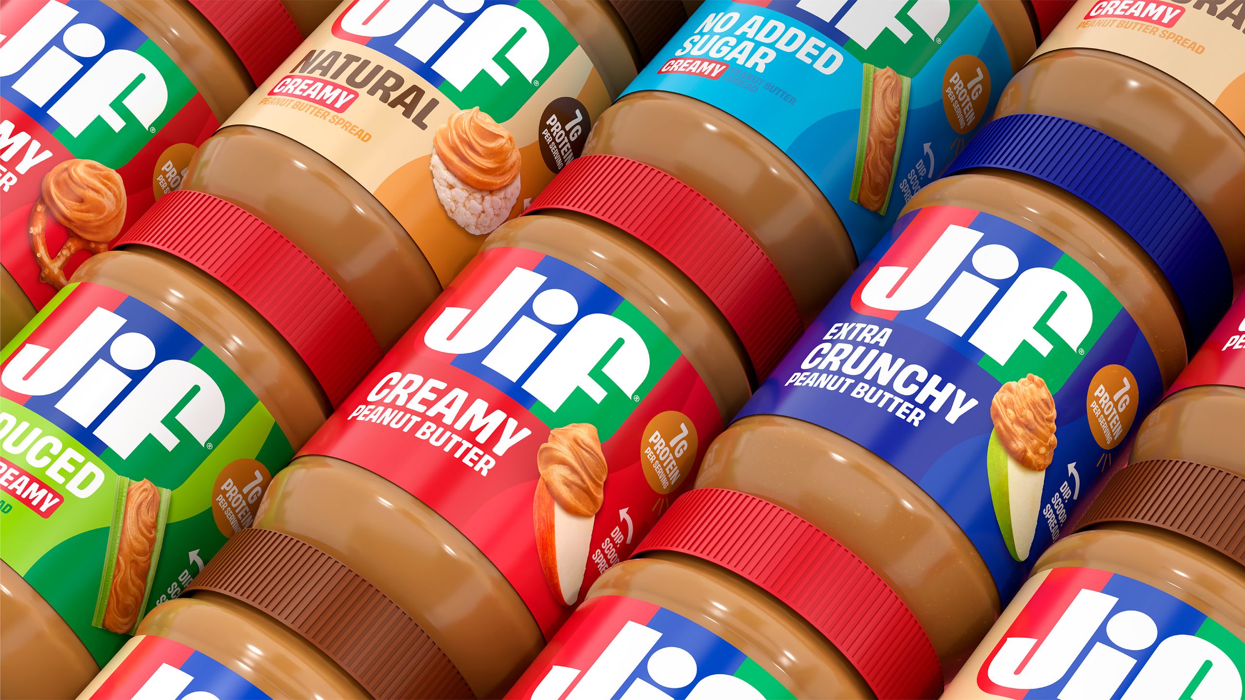
While you were angry at Instagram, Jif quietly debuted a perfect new logo
Design
Creative Bloq
Jif successfully refreshed its brand identity by performing subtle, evolutionary updates rather than seeking the controversy often associated with radical redesigns.
What: Jif updated its logo for the first time in 30 years by removing a drop shadow and restoring its classic tri-color banner, a change that largely bypassed public backlash.
Why it matters: Design discourse often incentivizes high-friction, radical rebrands that generate social media engagement over functional, evolutionary improvements.
Original article
Jif has introduced its first major logo refresh in 30 years, simplifying the design by removing visual clutter and bringing back its classic tri-colour banner while largely preserving its familiar identity. The update has attracted little attention, especially compared to more controversial rebrands, because it focuses on refinement rather than reinvention. Its low-profile reception highlights how branding discussions often reward dramatic changes and controversy over thoughtful, evolutionary design.
Explore all 43 articles in today's digest
Fresh dev news, AI-digested daily. Never miss a trend at devoured.fyi