DEVOURED
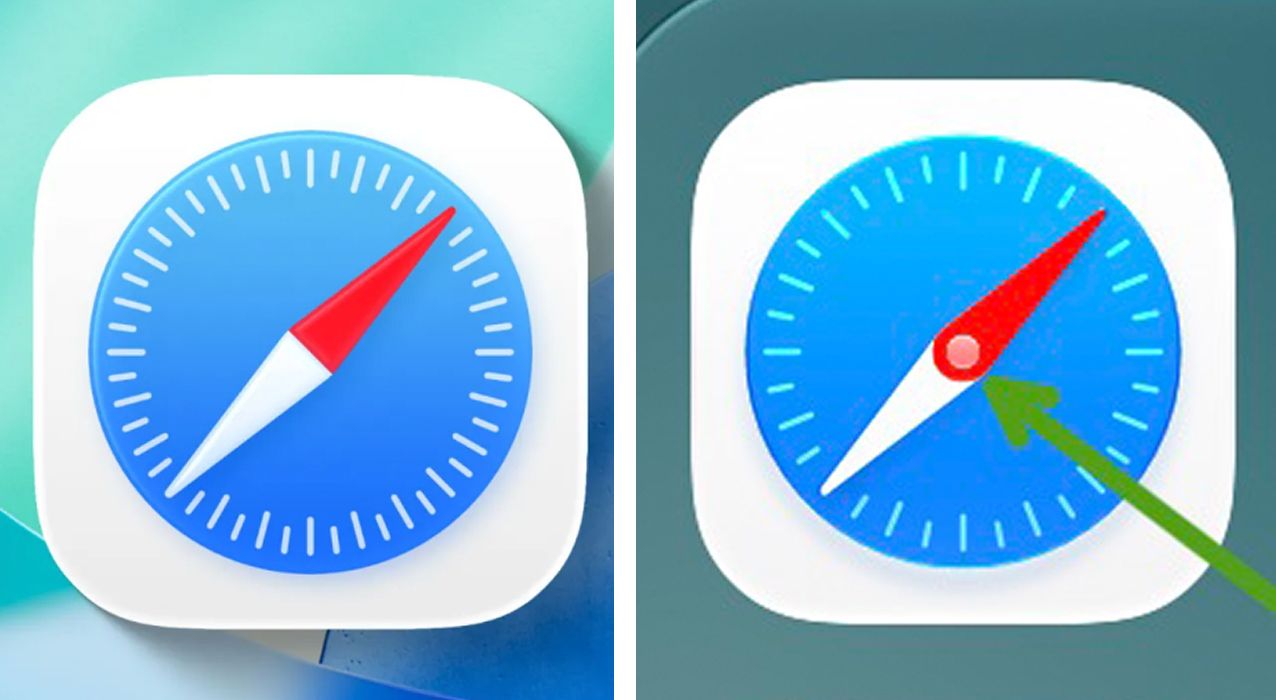
The glaring design fail in the new iPhone Safari logo is proof that Apple's lost its direction
Beta testers of Apple’s iOS 27 are criticizing the new Safari icon for a design error that inaccurately depicts a compass with two overlapping needles.
What: Apple’s Safari icon redesign in iOS 27 features a central pin with two needles instead of the single needle expected in a compass, leading to claims that the company is losing its attention to detail. Users have compared the aesthetic shift negatively against the iconic iOS 6 design.
Why it matters: This reaction highlights how high the stakes are for Apple's visual brand identity; even minor icon discrepancies serve as lightning rods for broader anxieties among users regarding the company's trajectory and commitment to design rigor.
Decoder
- Skeuomorphism: A design style where digital objects mimic their real-world counterparts, such as app icons that look like actual physical items.
Original article
Apple's redesigned Safari icon in iOS 27 has sparked criticism from design enthusiasts, who argue its compass graphic inaccurately resembles two overlapping needles and reflects a decline in Apple's attention to detail.
Explore all 59 articles in today's digest
Fresh dev news, AI-digested daily. Never miss a trend at devoured.fyi