DEVOURED
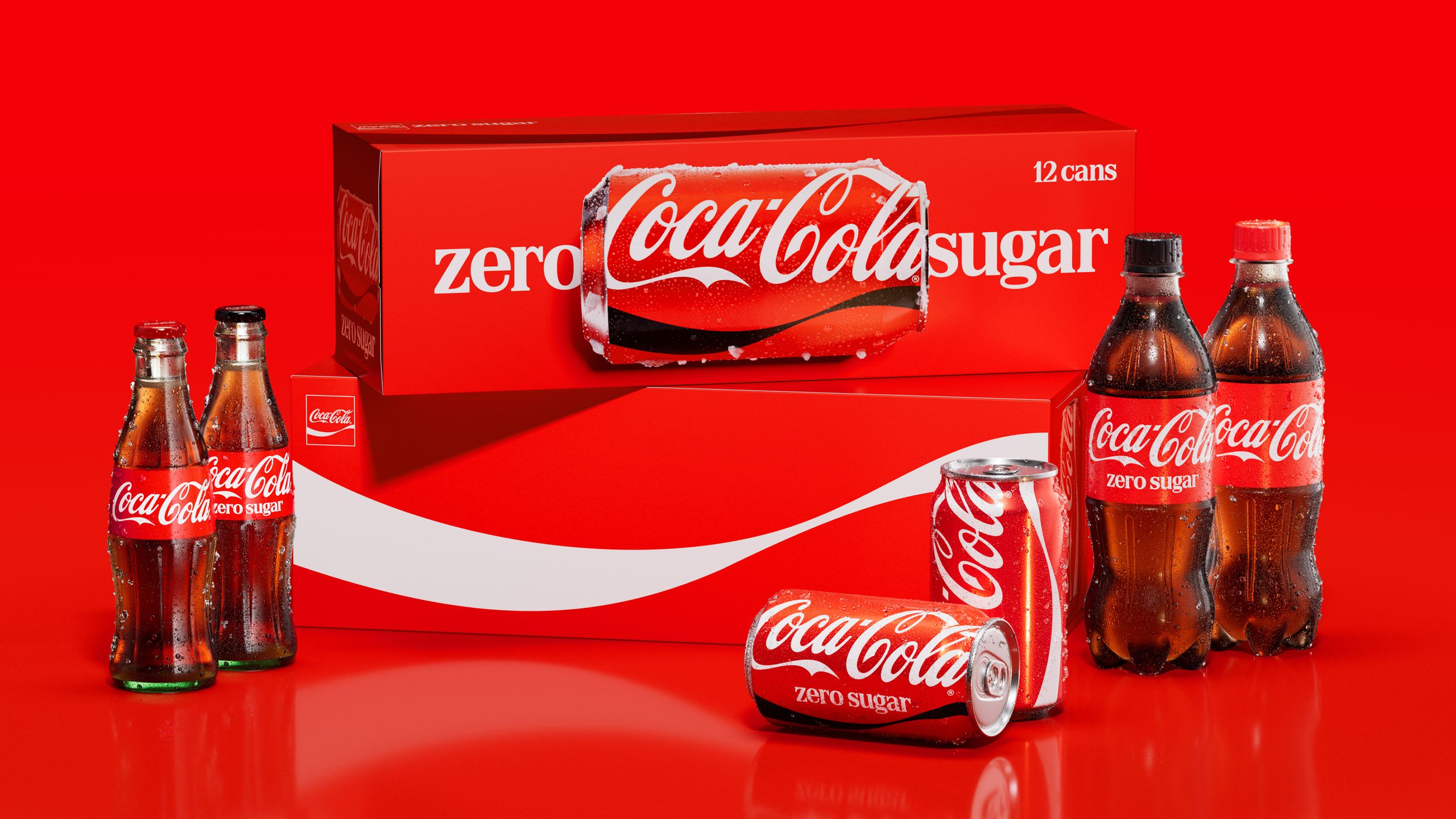
Coca-Cola Gets New Look that Makes it Even "more Coca-Cola"
Coca-Cola is rolling out a unified global design system to standardize its fragmented visual identity across 200 markets.
What: The Coca-Cola Company collaborated with design agency Jones Knowles Ritchie (JKR) to refresh its brand, emphasizing iconic assets like the Spencerian script, the Dynamic Ribbon, and the Arden Square. The initiative creates a cohesive digital and physical design ecosystem to ensure consistent brand recognition across packaging, retail, and digital media.
Why it matters: Large global brands often suffer from 'brand drift' where regional inconsistencies accumulate over time; this refresh is a defensive move to re-establish a singular, recognizable aesthetic against a backdrop of increasing digital fragmentation.
Decoder
- Arden Square: The rectangular container or frame used by Coca-Cola to house its logo or design elements.
- Spencerian script: The distinctive, flowing cursive typeface used for the Coca-Cola logo.
- Dynamic Ribbon: The iconic white wave graphic used as a visual brand signature on packaging and advertising.
Original article
Coca-Cola unveiled a global rebrand by agency Jones Knowles Ritchie, aiming to make the brand "more Coca-Cola" across over 200 markets.
Explore all 55 articles in today's digest
Fresh dev news, AI-digested daily. Never miss a trend at devoured.fyi