DEVOURED
Koto helps restaurant-discovery app Franki make time dance
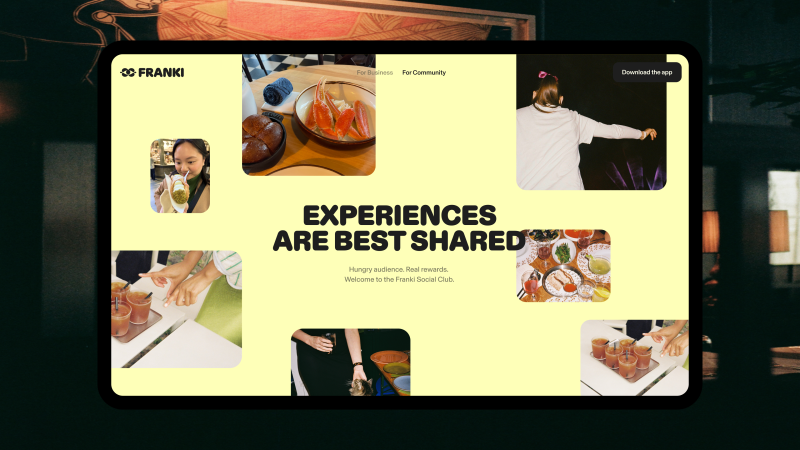
Global design studio Koto rebranded the restaurant discovery app Franki with a vibrant, character-driven identity centered on the concept of 'making time dance.'
What: Franki, an app that rewards users for sharing restaurant recommendations, shifted from a basic discovery tool to a social platform, utilizing a visual system of yellow tones and Diatype Rounded typography to emphasize warmth and community.
Decoder
- Jester archetype: A branding framework that uses humor, playfulness, and a light-hearted tone to make a brand feel more accessible and human.
Original article
Koto rebranded restaurant discovery app Franki around the idea of "Make Time Dance," creating a playful, community-focused identity that encourages people to discover, share, and earn rewards from real dining experiences. The new branding combines warm typography, vibrant colours, expressive motion, and a character-like logo to help Franki stand out in the crowded restaurant recommendation market while reinforcing its shift from a discovery tool to a social platform.
Explore all 56 articles in today's digest
Fresh dev news, AI-digested daily. Never miss a trend at devoured.fyi