DEVOURED
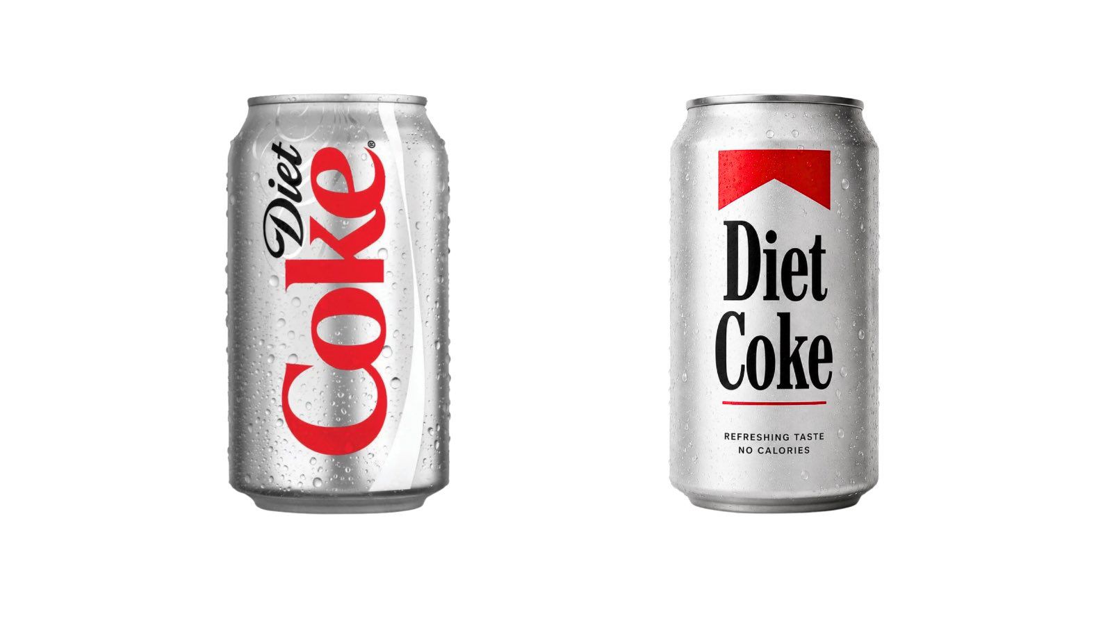
Everyone's Saying the Same Thing About the New Coca-Cola Font
Design
Creativebloq
Coca-Cola’s new serif typeface is facing social media scrutiny for its striking visual resemblance to the classic Marlboro cigarette brand identity.
What: Coca-Cola has promoted the 'Better With' serif font (designed by Brody Associates) as the centerpiece of a major brand overhaul by JKR, inadvertently sparking comparisons to tobacco marketing aesthetics.
Why it matters: The overlap in color palettes (red and white) combined with high-contrast serif typography creates a brand association that aligns a sugar-based product with a legacy addictive consumer good.
Original article
Coca-Cola's newly overhauled brand identity, designed by JKR, gives greater prominence to the "Better With" serif typeface, created by Brody Associates in 2023 for a holiday campaign.
Explore all 65 articles in today's digest
Fresh dev news, AI-digested daily. Never miss a trend at devoured.fyi