DEVOURED
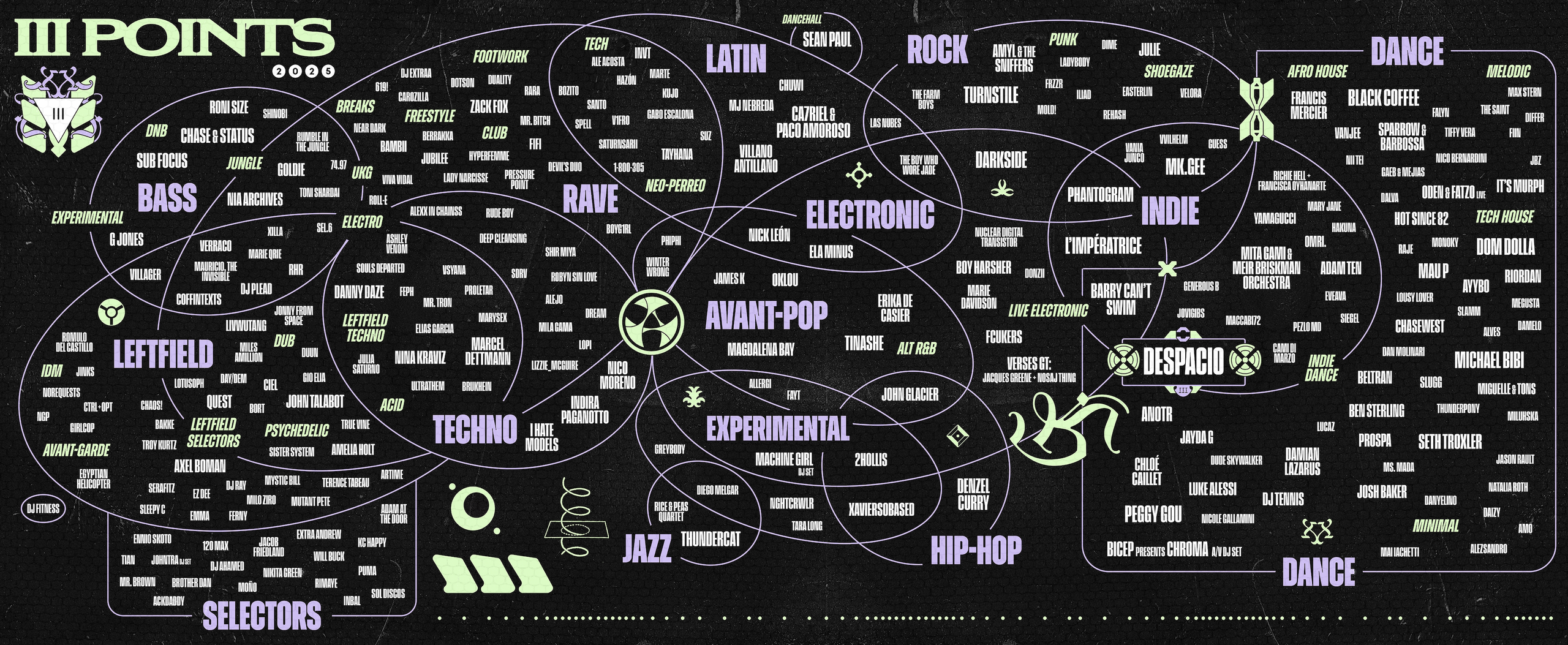
Why are Festival Line-up Poster Designs Getting So Hard to Read?
Design
Wallpaper
Music festivals are using intentionally abstract, hard-to-read posters to bypass the intense contract negotiations required by traditional tiered billing hierarchies.
What: Santi Vidal, talent buyer for the III Points festival, explains that non-traditional poster layouts—like circles or graffiti styles—obscure the traditional top-to-bottom hierarchy, reducing friction with agents who demand top billing for their clients.
Why it matters: Graphic design is being weaponized as a business tool to manage stakeholder egos, illustrating how administrative constraints in the music industry directly dictate public-facing design choices.
Decoder
- Billing: The specific order and font size of artist names on a promotional poster, which dictates perceived status and often influences artist compensation.
Original article
Festival lineup posters are increasingly adopting unconventional designs to reduce friction in artist billing negotiations.
Explore all 53 articles in today's digest
Fresh dev news, AI-digested daily. Never miss a trend at devoured.fyi