DEVOURED
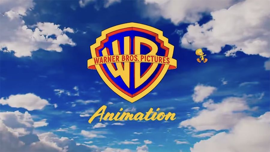
Delightful new Warner Bros Animation logo reveal is the perfect antidote to CGI saturation
Warner Bros. Animation is ditching textured CGI for a flat, hand-drawn aesthetic in its new logo to better align with the studio's traditional roots.
What: The new logo, unveiled at Annecy, features a simplified WB shield and Tweety Pie in a flat, matte design, marking a move away from the glossy CGI aesthetics used previously.
Why it matters: This signals a broader trend in animation to reclaim a distinct identity by emphasizing artisanal craftsmanship over the 'plastic' look of ubiquitous 3D renderings.
Original article
Warner Bros. unveiled a new flat-design Animation logo at Annecy, featuring a simplified WB shield and Tweety flying alongside it, inspired by traditional hand-drawn animation rather than CGI aesthetics. The logo, which debuted in an animated reveal celebrating the animation process, has been well-received by fans. It accompanies Warner Bros. Animation's upcoming 2026–2028 slate that includes projects such as Tom & Jerry, ThunderCats, Meerkats, and The Cat in the Hat.
Explore all 57 articles in today's digest
Fresh dev news, AI-digested daily. Never miss a trend at devoured.fyi