DEVOURED
This redesign of Stokes Coffee is a masterclass in 'change everything, but don't change a thing'
Eat Marketing redesigned 124-year-old Stokes Coffee around illustrated 'Stokes People' characters based on real staff and family, with coral-red line art and a strategy-first approach that modernized without erasing heritage.
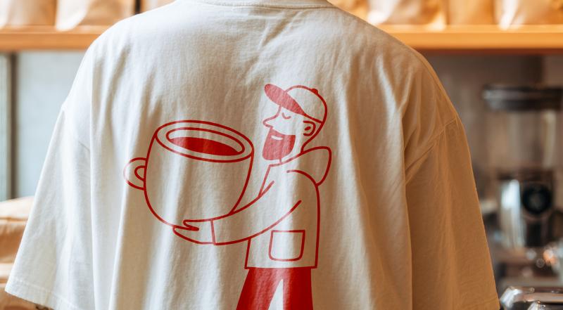
What: Coventry-based Eat Marketing overhauled the identity of Stokes Coffee, a Lincoln roaster founded in 1902, creating a character system of diverse illustrated figures carrying oversized cups. Managing director Nick Peel briefed the agency to modernize the brand across wholesale, retail, and café channels while preserving 124 years of reputation. The rebrand included new strategy, tone of voice, coral/burgundy/cream palette, and bold serif typography.
Original article
Eat Marketing reimagined the 124-year-old Stokes Coffee brand by modernizing its identity without losing its heritage, creating a warm and confident visual system centered around illustrated “Stokes People” characters inspired by real staff and family members. Rather than focusing only on aesthetics, the rebrand rebuilt the company's strategy, tone of voice, typography, and packaging to help Stokes compete in today's coffee market while preserving the trust and history that define the business.
Explore all 40 articles in today's digest
Fresh dev news, AI-digested daily. Never miss a trend at devoured.fyi