Website Design that Converts: Why Good-Looking Sites Still Fail
Premium service websites often fail to convert because they prioritize aesthetic photography over clear, actionable entry points for potential clients.
Original article
A beautifully lit room can stop a scroll. It cannot, by itself, explain how to get one. That gap is where many premium service websites lose people, and closing it is the core of website design that converts.
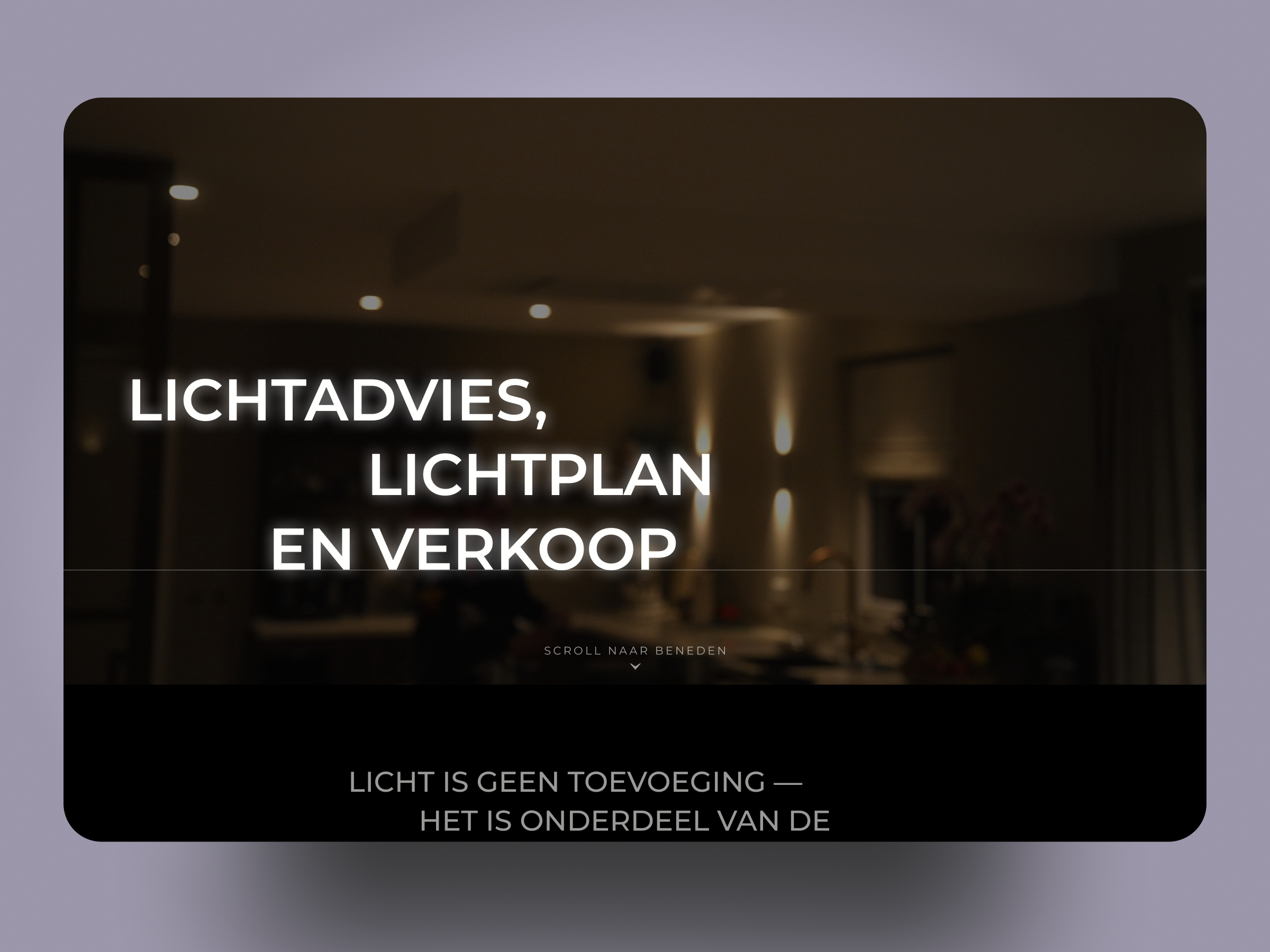
Eclectic Lighting is a Dutch lighting consultancy founded in 2020 by Rick Hommel. The studio combines lighting advice, design, product supply and installation, with work across homes, offices, public buildings, shops and showrooms. Its homepage states the philosophy early: light is part of the architecture, from concept to realization.
Our job was to build a premium, image-led website that does more than look good. It had to help homeowners, architects, and business owners understand the service, see relevant expertise, trust the process, and start an inquiry. The first half comes naturally to most web designers. The second half decides whether the site earns its keep.
Why good-looking websites lose visitors before the inquiry
Lighting is unusually visual. A photograph can make a room look exceptional, but it cannot tell a potential client what the collaboration involves. It also cannot show where the process starts or whether the studio works on their kind of property. Visitors admire a project and still leave without getting in touch.
I think of this as the gap between inspiration and action. A premium site needs bridges that close the gap. On Eclectic Lighting, there are four: project filters by sector, a clear four-step process, specific client reviews, and a floor plan upload. Each one answers a question the photography leaves open.
Photography that leads somewhere
Project photography is essential for a lighting studio. It is the closest a visitor gets to standing in the finished room. Every strong image should still lead somewhere.
On the site, each featured project opens into its own page, like the Deza Kozijnen showroom, with a “view project” link placed on the image. A visitor who stops to admire a room has an obvious next click. We kept the imagery immersive and gave it a direction. The same principle runs through the premium websites in our portfolio, from real estate to chauffeur services.
Four steps that make a bespoke service feel approachable
Premium services often feel abstract from the outside. Prospective clients cannot picture what happens after the first call, so some never make it.
Eclectic Lighting’s process has four steps. It starts with an introduction meeting at the office or on site. The design step produces a 2D lighting plan that shows which light goes where. In the presentation, the client sees that plan alongside a fixture book. Realization follows with a no-obligation quote, and the team can coordinate with the architect, interior designer, installer, and contractor.
Laid out in sequence on the homepage, those steps turn a bespoke service into something a visitor can picture. That reduces uncertainty without making the service feel transactional.
A portfolio organized by the visitor’s context
A homeowner renovating a kitchen and an architect specifying lighting for a public building look for different evidence. One wants to see a home like theirs. The other wants proof that the studio can handle scale and coordination.
The portfolio filters projects into commercial, residential, public buildings, and shops and showrooms. That turns a gallery into a set of answers. Visitors can find work that matches their own project and judge relevance before they judge beauty.
Reviews that make expertise believable
Generic quality claims do little on a premium site. Specific client experiences do more. Eclectic Lighting shows a 4.9 out of 5 rating from 28 reviews, along with longer testimonials.
The longer ones carry the weight. Homeowners describe detailed lighting plans and fixtures labeled to match the plan, which made their installer’s job easier. Interior architects describe repeat collaborations and reliable delivery. Those details tell a new visitor what it feels like to work with the studio, in a way no adjective can.
The floor plan upload as a natural next step
Most contact forms ask visitors to “get started” without telling them what that means. Eclectic Lighting asks for something visitors already have. The contact section invites them to upload a floor plan and receive a no-obligation cost indication for their lighting plan.
That request matches the service. People arrive with a renovation, a deadline, and often a drawing from their architect. Asking for the floor plan lets them bring their actual project into the conversation. It also asks more of web development than a standard form, because the upload has to accept PDFs, Word files, and images.
For visitors who prefer a quick question, a WhatsApp help link sits on the page. Small entry points like these are worth checking on every screen size, and good UI/UX designers treat them as part of the conversion path.
The test I use before a premium website goes live
After a visitor admires the work, do they know whether the studio fits their project, and how to begin? If the answer is yes, the site is doing both of its jobs. If not, the photography is carrying more than it should.
Premium design should feel effortless for the visitor, all the way from the first image to the first inquiry. That is the standard we apply to every website and landing page design we take on.
Fresh dev news, AI-digested daily. Never miss a trend at devoured.fyi