DEVOURED
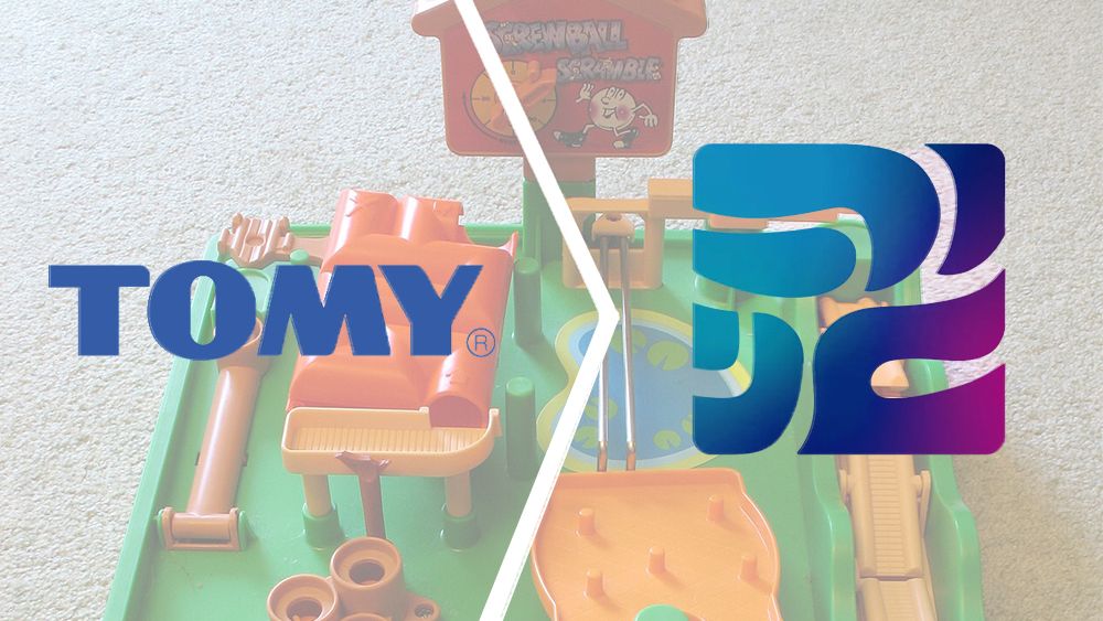
The toy company Tomy has a new logo, and people are baffled
Toymaker Tomy is unifying its global identity as Takara Tomy with a controversial new abstract logo representing 'play' that launches April 1, 2027.
What: The company is rebranding globally from Tomy to Takara Tomy, replacing its blue-and-white identity with a new teal-to-magenta gradient symbol based on the Japanese characters for 'asobi'.
Why it matters: The strong negative public reaction highlights the risks of moving away from established, legible brand assets toward abstract icons that require extensive explanation to convey meaning.
Decoder
- Katakana: One of the four Japanese writing systems, primarily used for foreign words or emphasis.
- Wordmark: A distinct text-based logo design that identifies a brand by its name rather than an abstract symbol.
Original article
Japanese toymaker Tomy is adopting the unified global name Takara Tomy and replacing its familiar blue-and-white logo with a new identity featuring a teal-to-magenta gradient symbol inspired by the Japanese characters for "asobi" (play).
Explore all 69 articles in today's digest
Fresh dev news, AI-digested daily. Never miss a trend at devoured.fyi