DEVOURED
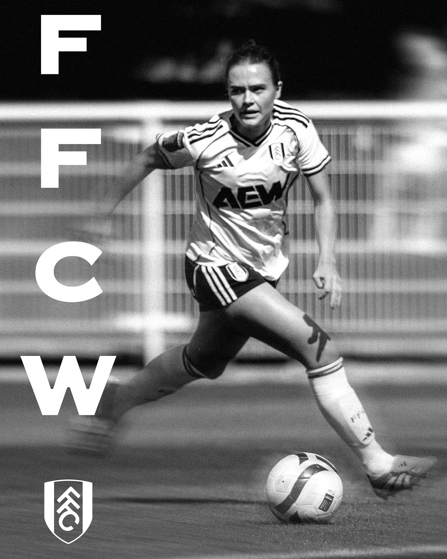
Fulham F.C gets a brand refresh built on hand-rendered lettering found on the walls of its stadium
Design
It's Nice That
Fulham F.C.’s brand refresh converts historic hand-rendered stadium typography into a functional, modern digital type system.
What: Creative agency Music and F37 Foundry developed 'FFC Original,' a bespoke typeface derived from architectural lettering inside Craven Cottage, to modernize the club's visual identity across digital and physical touchpoints.
Why it matters: This demonstrates a shift in sports branding where physical heritage is not merely a background aesthetic but the core structural foundation for modern, responsive digital design systems.
Original article
Fulham F.C's refreshed identity by Music and F37 Foundry is built around FFC Original, a bespoke typeface inspired by hand-rendered lettering discovered inside Craven Cottage, London's oldest football stadium. Rather than placing historical references alongside a contemporary identity, the system uses the club's physical heritage as the source of its modern visual language. The typography now extends across matchday graphics, campaigns, retail, moving image, and a 2026/27 away-kit campaign inspired by the visual language of the 1990s.
Explore all 43 articles in today's digest
Fresh dev news, AI-digested daily. Never miss a trend at devoured.fyi