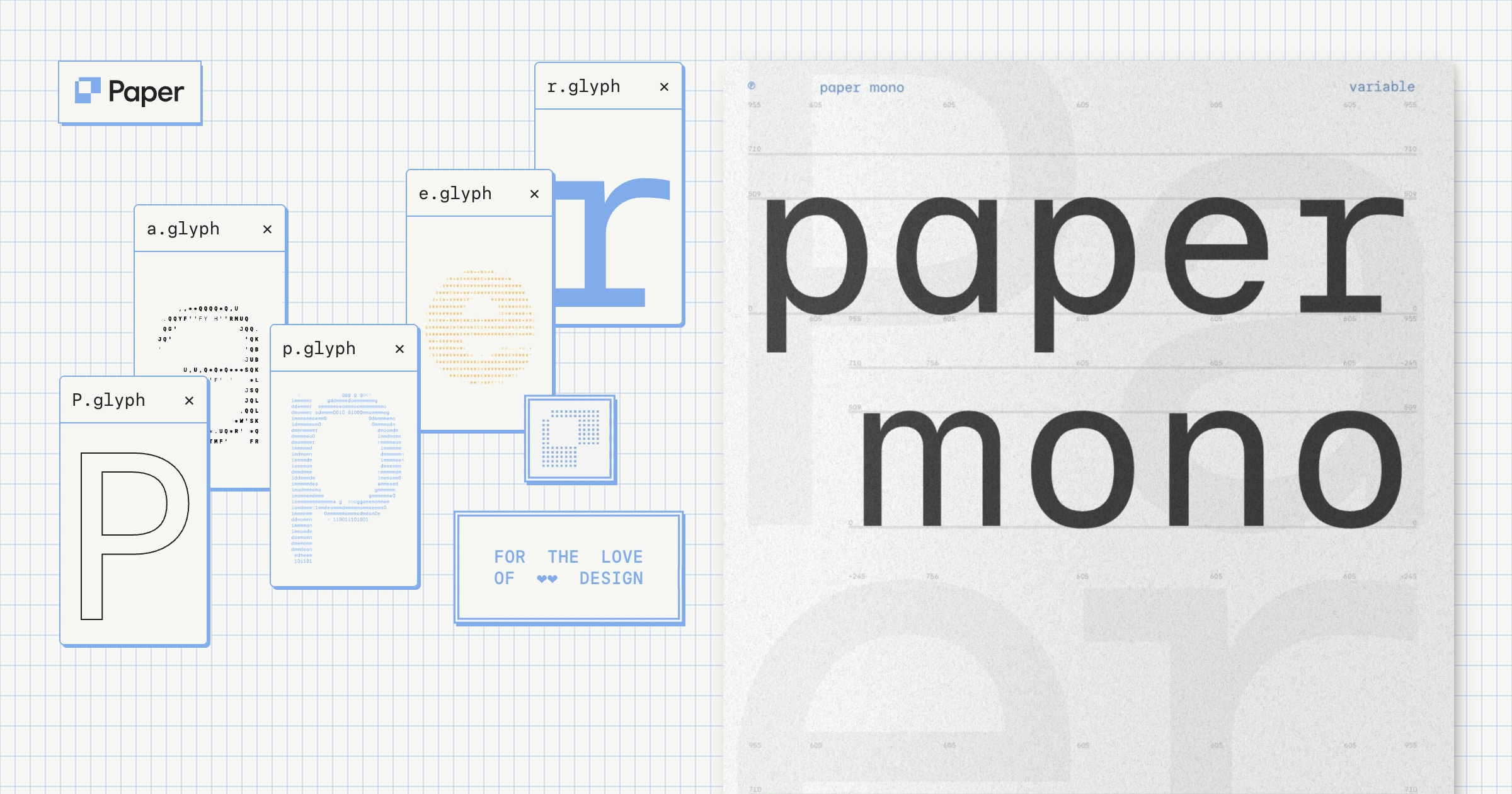
Paper Mono
Paper Mono is a new, versatile open-source variable monospace font family designed to bridge the gap between interface, code, and body text readability.
Deep dive
- Features 800 glyphs and eight weight variations (100-800).
- Supports coding-specific ligatures (e.g., ==, !=, =>) via SS01.
- Includes duospace support to balance monospace rigidity with natural text flow.
- Provides a full suite of 128 box-drawing characters for terminal or dashboard UI elements.
- Uses the SIL Open Font License 1.1 for broad developer integration.
Decoder
- Variable font: A single font file that contains multiple variations of the typeface (weight, width, slant) accessible via interpolation, rather than needing separate files for each style.
- Ligature: A character that combines two or more letters or symbols into a single glyph to improve readability or coding clarity.
- Duospace: A hybrid font style that maintains a monospace-like structure while allowing characters to vary slightly in width for better legibility.
Original article
Paper Mono is a free and open source font family.
Paper Mono summary
METRICS / UNITS
- Width: 606
- Cap height: 710
- X-height: 509
- Ascender: 955
- Descender: -245
- Underline: -100
- Axis: 100-800
Paper Mono v1.0
- Glyphs: 800
- Characters: 659
- Weights: 8
- Feature sets: 6
- Char sets: 12
- Languages: 100+
STYLISTIC SETS
- SS01: coding ligatures
- SS02: duospace glyphs
- SS03: narrow space
- SS04: small arrows
- CV01: single-story a
- ZERO: slashed zero
At Paper, we couldn’t find the mono we wanted – so we made it. Beautiful for headlines, text, user interfaces, and code alike.
1 Design
Timeless character
Flat terminals, gently squared curves, and a balanced x-height give Paper Mono the familiar character of a classic sans.
Variable weights
You have 8 weights to work with, and the variable font lets you fine-tune the weight anywhere in between.
Beautiful numbers and symbols
We designed numbers and symbols with utmost care, so that they’re pleasing to look at and effortless to read.
Box-drawing characters
Build tables, diagrams, and progress bars directly in text, using 128 box-drawing characters and 32 blocks.
Coding ligatures
A deliberately small set of ligatures that makes reading code enjoyable and doesn’t overwhelm you with unfamiliar shapes.
Duospace characters
Probably our favorite feature of the font, duospacing helps text flow naturally while keeping the monospace feel.
Narrow spaces
Enable a little less space between words to help paragraphs flow or to let inline code sit naturally within a sentence.
Small arrows
We’ve included an understated alternate arrow style that works alongside text without drawing too much attention.
Single-story a
You can use the single-story “a” to give the text a warmer, more informal voice.
Slashed zero
By default, the zero is unslashed to keep the numerals looking clean. You can add a slash when you need to tell 0 and O apart.
2 Glyphs
3 Play
Fresh dev news, AI-digested daily. Never miss a trend at devoured.fyi