DEVOURED
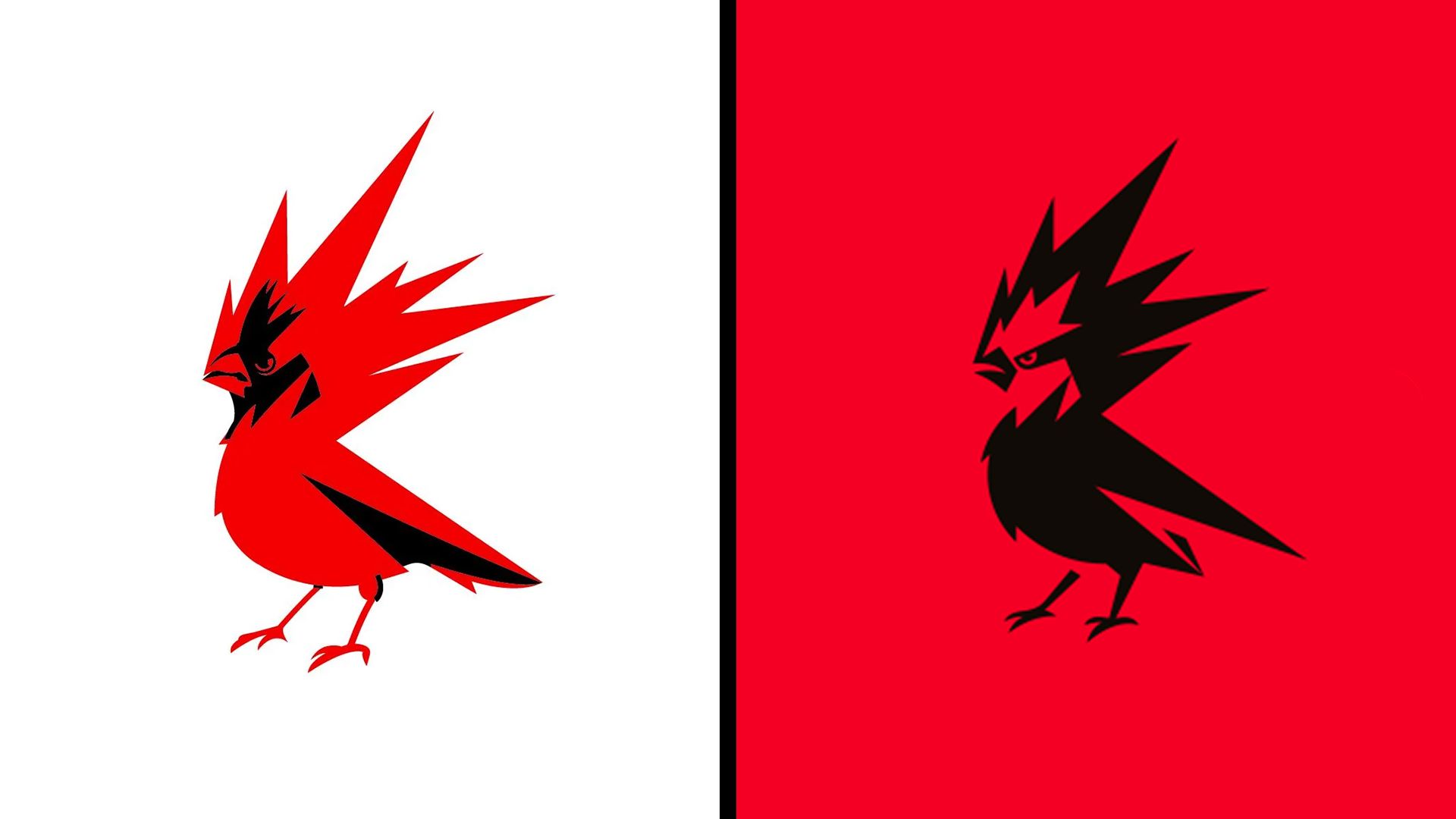
The new CD Projekt Red logo just sparked the weirdest backlash graphic design has ever seen
CD Projekt Red updated its mythological 'Raróg' bird logo with sharper, more aggressive lines, triggering bizarre online backlash over its color scheme.
What: The developer updated its logo to a black-and-red design to modernize the brand identity, resulting in unprompted claims from social media users that the design constitutes a political statement.
Why it matters: This highlights the growing tendency for online communities to interpret routine corporate branding updates through the lens of ongoing culture wars.
Decoder
- Raróg: A mythological firebird from Slavic folklore that serves as the basis for the CD Projekt Red brand emblem.
Original article
CD Projekt Red has refreshed its firebird logo with sharper, more aggressive features and a stronger use of red to better reflect the mythological Slavic raróg it represents, but despite the redesign being a relatively modest evolution, some social media users have bizarrely interpreted the shift to a black-and-red color scheme as a political statement, even though the company says the update is simply intended to create a more modern, confident, energetic, and culturally authentic brand identity.
Explore all 45 articles in today's digest
Fresh dev news, AI-digested daily. Never miss a trend at devoured.fyi