DEVOURED
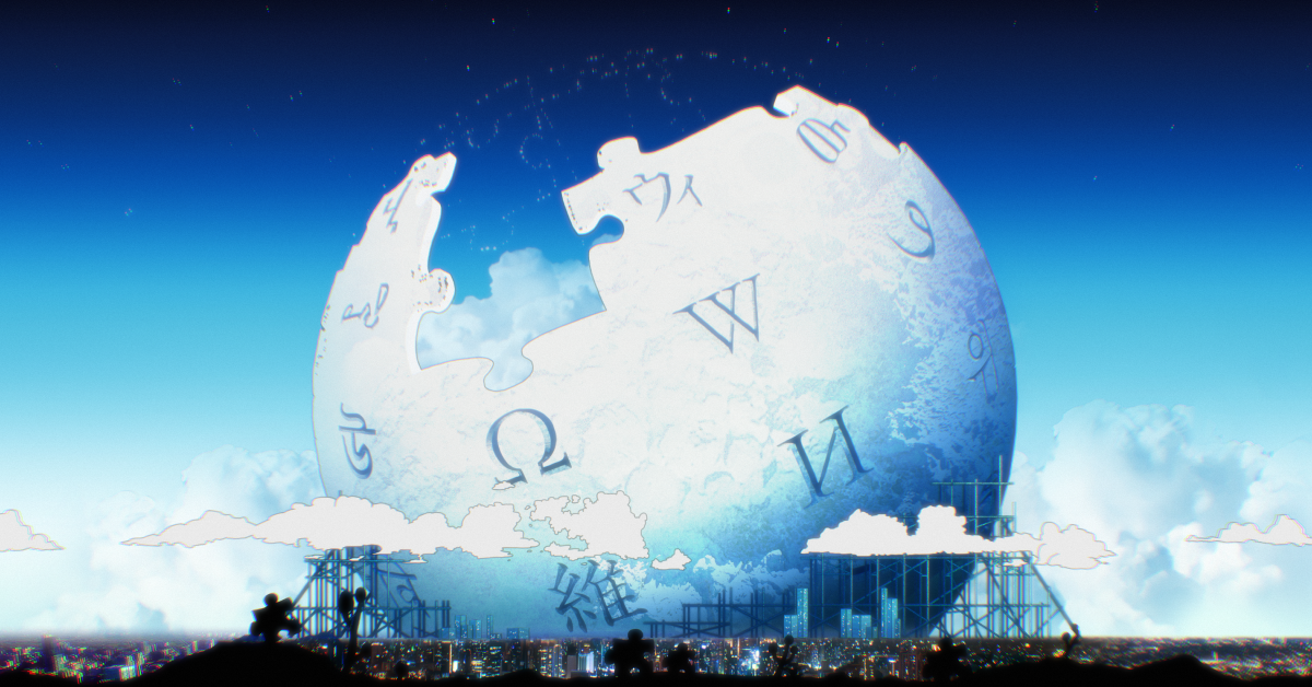
The mascots, design and visual history of Wikipedia, the encyclopedia that puts functionality above aesthetics
Wikipedia remains a bastion of data-first design, resisting the attention economy by prioritizing functional simplicity and volunteer-driven aesthetics over modern UI trends.
What: The Wikimedia Foundation maintains a consistent visual language that balances encyclopedic trust with community-led mascot creation, such as the 'Baby Globe' introduced for the 25th birthday.
Why it matters: Wikipedia's refusal to adopt infinite scroll and modern engagement-based design illustrates that extreme accessibility and trust are often better served by static, predictable interfaces.
Decoder
- Vector 2022: The latest major design update to the Wikipedia desktop interface, criticized by some for being too subtle, intended to improve readability and consistency.
- Wikimedia Commons: A massive repository of freely usable media files that contributes to the visual ecosystem of all Wikimedia projects.
Original article
Wikipedia's enduring design is built around simplicity, accessibility, and trust, evolving only subtly while remaining highly customizable and supported by a passionate global community of volunteers. Beyond the encyclopedia itself, its visual identity extends through iconic branding like the puzzle globe, community-created mascots, creative projects, and campaigns that celebrate Wikipedia as a collaborative, human-powered ecosystem rather than just a website.
Explore all 44 articles in today's digest
Fresh dev news, AI-digested daily. Never miss a trend at devoured.fyi