DEVOURED
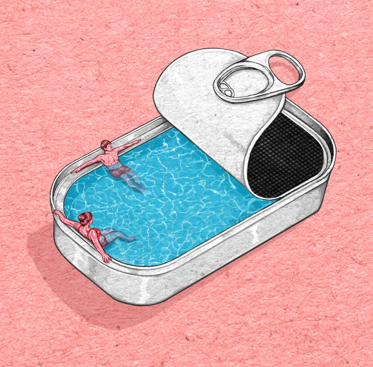
Illustrator Rosa Snijders Finds the Softness in Grief, Debt, and All of Life's Heavy Subjects
Dutch illustrator Rosa Snijders builds a successful editorial career by visualizing heavy topics like grief and death using soft color palettes.
What: Rosa Snijders, an Amsterdam-born illustrator based in Milan, produces editorial work for clients including Le Monde and National Geographic. She maintains a fast turnaround process, often creating final illustrations in under five hours, and emphasizes a shift away from traditional, grim depictions of negative emotions toward softer, more symbolic visual metaphors.
Why it matters: This highlights a shift in editorial illustration where visual storytelling is moving away from literal clichés in favor of mood-driven, abstract representations to better resonate with modern audiences.
Deep dive
- Rosa Snijders uses a consistent palette of turquoise, white, pink, and red to maintain stylistic cohesion across diverse topics.
- Her process involves walking to process briefs, keyword association, and sketching before assembly.
- She leverages internship experience and consistent cold-emailing to build a client base internationally.
- Moving from the Netherlands to Milan influenced her style, leading to more dreamlike, atmospheric qualities.
- She emphasizes editorial work as a form of self-promotion since her name accompanies the published illustrations.
Original article
Dutch illustrator Rosa Snijders built an editorial career drawing heavy subjects like grief and death for outlets including Le Monde, National Geographic, and Corriere della Sera, using soft palettes rather than grim imagery.
Explore all 67 articles in today's digest
Fresh dev news, AI-digested daily. Never miss a trend at devoured.fyi