DEVOURED
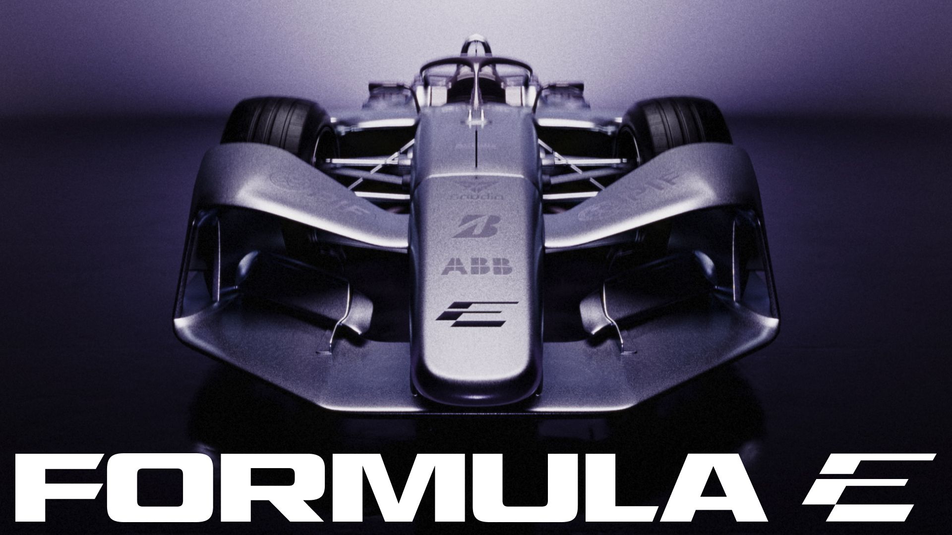
You'll either love or hate the Formula E logo – and that's the whole point
Design
Creative Bloq
Formula E’s new visual identity by MOX uses a divisive, angled logomark to signal speed as the championship enters its GEN4 era.
What: The rebrand features a 30-degree angled 'F' and 'E' logo, a bespoke typeface family based on AP Gavel, and a new color palette including Surge Purple and Electric Lime.
Why it matters: Motorsport organizations are increasingly adopting aggressive, non-traditional design systems to differentiate themselves and capture attention in an era of rapid digital evolution.
Decoder
- Logomark: A graphic or icon-based symbol used to represent a brand, distinct from a text-based wordmark.
- GEN4 era: The fourth generation of technical specifications and regulations for the Formula E electric racing championship.
Original article
Formula E's new identity by MOX centers on a deliberately divisive logomark that combines an F and E at a 30-degree angle to convey speed and momentum. A bespoke type family based on AP Gavel expands the system with condensed italics for energy and a monospaced style for technical data, complemented by Inter for longer copy. Surge Purple, Signal Orange, and Electric Lime add a distinctive palette designed to give the championship a more expressive identity as it enters its GEN4 era.
Explore all 57 articles in today's digest
Fresh dev news, AI-digested daily. Never miss a trend at devoured.fyi