Could this be the moment that drug manufacturing takes off in orbit?
Varda Space Industries signed a deal with United Therapeutics Corporation, marking the first time a major public pharma company is using its own capital for drug development in microgravity.
Summary
Deep Dive
- Varda Space Industries has announced a collaboration with United Therapeutics Corporation to explore drug development in microgravity for rare lung disease.
- This is the first time a major publicly traded pharmaceutical company is using its own funds for microgravity production, rather than relying on NASA subsidies.
- Microgravity influences the structure and crystallization properties of therapeutic compounds, potentially improving their stability and delivery.
- Molecules assemble more slowly and consistently in microgravity, leading to more uniform crystalline structures.
- Benefits include more consistent drug dissolution, longer shelf life, reduced cold storage needs, and potentially fewer side effects.
- Varda has launched six uncrewed capsules equipped with autonomous bioreactors since mid-2023, with plans to increase launch cadence to seven next year.
- Varda's co-founder, Delian Asparouhov, highlighted this as an important moment for the orbital economy, enabled by ISS research, increased startup capital, and reusable rockets reducing access costs.
- Varda's long-term goal is to become a pharmaceutical company operating in space, manufacturing valuable products to bring back to Earth.
Decoder
- Microgravity: A state in which objects appear weightless, often experienced in orbiting spacecraft, due to a constant state of freefall.
- Bioreactor: A device or system that supports a biologically active environment, used for growing cells or tissues, or for performing biochemical reactions.
- Crystallization properties: The characteristics of how a substance forms a crystal structure, which can affect a drug's stability, solubility, and bioavailability.
Original Article
NASA has enabled scientists to study the impact of microgravity on drug development for decades, beginning with the Space Shuttle. This work accelerated in the 2010s, with the completion of the International Space Station and full-time crew members devoted to scientific research.
There have been some notable successes during this timeframe, such as the ability to grow a more uniform crystalline form of the cancer drug Keytruda in 2019. This opened up the possibility of administering the drug via injection rather than requiring a patient to spend hours in a clinic setting to receive the drug intravenously.
NASA subsidized much of this work, typically paying the considerable costs to transport research to the ISS and for astronaut time to conduct research there. There were, however, trade-offs, such as long lead times to get research into space. Nevertheless, it has become clear that there could be some commercial applications for making drugs in space.
Varda starts cooking
A private space company, Varda Space Industries, has begun flying small, uncrewed capsules equipped with autonomous bioreactors that spend a few weeks to months in microgravity that can process pharmaceuticals in the absence of gravity. The company launched the first of these vehicles, W-1, in mid-2023. Five other vehicles have launched since then.
The pharmaceutical industry appears to be starting to notice. On Wednesday morning, Varda announced a significant new collaboration with United Therapeutics Corporation to explore the use of microgravity to develop improved treatments for rare lung disease. As part of the agreement, Varda and United Therapeutics will use microgravity’s influence on the structure and crystallization properties of therapeutic compounds in order to improve their stability and delivery.
In an interview, the president and co-founder of Varda, Delian Asparouhov, said this was an important moment for the orbital economy.
“This is the first time that a large, publicly traded company is using capital from their own balance sheet, not just from NASA, to build and produce a product in microgravity,” Asparouhov said. “This is the first, and we expect there to be many more. I do think it’s a really good historical moment for the space industry.”
More frequent access
Asparouhov said that several trend lines have converged, enabling Varda and United Therapeutics to collaborate. There is the bedrock of research done on board the ISS, increased capital for space startups like Varda, and the rise of reusable rockets that has brought down the cost of access to space and increased the cadence. Varda’s spacecraft, with a mass of a few hundred kilograms, typically fly on SpaceX’s periodic Transporter missions that launch dozens of space missions at a time.
Although he declined to discuss the explicit financial details of this agreement, Asparouhov said it will allow his company and United Therapeutics to do a large number of screening tests on the ground, principally in Varda’s new 10,000-square-foot pharmaceutical lab in El Segundo, California, and then to take these most promising applications to space.
Over time, scientists have come to understand that when molecules assemble in microgravity—that is, in Earth orbit—they do so more slowly and consistently. The crystalline structure of molecules is more uniform, rather than a broad variation.
This turns out to be quite useful in some pharmaceutical applications, including allowing drugs to dissolve more consistently, retain a longer shelf life or reduce cold storage requirements, and reducing side effects. Essentially, yanking gravity away is another tool, just like temperature or pressure, that drug manufacturers can apply to improve their products.
I’m not just the president, I’m also a client
Varda’s W-6 spacecraft is presently in orbit, and Asparouhov said three more vehicles are being prepped to launch this year. The plan is to increase that cadence to seven launches next year. The company presently has about 200 employees and has raised $330 million to date.
Long term, Varda’s goal is not to be a space company, but rather a pharmaceutical company that operates in space and brings valuable materials back to Earth.
“We’re not just building the reentry systems,” Asparouhov said. “We’re also building the largest customer for those reentry systems, which is our whole internal pharmaceutical business. Because at the end of the day, what are you reentering? If you’re bringing things back from space, it’s either humans, in which case there’s plenty of sort of human-rated things; and then if you’re not bringing back humans, it’s got to be a pretty darn valuable product.”
Browsers Treat Big Sites Differently
Safari and Firefox deliberately ship domain-specific code to make major sites like TikTok and Netflix work, effectively patching broken websites instead of waiting for developers.
Summary
Deep Dive
- Safari and Firefox include hardcoded domain checks to alter how specific websites render or behave.
- Examples include fixing video playback on Facebook/X, correcting popover dismissal on Netflix, and handling touch events differently on Amazon.
- Firefox's about:compat lists these site-specific interventions, which can inject custom CSS/JS or change user agent strings.
- Safari's Quirks.cpp file contains similar code, sometimes including comments about failed outreach to site owners.
- Browsers also spoof user agent strings to appear as Chrome for sites that serve degraded experiences to non-Chrome browsers.
- Chrome doesn't need a "quirks file" because its implementation largely defines what "works" for most developers due to its market share.
- This creates a feedback loop: developers build for Chrome, sites work best in Chrome, users switch to Chrome when sites break elsewhere.
- Browser vendors fix these issues to prevent users from blaming their browser for a broken site, rather than waiting for site developers to comply with standards.
- The article warns that sites might be unknowingly benefiting from these invisible browser fixes.
Decoder
- Quirks.cpp: A file in Safari's WebKit rendering engine source code that contains domain-specific fixes and workarounds for various websites.
- about:compat: A special internal URL in Firefox that displays a list of site-specific compatibility interventions and allows users to toggle them.
- User agent spoofing: The practice of a browser pretending to be a different browser (e.g., Safari identifying as Chrome) to receive content or functionality otherwise withheld by a website.
Original Article
Some browsers ship code that checks which domain you’re visiting and changes how the page renders based on it.
Yup, you read that right. If site == X, do Y.
TikTok gets special treatment. So does Netflix. So does Instagram.
And so does SeatGuru.
Safari and Firefox both do this. Chrome doesn’t.
That tells us something interesting.
The source code is right there if you want to look. These are literal domain checks baked into browser rendering engines that say things like “if the user is on this domain, render this differently” or “if they’re on that domain, handle that API call differently.” It’s not a bug. It’s a feature, and it ships to billions of devices.
Firefox’s about:compat
If you open Firefox and type about:compat in the address bar, you’ll see a list of site-specific interventions complete with toggle switches. Each one is a targeted fix for a specific website, and you can turn them off and watch sites break.
Firefox’s WebCompat system injects custom CSS and JavaScript into specific domains, changes user agent strings for sites that sniff browsers incorrectly, and papers over bugs that would otherwise make the web feel broken. The interventions are tracked in Mozilla’s Bugzilla, complete with bug reports and sometimes failed outreach attempts to the sites in question.
Safari’s “quirks”
Safari’s WebKit engine calls them “quirks,” and the file Quirks.cpp is publicly available on GitHub. Reading through it is an education in how the web actually works. Here’s one comment from the code:
Facebook, X (twitter), and Reddit will naively pause a <video> element that has scrolled out of the viewport, regardless of whether that element is currently in PiP mode.
So the browser detects when you’re on facebook.com, x.com, or reddit.com and changes how it handles Picture-in-Picture video. These companies wrote broken video code, and rather than wait for them to fix it, the browser shipped a workaround to every user. Here’s another comment:
FIXME: Remove this quirk if seatguru decides to adjust their site.
Someone added domain-specific rendering code for SeatGuru, and the comment implies outreach was attempted. SeatGuru didn’t fix their site, so the browser fixed it for them.
The commit history is a fascinating read. In just the last few months: Zillow’s floorplan images weren’t centering, TikTok was showing “please upgrade your browser” messages, Instagram Reels were resizing erratically during playback, Netflix’s “Episodes and Info” button was dismissing popovers incorrectly, Twitch was pausing PiP videos when you switched tabs, and Amazon Prime Video wasn’t letting Safari users watch at all. Each one got a domain-specific fix shipped to every single user.
Chrome Is Different
The quirks files aren’t just fixing broken sites; they’re often compensating for Chrome’s control over what “working” means in the first place.
The pattern goes like this: Chrome ships a feature, developers use it because Chrome dominates the market, and other browsers scramble to either implement the feature or add site-specific quirks to paper over the difference. By the time Safari or Firefox catches up, the quirk has already shipped to millions of users.
WebKit’s source code includes user agent overrides that make Safari pretend to be Chrome for specific sites like Amazon’s video pages and various streaming services. These sites sniff for Chrome and serve degraded experiences to everyone else, so rather than let Safari users suffer, WebKit lies about what browser it is. From the current Quirks.cpp source:
auto chromeUserAgent = "Mozilla/5.0 (Macintosh; Intel Mac OS X 10_15_7) AppleWebKit/537.36 (KHTML, like Gecko) Chrome/143.0.0.0 Safari/537.36"_s;
Safari literally ships with a fake Chrome user agent string, ready to deploy when sites refuse to work otherwise. Firefox does the same thing, and many of its about:compat interventions are user agent spoofs telling sites “yes, I’m Chrome” because those sites actively block or break on non-Chrome browsers. The Mozilla wiki explains that some sites “block access completely, display a different design, or provide different functionality” based on browser detection. So Firefox ships workarounds.
This creates a feedback loop. Developers build for Chrome because Chrome dominates. Their sites work best in Chrome. Users who hit bugs elsewhere blame the browser, not the site, so they switch to Chrome, reinforcing its dominance.
It Goes Deep
These aren’t just cosmetic tweaks. Browsers change fundamental behavior based on your domain, including scrolling behavior, touch event handling, viewport calculations, and image MIME type handling. The list in WebKit alone runs to thousands of lines.
Here’s one about simulated mouse events:
When panning on an Amazon product image, we’re either touching on the #magnifierLens element or its previous sibling.
The browser checks if you’re on Amazon and changes how touch-to-mouse event translation works for their product zoom feature. Amazon’s site assumes certain event behavior that Safari doesn’t provide by default, so Safari provides it anyway, but only for Amazon.
There are quirks for storage access, scrollbar rendering, autocorrection behavior, and zoom handling. Each one is behind a domain check, and each one is compiled into the browser executable.
Chrome Doesn’t Need a Quirks File
You might have noticed something. I’ve shown you Firefox’s about:compat and WebKit’s Quirks.cpp, but where’s Chrome’s equivalent?
Chrome doesn’t really need one, and not necessarily because Chrome is better engineered. The web is already built for Chrome. When over 80% of users browse with Chromium-based browsers, developers build for Chrome first. If a site works in Chrome, it ships. If it breaks in Safari or Firefox, they decide, knowingly or otherwise, that it’s less of a problem.
Chrome doesn’t add quirks; it sets the agenda. When Chrome changes how something works, sites update to match, and other browsers follow or break.
This is the asymmetry that runs through the modern web. When a site breaks in Safari, WebKit engineers add a quirk. When Chrome wants to change how the web works, Chrome just changes it and everyone else adapts. Chrome doesn’t need quirks because Chrome’s interpretation of web standards is the version that everyone else works to.
This isn’t done maliciously and it isn’t entirely Google’s fault; really it’s the natural consequence of market dominance. Browser engineers will tell you the specs themselves are actually well-defined now. The HTML5 “living specification” approach solved the chaos of the IE/Netscape era by making specs match reality. The problem is that developers rely on unspecified implementation details, then blame non-compliant browsers when those details differ.
While that may be true, it doesn’t change the outcome. When Chrome is the implementation everyone targets, Chrome’s unspecified details become the de facto spec. The same thing happened with Internet Explorer in the 2000s. When developers built for IE, sites broke elsewhere, and standards compliance became secondary to just making it “work in IE.” We spent years digging out of that hole.
A decade ago, the hope was that browser quirks would eventually disappear as the web became more standards-compliant. You could argue they did, but not for the reason anyone expected: the quirks didn’t go away, they just moved to browsers that aren’t Chrome.
Easier To Fix Than To Wait
You might wonder why browser vendors don’t just contact the offending sites and ask them to fix their code. Sometimes they do, and there’s even a field in source code comments linking to outreach efforts, but consider the economics of that.
A browser vendor’s job is to make the web work for users, and if a popular site is broken in their main browser yet works in Chrome, users blame the browser. Filing a bug with a third party and waiting weeks or months for a fix that may never come is a losing proposition when you can ship a five-line workaround tomorrow.
There’s also the question of who you’d even contact. The developer who wrote the broken code might have left the company years ago, the team that owns that endpoint might not know it’s their responsibility, and the site might be in maintenance mode receiving security patches but nothing else. From the browser’s perspective, the choice is simple: fix it now, invisibly, and save everyone the trouble.
A WebKit engineer wrote a blog post about removing a quirk for FlightAware. The site was comparing CSS transform matrix strings, but the CSS spec had changed how browsers should serialize the values, and the browser became compliant, FlightAware broke, and engineers added domain-specific code to fix it. Outreach eventually worked, FlightAware fixed their code, and the quirk was removed. But for months, Safari users had a working experience only because someone wrote an if statement in the browser checking for flightaware.com.
Check Yourself
Your site might be getting special rendering treatment and you might not be aware of it. That quirk you’re benefiting from doesn’t show up in your error logs, and there’s no console warning that says “this browser is working around your mistakes.” The fix is invisible by design.
If you test mostly in Chrome, you’re especially exposed. Your site might work perfectly not because you wrote good code but because Chrome’s behavior aligns with your assumptions. Other browsers will have to choose between letting your site break for their users or adding you to their quirks file.
Open your site in Firefox and Safari. Not occasionally, not before a big launch, regularly. The quirks files exist because developers didn’t do that.
If you find your domain in one, consider auditing whatever it was they worked around. Not because you have to (after all, the web kept working without your intervention) but because somewhere an engineer at a browser you don’t use solved a problem you didn’t know you had.
The Web We Want vs The One We Have
The specs are the map, but the quirks lists are the messy terrain.
Standards were supposed to eliminate browser-specific code. We dug ourselves out of the IE era, celebrated, and then built exactly the same hole again around a different browser. Only now the browser-specific code lives in the browsers that aren’t dominant, patching over a web built for the one that is.
Sites I’ve worked on are in these files. Yours might be too.
And the lists are getting longer.
When 36,000 Tiny Files Break Your Spark Pipeline: A Deep Dive into S3 DNS Exhaustion and the Small File Problem
36,000 tiny Parquet files on S3 can crash Spark pipelines with UnknownHostException by exhausting DNS and S3 API limits, revealing a critical small file problem.
Summary
Deep Dive
- A Spark pipeline failed when trying to read 36,000 tiny Parquet files from S3, manifesting as
UnknownHostExceptionerrors. - The error was misleading, as networking was fine; the issue stemmed from overwhelming DNS resolvers due to a high volume of S3 operations.
- Each S3 object access involves a DNS lookup, and a large number of small files triggered too many lookups too quickly.
- Beyond DNS, the pipeline also hit limits for S3 LIST and GET API calls, leading to throttling.
- Spark's driver and task executors also struggled with the sheer volume of metadata for thousands of tiny files.
- Temporary mitigations include tuning Spark's
spark.sql.files.maxPartitionBytesto combine small files into fewer partitions andspark.hadoop.fs.s3a.maxConnectionsto limit concurrent S3 connections. - The fundamental solution is to reduce the number of small files through compaction, merging them into larger files.
- Adopting modern table formats like Delta Lake, Apache Iceberg, or Apache Hudi provides built-in mechanisms for file compaction and metadata management, effectively solving the small file problem.
Decoder
- Parquet: A columnar storage file format optimized for analytics, known for efficient data compression and encoding.
- S3 (Amazon Simple Storage Service): Amazon's cloud object storage service, widely used for data lakes and large-scale data storage.
- DNS (Domain Name System): A hierarchical and decentralized naming system for computers, services, or other resources connected to the Internet or a private network, translating domain names to IP addresses.
- DNS exhaustion: A state where DNS resolvers are overwhelmed by too many requests, causing timeouts or failures in resolving domain names.
- Delta Lake: An open-source storage layer that brings ACID transactions to Apache Spark and other big data workloads, enabling reliability for data lakes.
- Apache Iceberg: An open table format for huge analytic datasets, providing SQL-like table capabilities (like schema evolution, hidden partitioning) on top of object storage.
- Apache Hudi: An open-source data lake platform that enables streaming data ingestion and provides record-level updates and deletes on data stored in cloud storage.
Original Article
Thousands of tiny Parquet files on S3 can break Spark reads with UnknownHostException, even when networking is fine, by overwhelming DNS, S3 LIST/GET calls, and driver/task metadata. Spark partition tuning can help stabilize reads, but the real fix is compaction and table formats like Delta Lake or Iceberg.
Why your AI agent has amnesia and why forgetting is the fix
Microsoft developed a novel memory architecture for AI agents that "forgets" less relevant data, achieving 97.2% retention precision and stabilizing at 400-500 memories to prevent "amnesia" in long workflows.
Summary
Deep Dive
- Enterprise AI agents frequently experience "amnesia" in long-running workflows, failing to retain crucial context over time.
- Current methods like increasing prompt length (bloated prompts) or using flat vector search are insufficient for effective long-term memory.
- Microsoft identifies the core problem as an inability to distinguish high-value memories from noise and manage a growing memory footprint.
- Their proposed memory architecture incorporates three key principles: consolidation, forgetting, and delayed maturation.
- Consolidation: Combining similar or related memories into more abstract, higher-level representations.
- Forgetting: Actively discarding less relevant or redundant memories to prevent memory bloat. This is crucial for maintaining focus and efficiency.
- Delayed maturation: Allowing memories to "mature" over time, giving them a chance to prove their long-term relevance before being consolidated or forgotten.
- This approach achieves 97.2% retention precision for high-value events.
- The memory footprint stabilizes around 400 to 500 memories, demonstrating efficient resource usage.
- The architecture is inspired by how biological brains manage memory, selectively retaining and consolidating information.
Decoder
- AI agent amnesia: A phenomenon where AI agents, especially those operating over long workflows, lose track of past events or context, similar to human memory loss.
- Bloated prompts: Large, overly verbose text inputs given to an LLM, attempting to include all past context, which can degrade performance and efficiency due to context window limits.
- Flat vector search: A basic method of retrieving relevant information by comparing vector embeddings in a high-dimensional space directly, without hierarchical indexing or advanced filtering.
- Memory architecture: The design and organization of how an AI agent stores, retrieves, and manages information over time to maintain context and improve decision-making.
Original Article
Enterprise AI agents fail in long workflows because they reset, lose context, and rely on bloated prompts or flat vector search. Microsoft's memory architecture uses consolidation, forgetting, and delayed maturation to keep high-value events, reaching 97.2% retention precision and stabilizing around 400 to 500 memories.
Migrating Data Ingestion Systems at Meta Scale
Meta successfully migrated its massive data ingestion system to a new architecture using a rigorous "Shadow → Reverse Shadow → Cleanup" phased approach, ensuring data integrity across petabytes of social graph data.
Summary
Deep Dive
- Meta undertook a large-scale migration of its data ingestion system, moving from legacy customer-owned pipelines to a more efficient, self-managed data warehouse service.
- The system daily scrapes petabytes of social graph data from one of the world's largest MySQL deployments into a data warehouse.
- The migration followed a strict lifecycle: Shadow → Reverse Shadow → Cleanup.
- Shadow Phase: New system jobs ran in pre-production, mirroring production data to shadow tables. Row count and checksums were continuously monitored against production data.
- Reverse Shadow Phase: The new system became the primary writer to production tables, while the old system wrote to shadow tables, acting as a live fallback for comparison and quick rollbacks.
- Cleanup Phase: Once stability was confirmed, the old system was deprecated.
- Rigorous data quality checks involved comparing row counts and checksums between old and new system outputs.
- Custom debugging tools were built to identify root causes of data mismatches and log detailed information to Scuba (Meta’s data management system).
- Rollback mechanisms were designed to quickly stop bad Change Data Capture (CDC) data propagation by marking problematic partitions and backfilling.
- The migration was executed in batches due to limited capacity, with automated tooling monitoring job status and promoting/demoting jobs based on criteria.
- Special attention was paid to avoiding unnecessary "full dumps" for new shadow jobs with known issues, improving migration efficiency.
Decoder
- CDC (Change Data Capture): A set of software design patterns used to determine and track the changes in data so that action can be taken using the changed data.
- Social graph: A term describing the global mapping of individual people and how they're related, often used in the context of social media platforms like Facebook.
- Scuba: Meta's internal real-time data analysis and debugging system.
- Full dump: A complete copy of all data from a source database, as opposed to incremental changes.
- Shadow migration: A technique where a new system runs in parallel with an old system, processing real production data but writing to a separate, "shadow" destination for validation without impacting live users.
- Reverse shadow: A stage in migration where the new system becomes primary, and the old system continues to run in parallel, writing to a shadow destination, providing a quick rollback option.
Original Article
- Meta’s data ingestion system, which our engineering teams leverage for up-to-date snapshots of the social graph, has recently undergone a significant revamp to enhance its reliability at scale.
- Moving from our legacy system to our new architecture required a large-scale migration of our entire data ingestion system.
- We’re sharing the solutions and strategies that enabled a successful large-scale system migration, as well as the key factors that influenced our architectural decisions.
At Meta, our social graph is powered by one of the largest MySQL deployments in the world. Every day, our data ingestion system incrementally scrapes several petabytes of social graph data from MySQL into the data warehouse to power the analytics, reporting, and downstream data products that teams across the company utilize for tasks ranging from day-to-day decision-making to machine learning model training and product development.
We’ve recently revamped our data ingestion system’s architecture to significantly enhance its efficiency and reliability. The new architecture moves away from customer-owned pipelines, which functioned effectively at a small scale, to a simpler self-managed data warehouse service that still operates efficiently at hyperscale.
We’ve successfully transitioned 100% of the workload and fully deprecated the legacy system. But migrating a data ingestion system of this scale was a major challenge. Several important solutions and strategies helped make a migration of this scope successful.
The Migration Challenge
As our operations grew in scale, our legacy data ingestion system began to show signs of instability under the increasingly strict data landing time requirements. We knew we needed to migrate to a new system. But we also knew that meant facing challenges around not only how to make sure each job would be migrated seamlessly but also how to perform large scale migration itself.
Ensuring a Seamless Transition
Ensuring a seamless migration meant we had to effectively track the migration lifecycle for thousands of jobs and put robust rollout and rollback controls in place to handle issues that might arise during the migration process.
The Migration Lifecycle
Our first step was to establish a clear migration job lifecycle to ensure data integrity and operational reliability throughout the process.
Each job needed to be verified for correctness and had to meet defined success criteria before moving to the next step of the migration lifecycle:
- No data quality issues. There is no difference between the data delivered by the old system and the new system. We verify this by comparing both the row count and the checksum of the data, ensuring complete consistency between the two systems.
- No landing latency regression is observed. The data delivered by the new system should exhibit improved landing latency, or at minimum, match the performance of the old system.
- No resource utilization regression is observed. The compute and storage usage of the job running in the new system should be improved, or at minimum, be comparable to that of the old system.
- For the critical table migration, we defined and agreed on extra migration criteria with the teams who were reliant on the service.
Phase 1: The Shadow Phase
In the first step of the lifecycle we set up shadow jobs in the pre-production environment to be delivered via the new system. This is essentially a production-realistic test that each shadow job consumed the same source as the production job but delivered data to a different table called the shadow table. This setup can help reveal issues because it exposes the new system to real production data and behavior, while still providing an isolated place to inspect outcomes and deploy fixes quickly.
We continuously monitored row count and checksum mismatches between the production jobs and the shadow jobs. When mismatches occurred, we quickly investigated the root cause and deployed fixes to the pre-production environment, then verified that the mismatch was resolved.
During this step, we also measured the compute and storage quotas for the shadow jobs to ensure that the production environment had sufficient resources before proceeding.
If the shadow job met the above criteria it moved to the production environment and made sure the job could still run reliably in the production environment before moving to the next step.
Phase 2: The Reverse Shadow Phase
Once the production job and the shadow job were running reliably in the production environment, we began the reverse shadow phase. In this phase, the shadow job’s data was written to the production table, effectively making the shadow job the new production job. Meanwhile, the production job’s data was written to the shadow table, so the original production job then acted as the shadow job.
This approach provided two key benefits. First, we could still get ongoing data-quality signals after rollout by continuing to compare outputs from the two systems. Second, we could roll back fast if discrepancies were detected, without needing to recreate or reconfigure the old system job.
Phase 3: Migration Cleanup
We continued to monitor and compare the data delivered by both jobs. If no discrepancies were detected, the shadow job, now running on the old system, was removed. The new system then took over and continued delivering data through the production job, marking the completion of the migration.
Custom Data Quality Analysis Tooling
We also built a comprehensive set of debugging tools to help team members efficiently identify and resolve issues that might arise during the migration.
We developed a data quality analysis tool to ensure that edge cases across jobs are effectively captured and addressed. For each landed shadow table partition, the system would read the corresponding production table partition and compare both the row count and checksum. Any mismatches were logged to Scuba, Meta’s data management system for real-time analysis. Every hour, the data quality analysis tool read the logs from Scuba, ran queries to identify example rows causing mismatches, and logged detailed debugging information back to Scuba. This process enabled team members to quickly determine the root cause of issues and assess whether they were already known and being addressed.
This same data quality analysis tool is still in use after the migration as part of the release validation process.
Handling Rollout and Rollback
Both our legacy and new data ingestion systems used change data capture (CDC) to incrementally ingest data into the target table. Each data ingestion job has its own internal table for a full dump of source databases (full dump), an internal table for capturing changes of source databases (delta), and the target table consumed by the data customers. All the information about job entities, including table names and table schemas, is saved and managed by the central management service.
Being a CDC process means the data generated by the system is used again to generate the new data. This means if previous landed data has any issues the problematic data will be passed to the new landed data. If issues were to happen after the migration we’d need to perform a rollback to fix the landed data to stop the bleeding.
To reduce the risk, we focused on two solutions:
- Early signals before problematic data are landed on the data customer.
- How to stop the bleeding quickly during rollback.
Early Signals After Rollout
Rather than waiting for data consumers to discover issues with problematic data, we received early signals indicating whether the migration is successful. As previously mentioned, after the rollout, the migration entered the reverse shadow phase. This meant the shadow job’s data was written to the production table, effectively making the shadow job the new production job. And the production job’s data was written to the shadow table, so the original production job now acts as the shadow job.
To get the early signals, we triggered backfill on both production and shadow jobs. If the backfill results still matched it indicated the migration is successful. If the result did not match, the job would be rolled back immediately and data consumers would not be impacted.
Stopping the Bad Data Propagation Quickly During Rollback
As previously mentioned, one characteristic of the CDC process is that problematic data can propagate to newly generated data. Quickly stopping the spread of bad data not only makes the migration more robust but also improves reliability after the migration is complete.
During the reverse shadow phase, if any data quality issues were detected in a specific partition, that partition would be marked in its metadata as having bad data quality. If this partition was a delta partition, then new data would stop landing, and an alert would be sent to a team member. If this partition was a target partition, the system would instead select an older partition and merge it with more deltas.
In this way we could stop bad data propagation quickly. For rollback, we could quickly query the metadata to find all partitions that were marked with bad data quality and fix them with backfill.
How We Executed the Large-Scale Migration
After successfully migrating a small batch of jobs, we were confident we would perform the full migration. The challenges in doing so roughly fell into two buckets:
- How to monitor and migrate large numbers of jobs automatically. (This challenge is intensified by the sheer volume of jobs to migrate).
- How to do effective shadow testing with limited capacity.
Monitoring With Automated Tooling
With tens of thousands of ingestion jobs to migrate we developed tooling that automated the entire process and minimized friction.
Running shadow tests and addressing edge cases across such a large job set requires robust automation and thorough validation to ensure reliability and correctness.
Since we established a clear migration job lifecycle and job promotion criteria, the system continuously sent job status signals to Scuba, including data related to the lifecycle promotion criteria and the job’s current stage in the migration lifecycle. We built external migration tools that continuously monitored signals from each job and automatically promoted or demoted jobs between stages of the migration lifecycle, depending on whether they met (or no longer met) the migration criteria. We also built system-level and job-level dashboards so engineers could quickly track the overall migration progress as well as monitor and debug individual jobs.
Planning With Limited Capacity
Because migration capacity was limited, we could not run all shadow jobs at once. Instead, we migrated the jobs in batches. Migration efficiency depends heavily on how jobs are selected for each migration batch.
We categorized jobs according to various features such as throughput, priority, and special cases. Engineering teams worked to ensure that the environment was properly prepared before creating a batch. For instance, they established selection criteria to exclude jobs with known issues that were still being resolved, thereby reducing noise caused by duplicate issues. Jobs were also prioritized based on business need and teams who were reliant on the service were notified ahead of migration.
We avoided creating new shadow jobs with known issues until those issues were resolved. When an issue was detected we removed any potentially affected jobs from the migration list and held them until a fix was in place.
As noted above, due to the system’s CDC design, a new job’s first snapshot was landed via a full dump, which is typically slow and expensive. If we detected data quality issues in a landed snapshot we also triggered another full dump to land a corrected snapshot after the underlying bugs were fixed. Creating shadow jobs while known issues were still present would therefore trigger a lot of unnecessary full dumps, both at job creation time and again during data-quality remediation. By avoiding creating those jobs, we avoided large amounts of extra full dump work and improved migration efficiency. We also built creative solutions like reusing snapshot partitions delivered by the old system as snapshot initially to reduce the full dump load.
Acknowledgements
We would like to thank all the team members and the leadership that contributed to make this project a success in Meta.
Quack: The DuckDB Client-Server Protocol
DuckDB introduces "Quack," a new HTTP-based client-server protocol enabling multiple DuckDB instances to communicate and concurrently write to the same database, overcoming its previous in-process-only limitation.
Summary
Deep Dive
- DuckDB, traditionally an in-process database, now supports a client-server architecture through the new "Quack" protocol.
- Quack allows multiple DuckDB instances to communicate over HTTP, enabling concurrent reads and writes to the same database file from different processes, locally or remotely.
- It is implemented as a DuckDB extension, initially available in core_nightly for DuckDB v1.5.2.
- The protocol uses a request-response pattern and a custom application/duckdb MIME type for efficient serialization of data types and result sets, leveraging DuckDB's internal primitives.
- Security features include a default random authentication token, localhost binding by default, and a recommendation to use external HTTP proxies (like Nginx) for SSL termination when exposed to the internet.
- Benchmarks show Quack transferring 60 million rows (76 GB) in under 5 seconds, significantly faster than Arrow Flight SQL (17.4s) and PostgreSQL (158.37s) for bulk transfers.
- For small concurrent writes (INSERTs), Quack outperformed PostgreSQL up to 8 parallel threads, achieving around 5,500 transactions per second before hitting an internal DuckDB limitation.
- The DuckDB team plans to integrate Quack into DuckLake for remote catalog serving and aims for a production release with DuckDB v2.0 in Fall 2026.
- They chose not to use Arrow Flight SQL due to its two-round-trip query execution, which is suboptimal for small updates, and to maintain full control over internal data structures and serialization for innovation.
Decoder
- Quack: The new client-server protocol for DuckDB, enabling communication between separate DuckDB instances over HTTP.
- DuckDB-Wasm: A version of DuckDB compiled to WebAssembly, allowing it to run in web browsers.
- Arrow Flight SQL: A client-server protocol for high-performance data transfer and SQL execution, often used with Apache Arrow.
Original Article
TL;DR: DuckDB instances can now talk to each other using the Quack remote protocol. This lets you run DuckDB in a client-server setup with multiple concurrent writers. In DuckDB's spirit, Quack is simple to set up and builds on proven technologies such as HTTP. It's also fast, which allows it to support workloads ranging from bulk operations to small transactions.
Background: Database Architectures
When databases first emerged, there was no distinction between a ‘client’ and a ‘server’, the whole database just ran on a single computer. Somewhere in the 80s, Sybase was the first to introduce the concept of a database ‘server’ and a ‘client’ running on different computers. Ever since, it was just assumed that every database system used a client-server architecture along with a communication protocol to talk between those. This was convenient, because the single mutable state stays in a single place under the control of a server, and there can be many clients at the same time reading and writing data. There are of course drawbacks to this method, most notably, those protocols can add a significant amount of overhead. If you’re curious to read more, we wrote a research paper on database protocols a while back.
Of course, there were always dissenters to the client-server architecture, most notably the ubiquitous SQLite in 2000, and of course DuckDB, first released in 2019. We made quite a lot of noise about implementing an in-process architecture, where there is no client-server, no protocol, just low-level API calls. This worked really well for interactive use cases in e.g., data science, where analysts would interact with their data for example in a Python notebook and their data was managed in a DuckDB instance running in the very same process. It also worked really well for the many use cases where DuckDB was just “glued” to an existing application to provide SQL functionality on data living in that application.
Being an in-process system works “less well” for use cases when trying to modify the same database file from multiple processes at the same time. There are a lot of use cases where this is relevant, for example, when inserting into the same database from a bunch of processes collecting telemetry while at the same time querying the same tables to drive a dashboard. There are very good technical reasons why we could not make this work, most notably, the fact that DuckDB keeps a bunch of state in main memory and would have to synchronize that state if multiple processes start making changes simultaneously.
And yes, there were workarounds. Of course you can whip up a custom Remote Procedure Call (RPC) solution where there is a process that holds the DuckDB database instance and offers a service to other processes to query and insert data. There are also multiple projects out there that retrofit client-server abilities to DuckDB, for example using the Arrow Flight SQL protocol. MotherDuck has their own custom client-server protocol. And of course, you can always (gasp) switch to a more traditional database system that had client-server support, for example the also-ubiquitous PostgreSQL. You can then even proceed to run a so-called “EleDucken”, DuckDB in said PostgreSQL using one of the various extensions out there that enable this, for example pg_duckdb.
The vast number of workarounds people built to bolt a client-server solution onto DuckDB has at the very least convinced us that this is something people cared about. We see DuckDB as a universal data wrangling tool. If this means having a client-server protocol in addition to the in-process capabilities – fine. If this ends up unlocking a vast new set of cases in which DuckDB can be useful – excellent! In the end we care deeply about user experience and perhaps less about having the last word on architecture. So we bit the bullet, eventually, finally, and today we are very happy to announce the result:
Introducing the Quack Protocol for DuckDB
What do two (or more) ducks do if they want to talk to each other? They quack! So it is quite natural that we need to call the protocol that two DuckDB instances can use to talk to each other “Quack”, too! We had the opportunity to design a database protocol from scratch in 2026 without having to consider any legacy, which is quite a luxury. We were able to learn from the existing protocols, including the more recent Arrow Flight SQL and others. Before we dive into how Quack works internally, let's see how it works from a user perspective. First, you need two DuckDB instances. That’s right, DuckDB will act both as a client and as a server! The two instances can be on different computers a world apart (or in space) or just two different terminal windows on your laptop. First, we need to install the Quack extension in both DuckDB instances. For now, Quack lives in the core_nightly repository and is available in DuckDB v1.5.2, the current release version:
DuckDB #1
INSTALL quack FROM core_nightly;
LOAD quack;
CALL quack_serve(
'quack:localhost',
token = 'super_secret'
);
CREATE TABLE hello AS
FROM VALUES ('world') v(s);
DuckDB #2
INSTALL quack FROM core_nightly;
LOAD quack;
CREATE SECRET (
TYPE quack,
TOKEN 'super_secret'
);
ATTACH 'quack:localhost' AS remote;
FROM remote.hello;
This should show the content of the remote table hello, world in DuckDB #2. Witchcraft! We can also copy data from the local instance to the remote one:
DuckDB #1
-- Waiting to serve data
DuckDB #2
-- Step one
CREATE TABLE remote.hello2 AS
FROM VALUES ('world2') v(s);
Similarly, you should see world2 in the output on DuckDB #1. Obviously those are the most basic examples we can think of. Tables can be much more complex, queries can be much more complex, data volumes can be quite vast (see below). There is also a way to just ship an entire verbatim query to the remote side using the query function, which is better for very complex queries on large datasets and offers more control over what exactly is executed remotely:
DuckDB #1
-- Waiting to serve data
DuckDB #2
FROM remote.query(
'SELECT s FROM hello'
);
Of course there is much more to see here. Please consult our documentation for more details.
Protocol Design
HTTP-Based
Quack is built straight on the venerable HTTP, the Hypertext Transfer Protocol. From its humble beginnings at CERN, HTTP has become a de-facto protocol layer on top of TCP and all the stuff below. The entire stack is optimized to transmit HTTP message streams efficiently. The protocol has surprisingly low overhead if implemented properly. Everyone and their little brother knows how to deal with HTTP in load balancing, authentication, firewalls, intrusion detection etc. It would be rather misguided not to build a database protocol on top of HTTP in 2026. HTTP also allows the DuckDB-Wasm distribution to speak Quack natively! So DuckDB running in a browser can e.g., directly connect to a DuckDB instance running in an EC2 server using Quack.
Request-Response Pattern
Interactions on Quack are always driven by the client in a request-response pattern. Quack messages are for example connection requests, to authenticate with a token as seen above. See below on how authentication and authorization are handled in detail. Subsequent messages are requests to execute a query and return the first part of the response and follow-up fetch messages to retrieve large results, possibly from multiple threads in parallel.
Serialization
Requests and responses are encoded using the new MIME type application/duckdb. This encoding leverages DuckDB’s internal efficient serialization primitives for complex structures like data types and result sets. We have been using the same primitives for example in our Write-Ahead Log (WAL) files for years, meaning they are fairly well-optimized and battle-tested.
Encryption
While we want Quack to “just work” we also are wary of the security nightmares of attaching a database directly to the evil internet, as has happened before. This is why Quack will by default generate a random authentication token at server start-up, which then has to be given to the client. In addition, the Quack server will by default only bind to localhost (which can of course be overridden). Quack does not use SSL by default, because it is a bit silly to bring all that infrastructure and add dependencies just for localhost communication. We do not recommend opening up a DuckDB Quack endpoint directly to the Internet. Instead we strongly recommend that you use a common HTTP endpoint like nginx if you should choose to expose Quack to the World Wide Web and have that proxy terminate SSL (e.g., with Let's Encrypt). The Quack client will assume SSL is enabled for non-local connections, this can be overridden. We provide a guide for this in our documentation.
Round-Trips
We have been careful to optimize the number of protocol round trips or request/response pairs for queries. Once connected, a query can be completely handled with a single round trip. This is a critical optimization for latency-sensitive environments. At the same time, we have seriously optimized Quack for efficient bulk response transfer. As far as we know, Quack is currently the fastest way to shove tables through a socket, and millions of rows can be transferred in a few seconds. Below are a few benchmark results.
Authentication and Authorization
Authentication and authorization of database queries are an endless source of joy and complexity. We are likely unable to capture everyone’s use case, certainly not in a first release. The smart thing is therefore not to try. For Quack, we have chosen an auth model that ties into DuckDB’s philosophy of extensibility. There are hundreds of DuckDB extensions out there already. Quack ships with a default Authentication method and no authorization restrictions, but both can be overridden by user-supplied code. As you have seen above, the Quack server generates a default random authentication token on startup. When a client connects, it provides an authentication string. The server side will call an authentication callback. By default, it will compare the client-supplied token with the one that was randomly generated before. But this callback can be changed through configuration! You can bring your own authentication function that for example queries an LDAP directory, reads a text file, or just rolls the dice. Up to you. Similarly, the authorization function can be changed. The default authorization function just says “yes” to everything, but you can inspect each query a client attempts to execute, correlate the query to the previously used authentication string etc. Those callbacks can even be plain SQL macros! Please see our documentation for more details.
Default Port
By default, a Quack server listens on port 9494, the number 94 being easy to remember as the year Netscape Navigator was released.
Benchmarks
We have set up two benchmarks to showcase the Quack protocol. Those benchmarks were run on AWS virtual machines running Ubuntu on Arm. We picked the m8g.2xlarge instance type, which has 8 vCPUs and 32 GB of RAM and, importantly, “up to 15 Gbps” network bandwidth. We recreated a real-world scenario where client and server are in the same data center, but on different machines. We made sure both instances were in the same “availability zone”. Ping time between the instances averaged around 0.280 ms.
Bulk Transfer
The first benchmark tests bulk transfer, the case where a fairly large number of rows should be transferred over the database protocol. If you’ve read the paper we linked above, you know that this is a case where traditional database protocols were struggling. We compare Quack with two systems: the widespread PostgreSQL protocol and the newer Arrow Flight SQL protocol. Arrow Flight is provided by the GizmoSQL server that also uses DuckDB internally. We transfer an increasing number of rows of the TPC-H lineitem table, all the way up to a whopping 60 million rows (76 GB in CSV format!) and report the median wall clock time over 5 runs. We expect the modern bulk-oriented protocols to far outclass the PostgreSQL protocol. Here are the results:
Runtimes of bulk transfer operations (lower is better)
| Rows | DuckDB Quack | Arrow Flight | PostgreSQL |
|---|---|---|---|
| 100k | 0.07 s | 0.07 s | 0.20 s |
| 1M | 0.24 s | 0.38 s | 2.20 s |
| 10M | 0.89 s | 2.90 s | 25.64 s |
| 60M | 4.94 s | 17.40 s | 158.37 s |
We can see how Quack is doing great for bulk result set transfer, transferring the 60 million rows in under 5 seconds! Even the purpose-built Arrow Flight SQL protocol can’t compete here, and Postgres’ row-based protocol is rather hopeless in general.
In fairness we have to mention that the standard PostgreSQL clients do not parallelize reads over multiple threads, but Quack and Arrow can. Shameless plug: DuckDB’s PostgreSQL client can also do that in some cases!
Small Writes
The second benchmark tests small appends. This is a common use case to, for example, centralize observability data in a single central DuckDB instance. This stresses the database protocol in a different way, for example, multiple round trips between client and server to complete a single transaction will be a disadvantage. We test this by creating an empty table with the same structure as the TPC-H lineitem table, and then insert randomized values into it, each row in its own INSERT transaction. The inserted values somewhat follow the distribution of the usual benchmark generator. We ran an increasing amount of parallel threads for five seconds. We repeated this experiment five times and reported the median transactions per second.
We expect a highly transaction-optimized system like PostgreSQL to dominate this benchmark. We also expect the bulk-optimized Arrow Flight to not do particularly well.
Throughput of small writes (higher is better)
| Threads | DuckDB Quack | Arrow Flight | PostgreSQL |
|---|---|---|---|
| 1 | 1,038 tx/s | 469 tx/s | 839 tx/s |
| 2 | 1,956 tx/s | 799 tx/s | 1,094 tx/s |
| 4 | 3,504 tx/s | 1,224 tx/s | 2,180 tx/s |
| 8 | 5,434 tx/s | 1,358 tx/s | 4,320 tx/s |
Quite surprisingly, we see Quack outperforming PostgreSQL up to 8 parallel threads to a maximum transaction rate of around 5,500 transactions per second. Beyond that, we hit a current limitation of DuckDB itself in concurrent insertions per second into the same table. PostgreSQL scales better here, which is something to look into for us in the near future. Arrow Flight is not doing too well, being roughly half as fast as Postgres, as expected.
Benchmark scripts are available online.
Conclusion
Today we released Quack, a client-server protocol for DuckDB along with an initial implementation as a DuckDB extension. Quack unlocks a full multiplayer experience with DuckDB, where multiple separate processes – locally or remote – can now modify contents of tables in parallel without locking each other out. And while part of this could also already be achieved with DuckLake, Quack makes this far simpler and provides far higher performance.
Use Cases
With Quack, DuckDB can now be useful in a wide range of new use cases, where centralizing state is more important than hyper-local querying. We have already had to learn that data is not always local with the rise of data lakes. Speaking of lakes, Quack is also going to be integrated into DuckLake so that DuckDB itself can be a remotely-accessible Catalog server. This will unlock new capabilities, e.g., for data inlining. If you have more questions on this, please consult the Quack FAQ.
Overall, DuckDB is moving further out of its initial niche of an in-process database for interactive analytics into a core building block of modern data architecture. We have been playing with Quack for a while now, and are quite excited to hear what you are going to build with it. If you have any suggestions on how Quack could be improved, let us know! And hey, the MythBusters have already proven that a duck’s quack echos, so let's see what kind of noise this leads to.
Next Steps
There are of course a lot of things still to do. First off, we are going to integrate Quack into DuckLake, so that it becomes possible to use a remote DuckDB server as a DuckLake catalog! We expect this to greatly improve performance, especially with inlining. Next, we are going to polish Quack over the coming months and release a first production release together with DuckDB v2.0 when it's coming in fall this year. We plan for example to enable auto-installation and auto-loading of the Quack extension whenever it is needed. Using our new parser, we are also planning to improve on the syntax for talking to remote SQL databases from DuckDB. On the core DuckDB side, we plan to work on greatly increasing the transactions per second achievable, so we can scale transactions far beyond eight parallel threads.
Further on, we are thinking about allowing extensions to the Quack protocol beyond authentication and authorization, for example, by allowing DuckDB extensions to add new protocol messages and the code to handle them. And we are also thinking about adding a replication protocol on top of Quack so that changes to a DuckDB instance can be replicated to other servers, for example to set up a cluster of read replicas.
If you want to learn more about Quack – and hear about its initial adoption – join our community conference, DuckCon #7, on June 24. DuckCon will start with the “State of the Duck” talk presented by the co-creators of DuckDB. You can either join in-person or watch the online stream on YouTube.
PS: We have a separate page for the Quack project, make sure you give it a visit.
Acknowledgements
We would like to thank Boaz Leskes from MotherDuck for sharing their lessons learned from building the MotherDuck protocol with us. We also want to thank Philip Moore from GizmoSQL / GizmoData, who has blazed this trail for us already and shown that client-server DuckDB is a very worthwhile thing.
Appendix: Why Not Arrow Flight SQL?
We also have to address one of the few elephants in the room: why on earth did we not use the existing Arrow Flight SQL protocol? It’s there. It’s available. There are existing implementations. We see the value in Arrow and related projects like ADBC: they are interchange APIs like ODBC and JDBC before them aimed at reducing friction in exchanging data between systems. And that works pretty well.
However, we are also wary of using interchange formats like Arrow inside DuckDB. And while DuckDB’s internal structures for query intermediates are in some ways close to Arrow, in other ways they are quite different. We feel that in order to be able to keep innovating in data systems, we cannot allow ourselves to be restricted by formats that are controlled externally. This is why we use our own serialization in Quack. If we want to add a new data type or protocol message, we can ship tomorrow.
Deep down, there is also one fateful design decision in Arrow Flight SQL: every single query requires at least two protocol round trips, CommandStatementQuery and DoGet. This is not ideal for small updates like in our second experiment above, especially in higher-latency environments. As mentioned, we designed Quack to be able to do single-round trip query execution and result fetching for small queries.
- Background: Database Architectures
- Introducing the Quack Protocol for DuckDB
- Protocol Design
- HTTP-Based
- Request-Response Pattern
- Serialization
- Encryption
- Round-Trips
- Authentication and Authorization
- Default Port
- Benchmarks
- Bulk Transfer
- Small Writes
- Conclusion
- Use Cases
- Next Steps
- Acknowledgements
- Appendix: Why Not Arrow Flight SQL?
Strong views on PostgreSQL VIEWs
PostgreSQL views, while offering logical abstraction, create hidden complexities through rigid schema dependencies, attribute number coupling, and the "SELECT *" trap, making schema evolution painful despite transactional DDL and query planner improvements.
Summary
Deep Dive
- PostgreSQL views are effectively stored SQL rewrite rules (macros) that the planner expands at query time, not physical tables.
- This design means views are coupled to underlying table column attribute numbers, not names, leading to rigidity.
- DDL operations like ALTER TABLE customers DROP COLUMN name or ALTER COLUMN email TYPE TEXT are blocked if a view depends on that column, requiring the view and its dependents to be dropped and recreated.
- SELECT
- in a view body is a "trap" because it expands and freezes the column list at view creation time, ignoring subsequent column additions to the base table and still blocking column drops.
- PostgreSQL's DDL is transactional, allowing the entire drop-alter-recreate-regrant sequence for views to be wrapped in a BEGIN/COMMIT block for safety, which is a key advantage over some other databases that auto-commit DDL.
- However, this transactional DDL still requires AccessExclusiveLock on the objects, leading to potential "stop-the-world" windows on busy systems.
- Writable views are only supported for simple cases (single base table, no joins/aggregates) and lose writability with complex transformations, requiring manual INSTEAD OF triggers.
- The article uses recursive CTEs on pg_depend to demonstrate how to programmatically discover view dependencies, which is a workaround for the lack of user-facing tools for view evolution.
- The author suggests a "missing primitive": a real ALTER VIEW DROP COLUMN, ADD COLUMN, ALTER COLUMN TYPE that would make views safer to evolve, noting that pg_dump uses a similar placeholder trick for handling view cycles.
Decoder
- DDL (Data Definition Language): SQL statements used to define or modify database structure, such as CREATE TABLE, ALTER TABLE, CREATE VIEW, DROP VIEW.
- Transactional DDL: The ability to wrap DDL statements within a transaction (BEGIN/COMMIT/ROLLBACK), allowing all changes to be committed or rolled back atomically.
- Attribute number: An internal PostgreSQL identifier for a column's position within a table or view, which can lead to rigidity when schema changes occur.
- AccessExclusiveLock: The highest level of lock in PostgreSQL, preventing all concurrent access (reads and writes) to a table or view, typically acquired during DDL operations.
- pg_depend: A PostgreSQL system catalog table that stores dependencies between database objects.
- pg_rewrite: A PostgreSQL system catalog table that stores rewrite rules, including the definitions of views.
- Recursive CTE (Common Table Expression): A SQL query construct that can refer to itself, allowing for traversal of hierarchical or graph-like data, used here to find transitive view dependencies.
Original Article
Full article content is not available for inline reading.
Agentic Design System - From Chatbot to Orchestration
Romina Kavcic argues that design systems are evolving into "agentic" operational infrastructure by 2026, requiring components to become contracts with semantic metadata for AI interpretation and orchestration.
Summary
Deep Dive
- Design systems are evolving from passive component libraries to operational infrastructure that AI agents can read, interpret, and act upon, with human oversight.
- The shift is from AI as a chatbot to AI as an orchestration layer, coordinating work across tools and workflows.
- An "agentic design system" provides enough structure for AI agents to understand what, why, when, and how components and rules should be applied.
- Existing building blocks include Figma's 2025 Model Context Protocol (MCP) for AI access to design context, automated quality checks (accessibility, visual regression), and internal background coding agents (like Spotify's).
- Future agents are expected to operate with "governed autonomy," proposing changes that humans review and systems validate, reducing invisible drift between design and implementation.
- Critical future developments include design tokens carrying rich metadata beyond just values (e.g., intent, usage rules, accessibility requirements) and documentation becoming executable context for machines.
- Runtime adaptation of UI, though exciting, necessitates strong governance, ethics, and audit trails to prevent UX manipulation.
- Potential pitfalls include agents optimizing locally at the expense of the overall product experience, amplifying existing system weaknesses, and generating confidently incorrect information.
- Figma is seen as evolving into a "design system control surface" for managing components, variables, and reviewing agent-proposed changes.
- Designers will shift from creating variations to defining intent, behavior, constraints, and governance rules.
- The article stresses that "structure beats prompts," advocating for deeply structured components and tokens with semantic meaning to build compounding advantage for AI leverage.
Decoder
- Agentic system: A system where AI agents can autonomously perform tasks, make decisions, and coordinate with other agents or systems, typically with human oversight.
- Model Context Protocol (MCP): A standard or method, as introduced by Figma in 2025, that allows AI tools to directly access structured design context (components, variables, styles) from design files, enabling more informed AI operations.
- Orchestration layer (in AI): A system that coordinates and manages the interactions and workflows of multiple AI agents and other tools to achieve a larger goal, moving beyond simple question-answering.
- Semantic tokens: Design tokens that define purpose or intent (e.g.,
color.background.primary) rather than just raw values (e.g.,color.blue.500), providing more context for AI and developers.
Original Article
Full article content is not available for inline reading.
Amazon ditches Rufus chatbot, launches Alexa shopping agent in AI strategy pivot
Amazon is pivoting its AI shopping strategy, ditching the standalone Rufus chatbot in favor of an enhanced Alexa for Shopping agent integrated directly into its e-commerce platform.
Summary
Decoder
- E-commerce bot: A software program designed to automate or assist with online shopping tasks, from answering product questions to managing purchases.
Original Article
- Amazon is axing its Rufus chatbot and making its Alexa assistant the centerpiece of its artificial intelligence shopping strategy.
- The company introduced Alexa for Shopping, an e-commerce bot that can answer queries and take actions on behalf of users.
- Amazon said the tool brings together Rufus and Alexa+, and taps a user's history and other data to be "the world's best, most personalized AI assistant for shopping."
Amazon is axing its Rufus chatbot and making its Alexa assistant the centerpiece of its artificial intelligence shopping strategy.
The company on Wednesday launched Alexa for Shopping, an e-commerce bot that can answer queries and take actions on behalf of users. Amazon said the tool brings together Rufus and Alexa+, and taps users' shopping history and other data to be "the world's best, most personalized AI assistant for shopping."
As part of the move, Amazon is adding Alexa to search results on its store, so if users browse for certain products, a chat window will appear with information and a few recommended items.
A little over two years ago, Amazon unveiled Rufus as a key part of its website and app in an effort to take advantage of the generative AI boom, which was sweeping across the the tech sector and into other parts of the economy. Rufus was described at the time as an "expert shopping assistant," and Amazon continued to expand its capabilities, though it remains in beta.
The stand-alone Rufus chatbot will be discontinued, but Amazon said it will use Rufus' recommendation features and shopping history for certain Alexa for Shopping queries. Users can summon Alexa for Shopping by clicking a cursive A icon on Amazon's website or app, or via Echo Show displays.
Read more CNBC tech news
- Cerebras soars in Nasdaq debut, topping $100 billion market cap after blockbuster IPO
- Xi tells Musk, Tim Cook and other CEOs on Trump's trip: China will 'open wider'
- Chinese companies are ramping up homegrown AI chips, even if Nvidia is coming back
- Microsoft feared being too dependent on OpenAI, Musk-Altman trial testimony reveals
Alexa for Shopping turns Amazon's search bar into a Q&A engine, and also lets users compare products side by side, as well as schedule purchases when an item hits a certain price. A Prime membership isn't required to use the tool.
Amazon is evolving its strategy as the e-commerce industry grapples with the rise of AI shopping bots. OpenAI, Google and Perplexity have rolled out research tools and agents over the past year that threaten to disrupt how people shop online. Some of those efforts have stumbled, and it's unclear whether consumers are ready to hand off the task of completing a purchase to bots.
Daniel Rausch, Amazon's top Alexa executive, said the new offering is superior to other AI shopping tools because it has access to valuable data, such as customer reviews and a vast product catalog. It can also reliably tell a user whether a product is in stock, or estimated delivery times, Rausch said.
"As I'm using it, I'm just realizing why other AI efforts have struggled with shopping because it's not just scraping web results and then putting things in a conversation," Rausch said in an interview.
Earlier this year, OpenAI significantly altered its AI shopping plans. The company ended Instant Checkout, a tool that let users check out directly from ChatGPT, in favor of working with retailers to create dedicated apps in its chatbot. OpenAI said at the time that shopping apps would enable users to make purchases "more seamlessly."
Rausch said he wasn't surprised "others have basically had to undo a bunch of features" that were incomplete or disjointed.
"It's just not worth it," he said. "Shopping is not something you do as a side quest."
Amazon has been reluctant to partner with rival AI platforms and open up its site to external shopping agents. CEO Andy Jassy has said the company is "having conversations with" and expects to partner with third-party agents, though Amazon continues to block many bots from accessing its site.
At the same time, it has also launched "Buy for Me," which uses AI to purchase products on a customer's behalf, including products sold on other retailers' websites. The tool sparked backlash from some retailers who said they never opted in to the program.
By inserting Alexa for Shopping into search results, Amazon is taking advantage of valuable real estate for promotion.
The move could prove disruptive to Amazon's millions of third-party sellers, who pay top dollar to promote their listings and rank higher in traditional search results. The ads, which Amazon refers to as sponsored product listings, account for most of the company's advertising revenue.
Alexa for Shopping will feature ads where they're relevant and when they "enhance" the shopping experience, Rausch said, adding that it's not designed to "narrow" search results.
"It's there to, in some cases, expose even more products for customers, depending on where you are in the journey," he said.
WATCH: Cramer interviews Amazon CEO Andy Jassy
AI Gateway production index
Vercel's AI Gateway data shows Anthropic leading in spend despite higher prices, Google leading in volume, and agentic workloads accounting for 59% of token volume.
Summary
Decoder
- Agentic workloads: AI tasks or applications designed to act autonomously or semi-autonomously, often involving a sequence of steps, decision-making, and interaction with various tools or environments.
- Token volume: The total number of tokens (parts of words or subwords) processed by an AI model, used as a measure of usage and cost.
- Spend share: The proportion of total expenditure attributed to a particular AI model provider.
Original Article
Full article content is not available for inline reading.
The Notion Developer Platform
Notion launched its Developer Platform, featuring a CLI, workers, database sync, and robust API support for building and integrating AI agent tools.
Summary
Decoder
- Notion CLI: A Command Line Interface (CLI) tool specifically designed for Notion, allowing developers to interact with and manage Notion data and features from their terminal.
- Notion Workers: A serverless function environment provided by Notion, enabling developers to run custom code on Notion's infrastructure in response to events or on a schedule.
Original Article
Full article content is not available for inline reading.
AI is the New Netflix
AI workflows and cloud sync are dramatically increasing broadband upstream traffic, signaling the end of the traditional asymmetric "fat downstream, thin upstream" internet model.
Summary
Deep Dive
- Om Malik, in 2008, predicted video streaming would be a killer app for broadband, focusing on downstream speed.
- He now argues AI is the killer app for the next broadband era, driven by upload needs.
- OpenVault's Q1 2026 report, using Aispire.ai data, shows a surge in upstream traffic.
- Cloud sync is now the dominant upstream category, accounting for 15-16% of all classified upload volume across speed tiers.
- This surge is attributed to AI models like ChatGPT, Microsoft 365 Copilot, and Apple Intelligence generating background data uploads.
- IoT devices (cameras, sensors) now upload 7x more than they download, streaming to the cloud.
- Connected cars send 3x more data outbound (GPS, diagnostics) than they pull down.
- Web search uploads have doubled, due to heavier voice queries and multimodal payloads.
- The traditional asymmetric broadband model, designed for passive consumption, is now considered obsolete.
- Non-residential subscribers (e.g., businesses running servers) show a much more symmetric 7.3:1 download-to-upload ratio, with cloud connections making up 20% of their uploads.
- This "non-residential behavior on residential networks" is expected to become commonplace as agentic AI and personal cloud infrastructure proliferate.
Decoder
- Asymmetric broadband model: An internet connection model where download speeds are significantly faster than upload speeds, designed primarily for content consumption rather than content creation or synchronization.
- Agentic AI workflows: AI systems designed to operate autonomously, often performing tasks in the background and frequently synchronizing data with cloud services.
Original Article
At my 2008 NewTeeVee conference, I asked Reed Hastings, then CEO of Netflix, whether streaming video would become the first killer app of broadband. It seemed obvious: video would consume capacity. And eventually it did. Streaming became the thing that made people care about downstream speed, drove the upgrade cycle, and reshaped how operators planned capacity. Now I think we’re watching a rerun of the same movie.
AI is becoming the killer app of the next broadband era. Not because of what it downloads, but because of what it uploads.
If you have been following my writing on how broadband traffic is changing (the upload nation piece from March and the Internet of AI piece from earlier this month), you know I have been watching this. The Q1 2026 report adds more weight to it.
Earlier this year, when I wrote about fiber upstream averages crossing 100 GB for the first time, I called it a turning point. The new data confirms that and shows early signs of changing behaviors.
Cloud Sync Eats Upstream Data
Using application-level data from Aispire.ai, OpenVault identified what is driving the upstream surge. Cloud sync is now the dominant upstream category across every speed tier, comprising 15 to 16 percent of all classified upload volume.
What has changed in the past 18 months is the nature of what’s being synced. ChatGPT reasoning models, Microsoft 365 Copilot, Apple Intelligence, and agentic AI workflows are generating upstream traffic that didn’t exist at scale in 2023. All of it flows to the cloud in the background.
IoT (cameras, sensors, doorbells) now accounts for 7 times more upload than download. Your doorbell doesn’t stream video to you; it streams to the cloud. Connected cars send 3 times more data outbound than they pull down. GPS, diagnostics, telemetry. And web search is generating twice as much upload as download, because voice queries and multimodal payloads are heavier than the typed searches they replaced.
The old asymmetric broadband model (fat downstream, thin upstream) was engineered for passive consumption. That model is finished.
Tale of Two Networks
One finding stood out. OpenVault’s first-ever breakout of residential versus non-residential subscriber behavior shows a 2.3x gap in download-to-upload ratios. It reveals how differently the same pipe gets used.
Residential subscribers run at a 23:1 download-to-upload ratio. Video comprises 48% of their downloads. That’s the familiar story.
Non-residential subscribers run at 7.3:1. Cloud connections account for 20% of their uploads, with a nearly symmetric 1.6:1 ratio for cloud specifically. At the 1 Gbps+ tier, cloud services make up 25.5% of non-residential upload traffic. Businesses running servers, SIEM tools, and cloud infrastructure behave more like small data centers than living rooms.
This reminds me of my own setup at home. An OpenClaw instance running on one machine, network-attached storage, a few other boxes humming away. Work-related computing running over a residential connection. I suspect that within a few years, this will be commonplace.
When cord-cutting was new, I was an outlier, writing about it at GigaOm while most people still paid for cable. Within a decade it was mainstream. Non-residential behavior on residential networks is going to follow the same arc.
The Bigger Picture
OpenVault’s Q1 2026 data points toward what the network is becoming. Not a delivery pipe, but an infrastructure layer of modern life. The upload economy has momentum. The next wave, agentic AI running persistently on consumer devices, hasn’t fully arrived yet.
But the numbers are already rumbling.
Say Hello to the Internet of AI
Source: OpenVault Broadband Insights, Q1 2026. Application-layer data from Aispire.ai.
May 13, 2026. San Francisco
LinkedIn becomes the latest name on a 100,000-job tech layoff list
LinkedIn is cutting 5% of its workforce, joining a tech industry layoff wave that has displaced over 100,000 workers while major companies pour $725 billion into AI infrastructure.
Summary
Deep Dive
- LinkedIn, a Microsoft-owned company, is cutting approximately 5% of its workforce, impacting around 900-1000 roles, primarily in engineering, product, marketing, and the Global Business Organization.
- CEO Dan Shapero stated the cuts are for operating "more profitably" and reinventing the company with smaller, agile teams.
- By May 13, 2026, the global tech sector recorded over 100,000 layoffs across 250 events, averaging 880 cuts per day.
- This trend occurs while major tech companies (Amazon, Microsoft, Alphabet, Meta) plan to spend a collective $725 billion on AI infrastructure (GPUs, data centers) in 2026, up from $410 billion in 2025.
- Meta is expected to cut 8,000 employees in May, with further reductions planned.
- Microsoft offered a voluntary-separation program to 8,750 US employees in April.
- Amazon has cut about 30,000 roles since October 2025, framed as flattening layers rather than direct AI substitution.
- Oracle, IBM, Salesforce, Cisco, and SAP have also confirmed layoffs.
- The article highlights a divergence between decreasing headcount and increasing capital expenditure in AI, raising questions about AI's role in job displacement.
Original Article
Microsoft’s professional network becomes the latest name on a list that now includes Meta, Amazon, Oracle, and IBM, even as the same companies are guiding $725 billion of AI capital spending this year.
LinkedIn is cutting roughly 5% of its staff, the latest reduction at a Microsoft-owned business and the most recent entry in a year-long Big Tech contraction that has now displaced more than 100,000 workers across the sector.
Chief executive Dan Shapero, who took over from Ryan Roslansky in late April when Roslansky moved into a new AI role inside Microsoft, set out the cuts in a memo to employees, citing the need to operate “more profitably” and to reinvent how the company works with smaller, more agile teams. Bloomberg reported the memo on Wednesday.
LinkedIn employed roughly 17,500 staff at the start of 2026, implying a cut in the region of 900 to 1,000 roles.
The company has not confirmed an absolute number, but multiple outlets briefed by sources put the figure at about 875 jobs, with engineering, product, marketing, and the Global Business Organization carrying most of the impact.
The bigger number is the one that frames everything else. By 13 May, the global technology sector had announced more than 100,000 layoffs across some 250 separate events, an average of roughly 880 a day, according to industry trackers.
The TrueUp layoffs tracker had logged 286 events affecting 128,270 workers, the highest reading since the 2023 contraction.
The defining feature is the divergence between payroll and capital expenditure. Amazon, Microsoft, Alphabet, and Meta are collectively guiding to roughly $725 billion of capital spending in 2026, almost all of it directed at AI infrastructure, GPUs, and data centres.
That figure is up from $410 billion in 2025, and rising faster than at any point since the cloud build-out of the late 2010s. Headcount, meanwhile, is going the other direction at the same firms.
The biggest single tranche still ahead this week is Meta’s. The company will begin companywide layoffs on 20 May, cutting approximately 8,000 employees, or about 10% of its 78,865-person workforce, with further reductions planned for the second half of 2026.
Microsoft has taken a different shape. Rather than involuntary cuts, the company in April opened a voluntary-separation programme to around 8,750 US employees, roughly 7% of its domestic headcount, structured under a “Rule of 70” formula in which years of service plus age must total at least 70.
It is the first such programme in the company’s 51-year history. Final notifications went out on 7 May, with a 30-day decision window. LinkedIn’s cuts now layer on top of those Microsoft moves.
Amazon has been quieter but is on a larger absolute trajectory. The company confirmed in January that it was cutting 16,000 corporate roles, bringing total reductions since October 2025 to roughly 30,000, the largest workforce contraction in its history.
Chief executive Andy Jassy framed the cuts as a flattening of layers built up during the 2020-2022 hyper-growth phase, not a direct AI substitution.
The smaller players are following the same pattern at a different scale. Oracle has cut roughly 30,000 positions, around 18% of its global workforce. IBM, Salesforce, Cisco, and SAP have all confirmed cuts over the year, and defence-adjacent contractors tied to federal technology procurement have shed several thousand roles since the start of the year.
For LinkedIn, the framing is narrower. Shapero’s memo pointed to slower revenue growth and an organisational flattening rather than an AI substitution, and the cuts are part of a wider Microsoft-group rebalance that began with the April Rule-of-70 programme.
LinkedIn’s revenue still grew 12% year on year in the most recent quarter, which makes the cut a profitability call, not a top-line one.
Whether the AI-substitution reading holds across the rest of the sector will probably be settled by the second-half 2026 round of disclosures, particularly Meta’s.
Until then, the running 2026 total is the only honest summary of the labour story: more than 100,000 jobs out, $725 billion of capex going in, and a widening gap between where the money sits and where the people do.
Get the TNW newsletter
Get the most important tech news in your inbox each week.
Also tagged with
Data Projects: Managing Data Assets at Netflix Scale
Netflix launched "Data Projects" to replace its legacy ACL system with durable team-owned app identities and scoped roles, streamlining data asset management and reducing permission churn.
Summary
Deep Dive
- Netflix developed "Data Projects" to address challenges in managing data asset access at scale, specifically replacing complex ACLs and human-owned workflow identities.
- The legacy system led to "permission churn," where roles and access needed constant updates due to changing team members or responsibilities, and made auditing difficult.
- Data Projects group related data assets (tables, workflows, secrets) under a single, durable "team-owned app identity."
- This app identity uses scoped roles and tokens, providing a more stable and auditable access mechanism.
- The system aims to simplify onboarding new employees and teams by providing pre-defined access patterns linked to projects.
- It also improves security posture by centralizing control and making access explicit to project boundaries.
- The architecture likely integrates with existing identity management systems at Netflix but introduces a layer of abstraction specific to data assets.
Decoder
- ACL (Access Control List): A list of permissions associated with an object, specifying which users or system processes are granted access to objects, and what operations are allowed on given objects.
- Permission churn: The constant creation, modification, or revocation of access permissions due to changing personnel, projects, or requirements, leading to complexity and potential security gaps.
- Workflow identities: Digital identities used by automated processes or scripts to access resources, which traditionally might be tied to individual human accounts, creating issues when those individuals leave or change roles.
Original Article
Netflix introduced Data Projects to replace brittle ACLs and human-owned workflow identities across millions of tables and thousands of jobs. Projects group tables, workflows, secrets, and assets under durable team-owned app identities, with scoped roles and tokens to reduce permission churn.
We need to talk about dbt
Pedram Navid argues that dbt's rapid venture-funded growth is alienating its core community by neglecting dbt Core, developer ergonomics, and making dbt Cloud a poor IDE experience.
Summary
Deep Dive
- Pedram Navid, a long-time dbt user, expresses concern over dbt's direction following multiple large funding rounds, including a $222 million round in February 2022.
- He believes the growth and venture funding have led to a shift in focus away from the core developer experience and community.
- Community Problem: The dbt Slack community, now with 25,000+ members, has become difficult to navigate and is used by data vendors as a content distribution channel.
- Core Problem: There's a perceived lack of transparency and communication regarding the vision and development plan for dbt Core (the CLI tool).
- Specific gripes with dbt Core include small annoyances (like needing to remove
.sqlfrom filenames), issues with macros (describing them as "jinja-powered hot mess of untestable code"), difficulties for vendors to integrate with the CLI, and lack of features like namespaces forrefcalls. - He desires features like a dbt language server for VS Code to catch syntax errors pre-runtime, similar to modern IDEs.
- Cloud Problem: dbt Cloud is described as a "really bad experience," slow to load, lacking awareness of the dbt ecosystem, and not feeling like a real IDE.
- Issues with dbt Cloud include losing work if branches aren't switched, slow start times, lack of native
dbt depsintegration, and poor documentation/awareness of metadata APIs. - Navid questions if dbt is still "for him" or if the focus has entirely shifted to large enterprise customers and their specific demands (e.g., customer-managed keys, audit-logging) over developer quality-of-life features.
- He hopes dbt Labs will rekindle its commitment to developer-focused features and quality-of-life improvements.
Decoder
- dbt (data build tool): An open-source command-line tool that enables data analysts and engineers to transform data in their warehouse by writing SQL
SELECTstatements, managing models, tests, documentation, and lineage. - dbt Core: The open-source command-line interface (CLI) version of dbt.
- dbt Cloud: A hosted platform by dbt Labs that provides a web-based IDE, job orchestration, and CI/CD for dbt projects.
- Analytics Engineering: A discipline focused on building and maintaining data transformation pipelines to prepare data for analysis, often using tools like dbt.
- Jinja: A modern and designer-friendly templating language for Python, used in dbt for dynamic SQL generation.
- dbt Exposures: A dbt feature allowing users to define and track downstream data products (e.g., dashboards, reports) that depend on dbt models, extending data lineage.
- Metadata API: An application programming interface that allows programmatic access to dbt project metadata, such as model dependencies, column details, and run results.
dbt deps: A dbt command that installs any external packages defined in a dbt project.
Original Article
We need to talk about dbt
This is a love letter, not a hate letter. I am, and have been, a dbt lover for a long time. I am not a dbt-skeptic. I don’t like doing hot-takes and take-downs of companies and the things people work on. This is not that. This is the culmination of many days and nights spent thinking about a product I love and how I feel less and less connected to it as time goes on. I want to rekindle that love.
dbt has made itself a core part of the Modern Data Stack ™ (whatever that may be). Analysts love using it, data tools all want to integrate with it, and it’s seen explosive growth in the past few years. But with that growth, something feels off in the state of data.
The Devil’s Bargain of Venture Funding
First, a brief history of dbt Labs and Fishtown Analytics. I still remember their pivot from a consulting company that happened to have an open-source tool, to a venture-backed startup. It was April 2020, almost exactly 2 years ago. There were 5,000 people in the Slack Community. It was an exciting time to be in data. Here was this company helping people like me create models in the warehouse in a way that felt as powerful as how software engineers built their products. It was scrappy, hacky, but it was cool. We had a CLI, we had git repos, we even had tests!
7 months later, in November of 2020, dbt announced a 30-million dollar series-B. They now had 3,000 companies using dbt every week.
Getting very in-the-weeds: we’re planning on being at roughly 60 people and 15 engineers by EOY this year and about 110 people and 35 engineers by EOY 2021. Even with that significant increase in burn, we now have runway through EOY 2024—4 full years.
8 months later, in June 2021, they announced a $150m series-C. With 5,500 companies using dbt, and 15,000 people in their Slack, dbt continued to grow at a rapid pace.
3. Raise more money and build product fast. Recognize that our space is heating up and this forces us to accelerate our ability to build differentiated products
We chose option #3. We believe that our independence is critical as we chart the course for the future of dbt, the dbt Community, and for the practice of analytics engineering.
The most recent round was in February 2022, with $222m in funding, 9,000 companies, and 25,000 people in their Slack, not to mention Coalesce.
In the last 2 years, dbt has had four rounds of funding. With funding comes pressures to generate revenue and demonstrate growth. Rightly, investors want returns on their capital. I don’t begrudge dbt for raising money or for pursuing profits, they aren’t, after all, a charity. They are a company, and their duty is to generate revenue for their shareholders, some of whom are their employees.
But funding comes with strings attached, and so I present this history to set the context for the problems with dbt as I see them today, and they fall into three categories: community, core, and cloud.
The Community Problem
A community of 8,000 people is a very different beast than a community of 30,000. With that growth has come two issues: volumes, and vendors.
dbt Slack has grown so big it has become hard for me to follow, and I’ve been a very active member of the Slack community in my two years as a part of it. I’ve live-tweeted Coalesce, made memes, responded to questions, asked my fair share, and tried to keep up with the great content people shared.
But these days, I barely check the Slack community. Part of the problem is just one of sheer scale. Many channels that could be interesting have become troubleshooting catch-alls for people with technical questions.
One of the biggest problems with the community however is that it’s now seen largely as a content-distribution channel by data vendors. #i-made-this and #i-read-this were initially created for the community to share what they’re working on, but it’s since become a dumping ground for content-marketing.
In January of this year, there was a discussion around creating a vendor content channel, but that channel has exactly one post in it, and no real moderation exists outside of that channel.
Many threads that do start as genuine questions become lead-generation funnels for data vendors trying to push their product.
With that said, there is work being done. The Analytics Engineering guide holds promise, and I hope to see dbt continue to curate great content from the community and bring it up to their website to make discovering knowledge easier. dbt Discourse holds a wealth of information and I still stumble upon answers to my questions in there, although it’s hard to keep it top of mind when I want to learn something new. I’m especially looking forward to more practitioner-led content on the dbt Developer Blog, though I hope they realize you can’t just wish content into existence, you must find people doing great work and help them writing it.
The Core Problem
dbt Core, or what I used to just call the CLI, is where my biggest hopes and regrets lay. To this day, I can’t give dbt a file name and hope it figures out what I mean, but instead I still have to remove the .sql at the end. Small gripes.
I have bigger gripes though. The biggest one is the lack of transparency and communication from dbt’s leadership about their vision for core. Where’s the love it used to get? What’s the plan for development? Is there one? Has all development on core been pushed aside in favor of cloud and metrics? My biggest issue here is that I just don’t know.
There’s the Analytics Engineering Roundup, which could be a perfect venue for discussing the future of dbt. Instead, it has largely become a place for the same male-dominated voices to receive a platform. To be fair, with the addition of Anna Filippova, Roundup has gotten a lot better, but instead of linking to the David and Benn show, or discussing the future of capitalism with ventures and CEOs, what if we had insight into what the vision of dbt is for practitioners from the CEO of dbt? I long for that.
A great example of something promising that I still hold out hope for is dbt Exposures. A nice first step in helping expand lineage beyond just the models that dbt creates but right down to the artifacts that depend on those models. Imagine a world where you could tell dbt to refresh all models that feed into an operational use case like syncing data into Salesforce, so that your syncs use the freshest of fresh data. The problem is that exposures are manual, and there’s no clear way for vendors to integrate with dbt exposures.
This Github discussion from October 2020 hasn’t really given us much insight, and a few relatively simple features have been all but forgotten. It could be that dbt is working hard on building out a great experience here, but I’d have no way of knowing it.
Macros are the illegitimate step-child of dbt and Python, a jinja-powered hot mess of untestable code, yet they remain the predominant way in which any logic outside of SQL is done in dbt. Is this the future of data analysis, or can we hope for something better? If Snowflake can run Python, why can’t dbt?
Ask any data vendors about how they integrate with dbt over a few drinks and you will hear some stories. For an open-source CLI, it’s exceptionally hard to integrate well with it. Something as seemingly simple as ‘getting the name of all models without running the entire project against a warehouse’ is actually impossible. No one wants to parse the undocumented hell that is manifest.json, but it’s our only choice.
Given a dbt project of sufficient size, odds converge to 1.0 that two tables will want the same name, yet namespaces are not supported in refs, but they are in sources. I wish I understood why.
The year is 2022, and I still need to run dbt before I can catch a syntax error. Imagine a world where VS Code or vim could leverage a dbt language server that catches errors before you run them. Imagine a world where dbt created VS Code plugins and we didn’t depend on the kindness of strangers
2 years ago I really felt that dbt cared about the developer experience. Everything they did showed that was true. 2 years later, I don’t feel that way. That doesn’t mean that they don’t care, I know there are many people at dbt working hard on these problems, and thinking carefully about them. But that doesn’t change how I feel, and I really wish that weren’t the case.
The Cloud Problem
dbt Cloud is a really bad experience. I hate saying this, but it’s also so universally known that I don’t think it is even controversial to say. In the end, it’s nothing more than a text editor with some syntax highlighting. Loading it is exceptionally slow, it has almost no awareness of the dbt ecosystem, and the interface is so confusing that I find it impossible to recommend to people learning dbt, which is so painful for me.
This is the real problem with dbt today, I think. I want an ecosystem that is so painless, and so easy, that I can take someone who wants to learn dbt, give them a tool, a 10-minute intro, and have them start building models. This is my dream.
dbt Cloud does not yet offer this. I’ve been burned many times by it. If I forget to switch to a branch before starting work, I’ll often lose the work I’ve done. It takes so long just to start writing code that I’ll end up closing the window and switching to the terminal instead. I still don’t know why it isn’t aware of the dbt deps command natively, and why it can’t just install them for me.
Imagine a world where dbt Cloud was natively aware of the dbt metadata and could switch seamlessly between model building, and model documentation. Imagine a world where I didn’t have to generate the documentation every time I wanted to view it, but where dbt Cloud knew to generate documentation for me as my models changed.
I really, really want dbt Cloud to be a great experience for people, especially people who are new to the analytics engineering ecosystem. Python and git are hard enough, we should be able to abstract that pain away in a simple, intuitive IDE that can help people get started with model building right away. Instead I have to explain so many caveats and gotchas with cloud, that I might as well teach them how to use VS Code and the command line instead.
Outside of the user experience, there’s also just the raw features. We still don’t have web hooks available publicly. The Metadata API is essentially undocumented. I still don’t know how to use it, or why I would. Much like exposures, Metadata, feels likes one of those things dbt developed and then forgot about. There’s so much hope and promise here, I just wish I knew that dbt cared about it as much as I do.
Who is dbt for?
I think in the end, my issues with dbt might simply be a consequence of the fact that maybe dbt isn’t for me anymore. With large funding comes a demand for large customers, and large customers care more about the features on their roadmap than I do. Maybe it’s true that there’s not a lot of money in developing an autocomplete CLI, when Enterprise customers want customer-managed keys and audit-logging. Maybe there’s less incentive to make dbt compile faster than there is to make dbt Cloud work better for projects with thousands of models.
Maybe the real source of these issues is just a lack of clarity or transparency. If so, that’s an easier fix, but more and more it starts to feel like the former rather than the latter. Maybe this is just what happens to all good software you love. I don’t know.
I hope I’m wrong. I hope there’s actually amazing work being done behind the scenes, behind closed doors, and in a few months time I’ll be amazed at the volume of developer-focused features and quality-of-life improvements that makes writing dbt models feel as exciting as it did back in 2020. It’s been a long two years for everyone, anything is possible. Here’s hoping.
April 2026 PDC State of Data Modeling Survey Results Are In!
An April 2026 survey found organizational issues, not tooling, are the overwhelming pain point in data modeling, with 28.1% wanting training and only 4.8% desiring better tools.
Summary
Deep Dive
- A pulse survey in April 2026 gathered 334 responses regarding the state of data modeling.
- The overwhelming sentiment is that organizational factors, rather than tooling, are the primary source of pain in data modeling.
- Key organizational pain points identified:
- 28.1% desire more training.
- 24.6% need clearer requirements.
- 21.6% report insufficient time allocated.
- 21.0% lack dedicated ownership for data modeling.
- A small minority, only 4.8%, believes better tools are the solution.
- Data modeling responsibilities are often fragmented; 42.5% of respondents indicate modeling is done by whoever builds the pipelines.
- Only 19.2% of teams have a dedicated data modeler or architect role.
- The survey found that 68.3% of teams refactor their data models only occasionally or rarely, indicating a lack of ongoing maintenance and improvement.
- Crucially, teams that enforce data modeling standards are approximately 5 times more likely to report that their data models hold up well over time.
- This suggests that formal processes, standards, and dedicated roles significantly impact the quality and longevity of data models.
Decoder
- Data modeling: The process of creating a visual representation or blueprint of an organization's data, defining how data is structured, stored, and related to other data.
- Pulse survey: A short, frequent survey designed to quickly gather feedback or measure sentiment on specific topics.
Original Article
A 334-response April 2026 pulse survey shows data modeling pain is overwhelmingly organizational, not tooling: 28.1% want training, 24.6% clearer requirements, 21.6% more time, 21.0% dedicated ownership, and only 4.8% better tools. Modeling is often owned by whoever builds pipelines (42.5%), while only 19.2% have a dedicated modeler or architect, and 68.3% refactor only occasionally or rarely. Teams with enforced standards are about 5x more likely to say their models hold up.
Lakehouse statistics and why query engines get lost
Lakehouse query engines often struggle with performance and cost due to missing, optional, or inconsistent statistical metadata across formats like Iceberg, Delta Lake, and Parquet.
Summary
Deep Dive
- Lakehouse query engines rely on statistical metadata to optimize query plans, skip data, size joins, and handle data skew.
- This metadata includes simple counts (nulls, record counts, average/max lengths, cardinality), probabilistic sketches (HyperLogLog for cardinality, Theta for set operations, KLL/T-Digest for quantiles, Frequent Items for skew), and range values (min/max).
- Many of these crucial statistics are optional or inconsistently stored across open formats like Iceberg, Delta Lake, and Parquet.
- For example, Iceberg's "Puffin files" and Delta Lake's log/Unity Catalog APIs store statistics in different, potentially incompatible ways.
- When stats are missing, query planners "guess," leading to suboptimal execution plans, increased memory usage, higher costs, and slower or failed queries.
- Storage engines also read too much data without reliable range values and Bloom filters for data skipping.
- The author's company, FloeDB Inc., is developing Floecat and FloeScan to address these issues by guaranteeing accurate statistical metadata while maintaining compatibility with open standards.
Decoder
- Statistical metadata: Information describing the characteristics of data within files (e.g., value distributions, cardinality, null counts) used by query optimizers for efficient execution.
- Iceberg: An open table format for large analytic datasets on object storage, providing ACID properties and schema evolution.
- Delta Lake: An open-source storage layer that brings ACID transactions, scalable metadata handling, and unified streaming and batch data processing to Apache Spark and big data workloads.
- Parquet: A columnar storage file format optimized for use with analytics systems.
- HyperLogLog (HLL): A probabilistic algorithm for estimating the number of distinct elements (cardinality) in a multiset.
- Theta sketch: A probabilistic data structure for estimating set operations (union, intersection, etc.) on data.
- KLL sketch: A quantile sketch that approximates the distribution of data and can be incrementally merged.
- T-Digest: A quantile sketch similar to KLL, weighted for accuracy at the extremes (e.g., 99th percentile).
- Frequent Items sketch: A data structure used to identify the most common values in a dataset, useful for handling data skew.
- Bloom filter: A probabilistic data structure used to test whether an element is a member of a set; it can produce false positives but never false negatives, useful for data skipping.
Original Article
Statistical metadata is to SQL Engines as maps are to delivery drivers. Without maps, drivers get lost; without statistical metadata, SQL Engines do things in the wrong order and also get lost. This happens rather more often than we'd like; read on to learn why!
Please follow us at FloeDB Inc if you find this content interesting 😁
Metadata
There are many types of metadata at work in a data lakehouse which I'll group into two categories: Structural and statistical. Structural metadata tells us what we've got: The data schema and its evolution, partitioning, versioning, snapshots, how to find files, that sort of thing. The specs of the catalogues deal really well with structural metadata, although the encodings of the manifests within are pretty verbose.
Statistical metadata describes characteristics of the data within the files: Statistics on the data itself used to plan queries in the optimal way along with indexing information needed to locate relevant data as fast as possible. Little is written about statistical metadata beyond file and partition pruning, and both the catalogue and Parquet format specifications are weak in this area. This article talks about some of the problems.
What statistical metadata?
Sometimes referred to as "column statistics," this type of metadata tells us all about the data within a table. In the current Parquet and Iceberg specifications, statistical metadata isn't standardised particularly well and a bunch of it is optional. There are a few different types, available at various resolutions:
Simple counts
Within a column of data within a file, planners and executors need to know at least the number of null values present, the size of the data, and the number of records present. You might want to know the average and maximum lengths of data within the column to estimate memory usage of operators like aggregates and joins.
It's also necessary to know the cardinality of a column to order joins correctly, as well as to size aggregates. The size of the hash table in the join and aggregate is calculated based on the number of distinct values. If this information is missing – and unfortunately, it's often unpopulated in Iceberg – the planner has no way to order joins correctly and just has to guess based on row counts, leading to wrongly-shaped query plans or incorrect selection of join strategy (merge vs hash, distribute vs broadcast, etc).
Sketches - probabilistic structures
Sketches are like a low-resolution version of a photo: You can preview what's there, understand the colour scheme and scene, identify the objects in the photo, but all of the detail is missing. Ideally, the sketch acts as a substitute for "all of the data," allowing you to compute the approximate outcome of operations on the data while processing 10s of KB of data instead of terabytes. Here's some examples of useful sketches:
- HyperLogLog (HLL): A sketch that tells us the approximate cardinality of the data i.e. how many unique values are present. Used to plan joins correctly and size aggregates.
- Theta: This is a cunning data structure that lets us perform set operations on the data - union, intersection etc - and get an approximate resulting count without needing all of the data. This sketch lets us estimate row counts coming out of multiple joins and set operations more accurately. It's often preferred to HLL due to ease of merging.
- KLL: A quantile sketch that lets us see the distribution of data without needing to look at all of the rows. This is a more advanced version of a traditional database histogram that can be incrementally merged. It can approximately answer questions like what's the median of the data, or how many values are within a certain range, to estimate predicate selectivity.
- T-Digest: A quantile sketch that's similar to KLL but weighted towards accuracy at extremes (e.g. the 99th percentile) than across the whole range.
- Frequent Items aka Most Common Values: This lists the most common values and counts in a column of data and is necessary to correctly handle skew in data. Skewed data sets can easily cause wrong algorithm choices and mess up parallel execution. There are a couple of algorithms for doing this - a sample scan to make a list of MCVs, like PostgreSQL, or a Frequent Items Sketch that can be incrementally updated on an ongoing basis.
- Bloom filter: A bloom filter allows us to definitively state that a data item isn't present in a set of data. It might have false positives but doesn't have false negatives. This lets us skip irrelevant rows of data very efficiently.
There are many more probabilistic structures being created, such as SuRF (succinct range filter - works like a bloom filter, but for ranges of data) and prefix bloom filters (useful for URLs).
Most of these probabilistic data structures are used extensively in planning queries to determine the optimal shape of the operator tree by allowing fairly accurate estimations of actual row counts. Some are used by storage engines to skip processing data that's not of interest to a given SQL query. Some can also be exposed through SQL to allow "approximate" answers to queries in far less time than it would take to crunch all of the data.
Range (min/max) values
Range values tell us, within a given column and row range, what's the smallest and largest value present. Range values are primarily used for skipping data in table scans. The range data can either be very coarse – stored at just a file level, for example – or very granular, stored for each small disc block. Sometimes range data is augmented with a simple bitmap to store which values in between a range are actually present.
For example, if we know we're scanning a set of files for people where age=40, and a subset of the files contain an age range under 21 or > over 65, they be skipped by the storage engine. Bloom filters also allow us to skip files, as some of the more advanced probabilistic structures mentioned above.
Data partitioning, and advanced clustering such as Databricks Liquid Clustering, try to group data such that data with similar ranges are kept close to one another to enable more efficient data skipping.
Range data can be stored at varying resolution. The Iceberg specification, for example, stores it in the catalogue for whole files, and even that's optional; more granular data, at the row group or page level, is optional in the underlying Parquet files themselves. If a whole file contains age data for people aged 22-64, we have to read and process all of the column data, even though only only 3% it might be relevant. It would be far nicer if we could just seek straight to that 3%.
What metadata can we rely on being present?
The answer is, not much unfortunately. Pretty much every single count or statistic mentioned here is optional in either Iceberg or Delta Lake or both!
When a query planner has no statistics to count on, it falls back to 'guessing' and will produce wrongly shaped plans, causing long execution times, excessive memory usage and spilling. Some queries may never finish. This is the biggest issue with lakehouse query engines today.
Likewise when a storage engine has no statistics to count on, it will read and throw away far too much data, increasing cost, increasing runtimes, slowing execution and reading data in the wrong order.
This happens often in the Lakehouse world because some of the simple counts might be missing, all of the sketches might be missing, and the range values may only exist at a whole file level. Some statistical metadata is optional at the Catalogue level, and some is optional at the Parquet-file level. Between Databricks and Iceberg, these different types of statistics are stored in completely different places. Iceberg has "Puffin files," which contain serialized binary blobs that be missing or incompatible between engines. In Databricks, there's the Delta log and API-only access to the Unity catalogue.
It's a mess. At Floe, we are working on Floecat and (yet to be announced) FloeScan, which clean up the mess and guarantee to always provide the accurate statistical metadata that query planners and execution engines count on while remaining compatible with open standards.
In future blogs, I will explain how we're fixing this for both Delta Lake and Iceberg.
Can Kafka Queues Make Consumers Faster? Part 2: Head-Of-Line Blocking
Kafka's new Share Groups (Queues) linearly scale consumer throughput for I/O-bound workloads by avoiding Head-Of-Line Blocking, supporting more consumers than partitions, but at the cost of losing message ordering guarantees.
Summary
Deep Dive
- Apache Kafka's new "Queues" feature, officially known as Share Groups, allows multiple consumer instances to process messages from a single partition.
- Standard Kafka consumer groups limit parallelism to the number of partitions; a delay in one message blocks subsequent messages in that partition (Head-Of-Line Blocking).
- The benchmark simulated delays (e.g., 200ms, 20ms, 5ms, 1ms) to model external I/O, which is a common cause of Head-Of-Line Blocking.
- With 4 partitions, a standard consumer group maxed out at 4 instances, but a Share Group scaled linearly up to 32 instances, achieving an 8x increase in total processing rate without noticeable per-instance overhead.
- This linear scaling is effective for I/O-bound workloads, turning Kafka into a more flexible job queuing system.
- The main drawback of using Share Groups is the loss of message ordering guarantees within a partition, as multiple instances can consume data concurrently.
Decoder
- Head-Of-Line Blocking (HOL Blocking): A performance-limiting phenomenon in queueing systems where the processing of one item at the front of the queue prevents other items behind it from being processed, even if those items could be processed by available resources.
- Kafka Share Groups (Queues): A new feature in Apache Kafka allowing multiple consumer instances to subscribe to and process messages from the same partition, enabling greater parallelism than traditional consumer groups.
Original Article
Can Kafka Queues Make Consumers Faster? Part 2: Head-Of-Line Blocking
Go slow to go fast.
A few weeks ago, I published my findings about the new Apache Kafka feature: Queues.
Check the post if you haven’t already!
I kept receiving the same feedback:
-
Obviously, with all the additional overhead that comes with Queues, it won’t be faster than a consumer with a much simpler standard consumer group (it wasn’t obvious to me 🤷).
-
Queues will likely perform much better when messages are processed with some delay, e.g., due to external IO. This is because Queues can essentially avoid hitting the Head-Of-Line Blocking problem.
Head-Of-Line Blocking?
Apache Kafka and similar systems use partitions as the smallest unit of parallelism. A topic with 4 partitions can be processed by up to 4 instances in the same consumer group (unless you add more groups reading the same topic, or start adding asynchronous message processing, which adds a lot of complexity very quickly).
And because only one instance processes a partition at a time, any delay in processing stalls the entire partition. For example, imagine a pipeline that needs to call an external API for enrichment for about half of the records. If that API is briefly unavailable, the pipeline can’t process any messages, even the ones that don’t need to be enriched.
Queues should solve this: a share group (new primitive) can have more active instances than partitions. My previous benchmark showed that this doesn’t really provide any advantage when message processing doesn’t have delays (so data is processed as fast as possible). So, let’s add some delays?
The Benchmark
The benchmark setup was identical to the one in the previous post.
The only difference: both standard and share group consumers had a configurable delay, modelling some kind of IO.
I wanted to see how delays affect throughput and whether share groups can keep scaling as new instances are added.
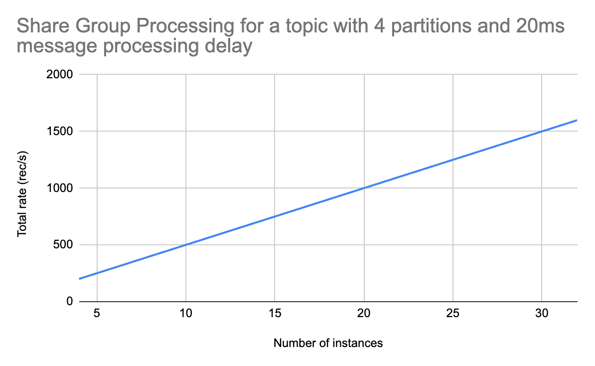
Results
I tried a few different delays:
-
200ms. Each instance could process records at a 5 rec/s rate.
-
20ms. Each instance could process records at a 50 rec/s rate.
-
5ms. Each instance could process records at a ~196 rec/s rate.
-
1ms. Each instance could process records at a ~925 rec/s rate.
The last two rates show that, at lower latencies, batch processing impact (Kafka consumer polls data in batches) becomes apparent.
But what’s more important: the numbers looked exactly the same for the standard and the share consumer at 4 instances. I couldn’t scale out the standard consumer (the test topic only had 4 partitions). But the share consumer can be scaled out!
So I tried 8, 16 and 32 instances. And all of them showed a linear increase in the total processing rate! Individual instances performed at the same rate, and there was no overhead as the number of instances grew. This will likely hit a bottleneck at some point, but this test shows that it’s very easy to achieve at least an 8x increase in throughput!
Summary
Kafka Queues is a great building block for things like job queuing, but it can also be used for scaling consumers! As long as consumers perform some form of head-of-line blocking, share groups can be used to scale processing beyond the number of partitions.
The biggest downside is losing ordering guarantees. Because several instances can consume data from the same partition, the ordering is no longer guaranteed. This can be a deal-breaker for many systems, so make sure to confirm if ordering is important before switching to share groups!
Other Posts
I recently wrote Apache Flink: Postgres to Postgres Replication with Flink CDC, which you may find interesting.
Advanced Apache Flink
Advanced Apache Flink is an on-demand course focused on Flink internals, production deployment best practices, and advanced patterns.
Agentic search models
Agentic search models are emerging to orchestrate entire retrieval workflows, replacing traditional brittle stacks with LLMs specifically trained for domain-specific search, prioritizing smaller size and lower latency over general-purpose frontier models.
Summary
Deep Dive
- Traditional search systems are built from a "thick monolith" of disparate components like embeddings, rerankers, query classifiers, and BM25, each focusing on a specific part of the problem.
- Agentic search models are LLMs specifically trained to orchestrate the entire search task, using simpler backend retrieval primitives (e.g., basic keyword search, embedding models with filters).
- These models aim to address the "last 20%" of search relevance, which includes domain-specific nuances (e.g., "bistro tables" meaning "small outdoor tables" in a furniture store) that general-purpose frontier LLMs (like GPT-5) often miss.
- Early examples include SID-1 by SID and Waldo by Glean, which emphasize smaller size and lower latency compared to larger frontier models.
- The benefit is a more intelligent, holistic approach to search, where a single model manages the entire process from query understanding to hybrid search, reducing the need for complex, manual query and reranking pipelines.
- This approach is expected to lead to a family of domain-tuned agentic search models, similar to the current specialization in embedding models for finance, legal, or e-commerce.
Decoder
- Agentic search models: Large Language Models (LLMs) specifically trained to understand and orchestrate the entire search and retrieval process within a given domain, rather than just generating text or embeddings.
- Frontier LLMs: Refers to the most advanced and largest general-purpose LLMs from leading AI labs (e.g., OpenAI's GPT-5, Anthropic's Sonnet).
- BM25: A ranking function used by search engines to estimate the relevance of documents to a given search query.
- Embeddings: Numerical representations of text, images, or other data that capture their semantic meaning, used for similarity search.
- Rerankers: Models or algorithms that reorder initial search results to improve relevance based on additional criteria or deeper analysis.
- Query classifiers: Components that categorize incoming search queries to apply specific business rules or route them to specialized retrieval backends.
- RAG (Retrieval-Augmented Generation): An AI framework that retrieves facts from an external knowledge base to ground large language models on the most accurate, up-to-date information and cite sources.
Original Article
In retrieval, we know the lego pieces well. Embeddings. Rerankers. Query understanding. BM25. All the parts we put together in the standard stack.
But a new power is rising: agentic search models. LLMs trained specifically on controlling the search task. Compared to GPT-5 and pals, these models might focus on tasks / domains. They can be smaller, faster, and easier to deploy in our search infrastructure.
Let’s set the stage.
With the traditional lego pieces, we build something like this thick search monolith:
That’s what we’ve built for 1-2 decades. Queries flow into the system. We apply business rules and classify queries. We search one or more retrieval backends. We post-process and rerank what comes back.
It’s all very manual, programmatic, and bespoke. Each piece doesn’t see the whole. Every piece focuses on its part of the problem (rerankers, query classifiers, etc) ignorant of the whole.
Agentic search orchestrates the pieces
Agentic search unbundles the pieces to see the whole. An agent built on GPT-5 or Sonnet knows it has tools. It’s given knowledge / context to solve the user’s query.
The agent helps the user: driving a few simple retrieval primitives, exploring candidates to return what’s relevant. Instead of thick, monolithic search, the underlying search tools become thin wrappers on our backend indices.
Unlike the traditional stack, the agent sees the whole process. It’s not a series of reductive steps. Instead the model orchestrates a solution for the user using what’s available - retrieval tools, other subagents, or a knowledge base to guide the user.
In other words, agentic search unbundles the retrieval stack. The parts still matter. But the whole can be managed by a single, intelligent model.
GPT-5 doesn’t really know search
Frontier lab models (GPT-5, Sonnet and pals) do well in the 80% case. They understand the queries with general knowledge. They surface defensible search results.
But it’s the last 20% that moves the needle.
What’s in the last 20%? It’s the non-obvious stuff in our users / domain. GPT-5 doesn’t know that in our furniture store a search for “bistro tables” actually means “small outdoor tables” not restaurant equipment. GPT-5 doesn’t know our fashion search users click on dark or plain patterns over complex ones.
Why not? Isn’t GPT-5 itself also trained on search?
Yes, of course.
GPT-5 and pals think of ‘search’ as web search. Mainline models expect search tools that work near flawlessly. To give them answers they don’t have. Unfortunately, our search isn’t Google. We work on smaller, focused teams: building simpler search backends for our narrow domains. We need agents trained to reason and orchestrate simpler retrieval systems.
Currently, as I teach in Cheat at Search with Agents, we build constraints + checks around the model. But this intense level of context engineering eats up tokens and costs $$$.
Agentic search models for the last 20%
What if we could train an LLM to focus on search specifically? Even better: search in our domain, for our users?
We’re beginning to see models in this direction: SID was first with their SID-1 model. We’ve since seen Glean release Waldo. Startups like Charcoal tailor to your corpus.
Teams advertise these replacements by training on document search specifically - they focus on that last 20% needed to find useful results. Sid, for example, points to smaller size and lower latency compared to GPT-5 for agentic search.
Think about the implications. I’ve described a future where we don’t build complex query + reranking pipeline. Instead agents orchestrate simpler retrieval primitives. A basic keyword search or embedding model with a few filters. Basic, scalable, and simple retrieval tools.
Then we deploy an agentic search model like SID-1. It knows what’s relevant in our domain. It gets our users. Now it can orchestrate the tools to find relevant search results. Currently, sure, the focus begins with RAG and classic passage retrieval (ie chunks). That will surely expand to a family of models, targeting different domains from e-commerce to job search to ??.
Today we have scores of embedding models on huggingface, targeting financial, legal, e-commerce. Why wouldn’t we also have many agentic search models? Tuned to domains?
An embedding only solves a narrow portion of the problem (similarity). An agentic search model could encompass the entire process from query understanding to hybrid search. Yes they’re too slow today to drive site search. But that will surely change in the years ahead.
It’s a future I’m excited about. Search will look radically different.
If you want to learn about these topics, check out my Cheat at Search w/ Agents class starting Monday.
Stop Starting Data Projects
Many data projects fail because engineers build solutions in isolation; instead, focus on stakeholder workflows, define "done" upfront, ship ugly MVPs quickly, and communicate constantly to ensure adoption and reduce wasted effort.
Summary
Deep Dive
- The article argues that many technically sound data projects fail because engineers build in isolation without truly understanding stakeholder needs or existing workflows.
- The author proposes a "minimum viable process" to bridge this gap, starting with a conversational reply to vague requests instead of immediately planning a data model.
- Key questions to ask stakeholders on the first call include: "How are you doing this currently?", "What does a good week look like with this data?", and crucially, "If this was done, what would you do differently?" (focusing on behavior, not features).
- Before leaving the call, establish a one-sentence "Definition of Done" (e.g., "What we're building is X, and we'll know it's done when Y").
- Identify key stakeholders: the decision-maker, the champion, and informed parties, and set rough delivery stages.
- Build an "ugly" MVP within five working days to get early feedback and validate direction; the goal is to confirm you're solving the right problem, not to deliver a polished product.
- If the MVP isn't what they expected, treat it as a success for early discovery and iterate quickly.
- Maintain stakeholder engagement by showing progress every three days with short Slack messages, as silence leads to anxiety and disengagement.
- Handle "ghosting" stakeholders with a direct, non-confrontational message to get a go/no-go decision.
- Stop when the project is "good enough," indicated by stakeholder feedback shifting from changes to readiness for rollout, and address scope creep as separate requests.
Decoder
- MVP (Minimum Viable Product): A product with just enough features to satisfy early customers and provide feedback for future product development.
- RACI (Responsible, Accountable, Consulted, Informed): A matrix used to clarify and define roles and responsibilities in a project or process.
Original Article
Stop Starting Data Projects
The minimum viable process for turning vague stakeholder requests into shipped, adopted work
This article is part of the Data Project Management playlist. Click here to explore the full series.
A colleague of mine was one of the most talented engineers I have ever worked with. Sharp, fast, technically thorough. When a stakeholder came to him with a project, he would disappear for six weeks and come back with something impressive.
The stakeholder would look at it, go quiet, and say something like “This is not quite what I had in mind“.
And every single time, his response was the same. “They are stupid. I know what they need. They should use it“.
The project would either get quietly cancelled, or the stakeholder would ask someone else to redo it. I watched this happen twice. Same engineer, same pattern, different projects.
The thing is, he was not wrong about the technical side. The code was clean, the logic was sound, and the solution was, in his view, objectively correct.
He just never learned the business process. He never asked the stakeholder to show him how they actually worked. He heard the request, translated it into a technical problem, and solved that problem in isolation. Then he was genuinely confused why nobody wanted what he built.
The truth is that nobody gets fired for writing good code. They just stop getting the interesting projects. The stakeholder quietly routes around them. And they never quite understand why.
It is a process problem. And process can be fixed.
Here is the exact process I use, from the moment a vague Slack message lands to the moment I close a project out.
The Scripts That Keep Projects on Track
Know exactly what to type at every stage, from the first vague request to closing the project out.
Reply to the Slack Message Before You Touch a Keyboard
The vague request is not a problem at all. It is the starting point.
Most engineers read a message like “Hey, can we get a dashboard for the sales team?“ and immediately start thinking about the data model. That is the mistake.
Instead of a spec, the request is an opening. Your job at this moment is to open a conversation without making it feel like a process.
Do not schedule a meeting. Do not send a list of questions. Send one message back.
Here is what I type:
This kind of a message signals you are taking it seriously without turning it into a project before you know what the project is.
When the call happens, most engineers ask “what do you want the dashboard to show?“
But that is the wrong question. It gets you a list of metrics that may have nothing to do with how the stakeholder actually works. Instead, ask them to show you their current process.
Here are the three questions I ask on every first call:
-
Can you walk me through how you’re doing this currently?
-
What does a good week look like for you, in terms of this data?
-
If this was done and working perfectly, what would you do differently?
The third question is the important one. It forces them to think about behaviour, not features. The answer tells you what the project is actually for.
This publication is not about tools.
It is about operating as a data professional in a world that has no idea what you do or why it matters.
The Definition of Done Is a Contract
Before you leave that call, you need one sentence that both of you agree on.
Here is how I get it:
Let me make sure I’ve got this right. What we’re building is X, and we’ll know it’s done when Y. Does that sound right to you?
If they say yes, you have your definition of done. If they hesitate, you have just saved yourself six weeks of building the wrong thing. Keep asking until the sentence lands cleanly.
Write it down and send it in Slack after the call. Something like:
Ideally, you create a channel for that project. Now both of you, and everybody interested in that project have it in writing.
Know Who Can Kill This Before You Build Anything
Before you write a single line of code, you need to know two things:
-
who can kill this project
-
who will fight for it
Most engineers talk to the person who sent the Slack message and assume that is the whole picture. Sometimes it is.
Often there is a manager who needs to sign off, a team that will be affected, or a senior stakeholder with strong opinions who has not been in the conversation yet. Finding out about them after you have built something is expensive.
You do not need a stakeholder mapping workshop, but you need to ask one question on that first call:
Is there anyone else I should loop in, or anyone whose sign-off we’ll need before this goes live?
That one question will surface 90% of what you need to know. From the answer, you are looking for three types of people.
-
The decision maker: The person who can say yes or no to the final output. Everything you build needs to satisfy them, even if they are not the one who sent the request.
-
The champion: The person who wants this to exist and will push for it internally. Usually the person you are already talking to. Keep them close.
-
The informed: People who need to know this is happening but have no power over the outcome. A quick message every now and then is enough.
Once you know who you are dealing with, agree on delivery stages. You just need two or three rough checkpoints and an expected delivery date. Something you can type in Slack in four lines.
Here is what I send:
That message does three things. It sets expectations, commits you to a timeline, and signals that you will be showing progress before the end. Your stakeholder now knows they will not be waiting in silence for six weeks.
The RACI Nobody Will Ever See
You do not need to show anyone a RACI diagram. But you need to have done the thinking.
Take five minutes, on your own, after the first call. Write down who is responsible for building this, who is accountable for the outcome, who needs to be consulted, and who needs to be kept informed. No template, no meeting, and definitely no slides.
When something goes wrong mid-project, and something always does, you will know exactly who to call and what to ask. That clarity is worth more than any amount of documentation.
Build the MVP in Under Five Days
McKinsey research on 5,400 IT projects found that the average large project delivers 56% less value than predicted. The number one reason is building in the wrong direction for too long before anyone checks. The fix is embarrassingly simple:
Build something ugly and show it fast.
The rule I follow is five working days from the moment I actually start building. Not from the first call. From the day I sit down and open Neovim (and mostly Claude Code nowadays).
It will have hardcoded values, missing edge cases, and placeholder logic. That is fine. The goal of the MVP is to confirm you are moving in the right direction before you invest more time going in the wrong one.
Here is how I introduce it:
That framing removes the pressure from both sides. The stakeholder is helping you steer.
Don’t look for the “I love it” responses. This doesn’t matter. Listen for whether they are reacting to the right problem.
If their feedback is about polish, you are on track. If their feedback reveals a fundamental misunderstanding about what they needed, you have just found that out in week one instead of week six.
How to Handle “This Isn’t Quite What I Had in Mind”
This is the moment most engineers dread. It does not have to be.
If the stakeholder sees the MVP and tells you it is not what they expected, that is the process working. Here is what I say:
That’s really useful, thank you. Can you explain me what you had in mind? A rough sketch or an example would help me get there faster.
Then you go back, adjust, and show them again. The loop is fast because you have not built much yet.
The other outcome is rarer but worth being ready for.
Sometimes a stakeholder sees the MVP and realises they do not need the project at all. Seeing something concrete makes them understand that what they actually wanted was a process change, or a conversation with another team, or something that has nothing to do with data.
When that happens, you have saved everyone a significant amount of time. Close it and move on.
Show Progress Every Three Days or Lose the Project
Once the MVP is signed off and you are building toward the real thing, most engineers go quiet. They are heads down, making progress, and they assume the stakeholder knows that.
The stakeholder does not know that.
-
After three or four days of silence, they start wondering.
-
After a week, they are telling their manager the project might be stalled.
-
After two weeks, they have mentally moved on and started looking for alternatives.
You are still building, but the project is already dying.
The rule I follow is simple.
No more than three days without sending something.
It does not need to be a status report, or a meeting. It can be one Slack message.
Here is what I send msot times:
This takes less than 30 seconds to write. It resets the clock on stakeholder anxiety and signals that the project is moving.
Over time, the stakeholder starts getting invested. They follow the progress, and start telling colleagues about it. By the time you deliver, they are already its biggest advocate.
That is not a small thing. A stakeholder who is invested in a project will push for its success, defend it in conversations you are not part of, and use it after delivery.
That kind of adoption happens only if you keep them close while you are building.
When Your Stakeholder Goes Ghost
Sometimes the silence goes the other way.
You send an update and hear nothing back. You share a progress demo and get no response. You follow up once and still nothing. In my course, I call these stakeholders Ghosts.
Silence at different stages means different things:
-
Early in the project, no response usually means competing priorities. They are busy, the project is not urgent, and they will come back.
-
Mid-project silence is a warning sign. It often means they have lost confidence, or something has changed internally that they have not told you about.
-
Post-MVP silence, after they have seen something concrete and gone quiet, almost always means they did not know how to say “this is not what I wanted“.
In all three cases, the move is the same. One message that forces a yes or no without making it feel like a confrontation.
Here is what I send:
That message gives them an easy out if something has changed, and it gives you the information you need to decide whether to keep building.
Most of the time, you will get a response within an hour. Either they apologise for being slow and re-engage, or they tell you something has shifted. Both outcomes are better than building in silence for another two weeks.
Plus, having this in the dedicated channel means you have a documented go/no-go decision.
You already know the problem.
The gap between "knowing what to do" and "doing it" is just a decision. Inside the paid tier you get the frameworks, scripts, and templates I used to build my career over 16 years. Field-tested stuff!
Stop When It’s Good Enough
At some point, the project is done. Not perfect, but done.
This is harder than it sounds. Engineers are wired to improve things. You finish the main deliverable and you start noticing rough edges:
-
The query could be faster
-
The dashboard could be cleaner
-
The logic could handle three more edge cases
So you keep going, and your stakeholder is sitting there wondering why they still do not have the thing you promised them.
The signal that you have hit good enough comes from the stakeholder. When their feedback shifts from “can we change X“ to “this is great, when can we roll it out“, you are done.
Here is how I close a project:
I think we’re at a good place. Here’s what’s been delivered, here’s how to use it, and here’s who to contact if something breaks. Is there anything critical missing before we call this done?
That last question matters. It gives them one final chance to raise something real. If they say no, the project is closed. If they raise something small, you make a call on whether it belongs in this version or the next one.
And this brings you to scope creep. Every project attracts it. The stakeholder sees what you built, gets excited, and starts asking for more. New reports, new dimensions, new use cases.
These are all reasonable requests, and all belonging in a different conversation. I have a full article on how to handle that without losing the relationship, linked at the end of this one.
The other exit is the kill decision. Sometimes the right call is stopping entirely.
Final Thoughts
The engineers I have seen succeed long term are not always the most technically gifted. But they are the ones whose work gets used. Their dashboards are open every week, their pipelines run without anyone filing a ticket, and their stakeholders mention them by name in meetings they are not part of.
That happens because they treat the non-technical part of the job with the same rigour they bring to the technical part:
-
They ask the right questions before they build anything
-
They show their work early and often
-
They keep people close instead of going silent
The process in this article is the minimum required to make sure your technical work actually lands. Most of it happens in Slack, and none of it requires a bureaucracy.
Even a project that looks doomed can be turned around with the right moves at the right time. I have seen it.
The engineer who gets that call, who steps in late and still manages to deliver something the stakeholder trusts, is never the one who worked the hardest. It is always the one who communicated the best.
—Yordan
PS: Paid members consistently share they got promoted or praised because they apply my guides. When ready, upgrade here.
More on the Topic
-
The Customer Service Mindset Is The Fastest Way To Destroy Your Data Team
-
How I Scope Minimum Viable Data Products That Prove Value Fast
-
Why trust disappears faster than servers crash when you hide bad news
-
Crush Scope Creep: Data Engineer’s Blueprint for Bulletproof Data Product Plans
Data Gibberish is a reader-supported publication. To receive new posts and support my work, consider becoming a free or paid subscriber.
Postgres has had a good 30-year run – is DuckDB coming for its crown?
DuckDB's co-creator Hannes Mühleisen unveiled Quack, a new client-server protocol enabling transaction-oriented workloads and 36X faster bulk inserts than Postgres.
Summary
Deep Dive
- DuckDB co-creator Hannes Mühleisen introduced the "Quack" client-server protocol at the AICouncil keynote.
- Quack allows DuckDB to handle transaction-oriented workloads, including fast inserts, parallel writes, and read replica syncing, moving it beyond its embedded analytics origins.
- Benchmarks showed Quack completing a 60 million row bulk insert in 5 seconds, compared to 20 seconds for Postgres.
- For small inserts with 8 clients, Quack achieved 5000 transactions per second, slightly faster than Postgres.
- Quack provides a core primitive for building distributed DuckDB systems with an optimized remote procedure call protocol.
- The protocol's architecture was influenced by MotherDuck, a leading DuckDB-powered cloud database.
- Hannes Mühleisen and Mark Raasveldt had previously published a 2017 paper advocating for client protocol redesign due to existing inefficiencies.
- The DuckDB team continues to innovate with features like ergonomic SQL (GROUP BY ALL), a simpler data lake (DuckLake), and a faster SQL parser (PEG).
Decoder
- OLAP (Online Analytical Processing): A category of software tools that provide an enterprise with the ability to gain insight into its data from different points of view, typically involving complex queries over large datasets for analysis.
- OLTP (Online Transaction Processing): A category of software tools designed for transaction-oriented applications, typically involving many concurrent small transactions (inserts, updates, deletes) in mission-critical systems.
- Quack Protocol: A new client-server communication protocol for DuckDB, designed to enable distributed, transaction-oriented workloads beyond its traditional embedded analytics use case.
- Remote Procedure Call (RPC): A protocol that allows a program on one computer to execute code on a remote computer without explicitly coding the remote interaction.
Original Article
Postgres has had a good 30-year run – is DuckDB coming for its crown? Yesterday at his #AICouncil keynote, DuckDB's co-creator Hannes Mühleisen unveiled a shot across the bow: a new client-server protocol called Quack. This is a foundational shift, enabling DuckDB to move beyond its roots as an in-process, single-node, analytics database towards more general purpose use cases. With Quack, DuckDB supports transaction-oriented workloads: fast inserts, parallel writes, and syncing read replicas. DuckDB's Quack is 36X faster than Postgres for bulk inserts, and rivals Postgres performance for transaction throughput on smaller inserts. [1] More broadly, Quack provides a core primitive for building distributed systems with DuckDB, now with a native, highly optimized remote procedure call protocol to coordinate across clusters of database nodes. MotherDuck, who operate the leading DuckDB-powered cloud database, has undoubtably inspired and influenced Quack's architecture. Hannes has been contemplating how a better protocol would work for years: he and DuckDB co-creator Mark Raasveldt authored a paper in 2017 titled "A Case for Client Protocol Redesign" where they mused about the inefficiencies of the then-current, and still-used approaches. Brick by brick, the DuckDB team members are rewriting the foundations of databases and data infrastructure for the modern era: more ergonomic SQL (c.f. GROUP BY ALL), a simpler data lake (DuckLake), a faster SQL parser (PEG not YACC), and much, much more. As Hannes said on stage yesterday, "Maybe it's time to use a database built after 2000." Ultimately, the world of developers will be the final judge. [1] For a 60M row bulk insert, DuckDB's Quack finished in 5 seconds, vs Postgres' 20 seconds. For small inserts with 8 clients, DuckDB's Quack supported 5000 transactions per second, slightly faster than Postgres.
A detailed overview of the Quack protocol, including a link to Hannes' talk yesterday at AICouncil, can be found here: https://duckdb.org/quack/ (Kudos to Gábor Szárnyas for contemporaneously launching this site with the full video already available).
Yeah... I'm sure it's going to replace Postgres for Postgres' most common use case... OLTP... (eye roll) - Quack is great; it solves a major problem with DuckDB... but there always seems to be a need to create some odd competitive angle where there isn't much of one, either for clicks, ego, or something.
I don't think DuckDB is trying to replace postgresql at all. Its intended for more data lake type scenarios, right? Not read/write working data.
Sai Krishna Srirampur Kaushik Iska
36 times faster than Postgres COPY command with binaries? Or just plain vanilla Postgres? Kind of an apples-to-oranges comparison, no? https://github.com/duckdb/duckdb-quack/blob/v1.5-variegata/benchmarks/benchmark-batch.py
Dying to know what was the prompt for this image
DuckDB doesn't handle concurrent read/writes. With Quack if you can do inserts into one database and use it to connect another where you do the reads would this simulate concurrency or am I conflating things here?
Hot take: I'd rather use Postgres with pg_duckdb. I'm not in a rush to lose a whole ecosystem for Duck.
Curious, if PostgreSQL develops a similar communication layer to duckdb and gets improved loads and writes…does this still apply? Quacking for a friend
Sounds like a lot of copium to me.
Complete End-To-End Build of ETL Pipeline in AWS
A reusable AWS ETL pattern leverages ECS Fargate and DuckDB for single-node data processing, avoiding Spark-heavy solutions like Glue.
Summary
Decoder
- ETL (Extract, Transform, Load): A three-phase data integration process used to extract data from sources, transform it into a consistent format, and load it into a target system (like a data warehouse).
- AWS ECS Fargate: A serverless compute engine for Amazon Elastic Container Service (ECS) that allows you to run containers without provisioning or managing servers.
- AWS ECR (Elastic Container Registry): A fully managed Docker container registry that makes it easy to store, manage, and deploy Docker container images.
- AWS EventBridge: A serverless event bus service that makes it easier to connect applications together using data from your own applications, integrated SaaS applications, and AWS services.
- AWS CloudWatch: A monitoring and observability service that provides data and actionable insights to monitor applications, respond to system-wide performance changes, and optimize resource utilization.
- AWS Secrets Manager: A service that helps you protect access to your applications, services, and IT resources by rotating, managing, and retrieving database credentials, API keys, and other secrets throughout their lifecycle.
- Terraform: An open-source infrastructure as code software tool that enables you to safely and predictably create, change, and improve infrastructure.
- AWS Glue: A serverless data integration service that makes it easy to discover, prepare, move, and combine data for analytics, machine learning, and application development; often uses Apache Spark for distributed processing.
Original Article
A reusable AWS ETL pattern is built with ECS Fargate, DuckDB, ECR, EventBridge, CloudWatch, Secrets Manager, and Terraform, targeting single-node jobs rather than Spark-heavy Glue.
Amazon launches an AI shopping assistant for the search bar, powered by Alexa+
Amazon launched "Alexa for Shopping," an AI assistant replacing Rufus, integrated into its search bar and capable of shopping across Amazon and other retailers.
Summary
Decoder
- Alexa+: An enhanced version of Amazon's AI assistant, likely with more advanced conversational capabilities and integration features.
Original Article
Whether you like it or not, Amazon continues to put AI at the center of the shopping journey. The company announced Wednesday “Alexa for Shopping,” its new personalized AI shopping assistant, powered by Alexa+.
Notably, the experience will replace Rufus, its generative AI shopping assistant that launched in 2024. According to the company, Alexa for Shopping is designed to offer a voice- and touch-enabled shopping experience across mobile, desktop, and Echo Show smart displays. While Rufus focused on helping customers discover and compare products, Alexa for Shopping is meant to provide more personalized recommendations and automate the shopping experience across Amazon and other online retailers.
Now available to U.S. customers, Alexa for Shopping can answer anything from “What’s a good skincare routine for men?” to “When did I last order AA batteries?” Users can type their question into the main search bar or the dedicated Alexa for Shopping chat window, and Alexa will provide tailored answers and recommendations, and even create custom shopping guides. The company says the assistant understands customers’ habits, preferences, and purchase history to bring “that connected, personalized assistance to how you shop” and to make the assistant “more personal and more helpful over time.”
Beyond answering questions, Alexa for Shopping can compare products, track prices, and even schedule recurring orders for essentials like pet food or paper towels. If you want to automatically add something to your cart when it goes on sale, you can just tell Alexa, “Add this sunscreen to my cart if the price drops to $10.”
Additionally, the assistant can go beyond Amazon’s marketplace, shopping other online stores and using its “Buy for Me” feature to handle the purchase for you, which could be seen as convenient but also a little controversial, given the growing concern around AI autonomy and privacy.
The launch of Alexa for Shopping comes on the heels of Amazon introducing its 30-minute delivery service, “Amazon Now,” in dozens of U.S. cities and a new AI-powered feature that generates real-time conversational audio responses to customer product questions.
Designers are a Rare Breed
Designers, a mere 0.25% of the US workforce, will find AI tools like Claude Design raise the design quality floor for businesses, not replace their irreplaceable expertise.
Summary
Original Article
Designers are a Rare Breed
AI is raising the floor. The ceiling is yours.
Welcome to Unknown Arts — I’m Patrick, your field guide to the creative frontier. Join thousands of builders around the world navigating what’s next.
Designers are a rare breed.
It’s easy to forget if you’ve built your community around design, but the data is clear: designers make up roughly 0.25% of the US workforce, or about one in every 400 workers. Only 16% of US companies say they pursue design as a structured process. The rest handle it ad hoc, or not at all. They do just enough to get by.
I’ve lived this firsthand. Most of my career has been in cybersecurity startups, where design is chronically scarce. The largest team I worked on in the last decade had fewer than ten designers at a company with over a thousand employees.
So when Claude Design dropped recently and the usual online anxiety started up again, I had a different reaction than most. Not fear for my job, but optimism for a world with a higher floor of design quality.
What tools like Claude Design represent isn’t a replacement for designers at businesses that already hire them. It’s design finally starting to reach the vast majority of businesses that never would have hired a designer in the first place.
I don’t see that as a threat. I see it as a massive expansion of who gets to work with good design foundations. Designers included.
Appreciation isn’t craft
No tool automatically closes the gap between recognizing good design and being able to make it. It’s worth noting where most people actually stand in terms of recognizing good design in the first place: they don’t have particularly good taste (sorry, but it’s true). A smaller group has solid taste but doesn’t have the ability to execute on it. Those who can do both are a rare subset of an already rare group. (If you’re reading this I imagine you fall into one of the two later camps)
There’s a whole genre of video on YouTube built around this idea: give a novice top-of-the-line professional equipment, give an expert the most basic gear that gets the job done, and see what happens. Spoiler alert: the expert wins every time. Specific knowledge, built through years of reps, shapes the output in ways no tool can replicate.
What this means for you
If you’ve always cared about design but never had access to professional support, this is good news. The floor is rising. Solid design work that used to require a specialist is increasingly within reach.
And if you’re a designer, the right response is confidence. Raising the floor doesn’t flatten your ceiling. If anything, the best designers stand to gain the most from these tools: more leverage, more reach, more impact than any previous generation has had access to.
Think about the odds you’ve already beaten as a designer. You’re one of just a fraction of a percent of total workers and most companies don’t even practice your craft in any routine way. You chose a rare path, built real skills, and made it work despite the odds.
New tools don’t change that. You’ll figure them out. Approach them with a beginner’s mind, staying curious and willing to evolve. That’s what every great craftsperson has always done: they find new ways to do their best work as new resources become available. This is no different.
You beat the odds to get here. Now beat them again.
Until next time,
Patrick
📚 Go deeper
-
Introducing Claude Design — Anthropic — The official company announcement.
-
“Be a Skill Surfer” — Unknown Arts — The framing I keep coming back to as tools change faster than ever. Expertise is the thing worth protecting. Everything else is a wave to ride.
-
“Taste for Makers” — Paul Graham — A short essay arguing that taste is real, learnable, and inseparable from doing great work. A useful counterweight to the “AI can do it now” narrative, because taste and craft are not the same thing and Graham explains why better than most.
Find this useful? Share it with someone who might also get value.
How to make Claude Code follow your design system in Figma
To make Claude Code adhere to design system governance in Figma, the author developed four "Skills" that enforce token and component library usage during canvas construction.
Summary
Decoder
- Figma MCP: Figma's Machine Code Plugin (MCP), a component that allows external tools, like AI models, to directly interact with and manipulate Figma files.
- Design system: A set of standards, reusable components, and guidelines that define the design of products across a brand, ensuring consistency and efficiency.
- Design tokens: The smallest, indivisible units of a design system, such as color values, font sizes, spacing, and animation durations, stored in a format that can be used across different platforms.
- Library instances: Reusable components from a Figma design library that maintain a link to the master component, allowing for consistent updates.
Original Article
Claude Code writes directly to Figma via Figma MCP but ignores design system governance, using raw hex values and improvised components instead of tokens and library instances. To fix this, the author built four Claude Code Skills — Preflight, Reference Interpreter, Component Rules, and Style Binding — that enforce design system compliance at every layer before and during canvas construction. The same tool can then shift roles: acting as a strict design assistant when iteration matters, or a fast prototyper when speed takes priority.
Extract Styles From Any Website — miromiro (Website)
MiroMiro is a Chrome extension that extracts full CSS, Tailwind code, design tokens, images, and Lottie animations from any website, aiding AI-driven development.
Summary
Decoder
- Lottie animation: A JSON-based animation file format that enables designers to ship animations on multiple platforms as easily as shipping static assets.
Original Article
Full article content is not available for inline reading.
How to do UX research in the Age of AI
AI excels at data analysis but still struggles to grasp nuanced human behavior, making in-person contextual UX research critically important for deep insights.
Summary
Decoder
- Contextual research (UX): A qualitative research method in user experience design where researchers observe users performing tasks in their natural environment to understand their behaviors, motivations, and pain points.
Original Article
AI can identify trends and summarize information, but it still struggles to understand the complexity of real human behavior in specific environments. Contextual research — observing people in their homes, noticing physical habits, cultural differences, emotional reactions, and communication patterns — reveals insights that data alone often misses. Whether studying accessibility needs, older adults' sense of familiarity, or how people naturally interact with devices, the most valuable findings come from human interpretation, empathy, and observation rather than pattern recognition alone.
Apple is working to incorporate AI agents on the App Store
Apple is exploring ways to integrate AI agents into the App Store while maintaining its strict privacy and security standards to protect revenue streams and user trust.
Summary
Decoder
- AI agents: Software programs designed to perform tasks autonomously or semi-autonomously on behalf of a user, often involving complex decision-making and interaction with other systems.
Original Article
Apple is exploring ways to incorporate AI agents into the App Store while still adhering to its privacy and security standards. AI agents can take complex actions on behalf of users, which can be an issue for Apple's strict regulations, which are designed to prevent apps from spreading malware, avoiding App Store fees, and committing other misbehavior. Providing better support for agents will help Apple protect a revenue stream while providing key privacy and security guarantees to users.
A Start-Up Aiming to Make Geothermal Energy Mainstream Goes Public
Geothermal energy startup Fervo Energy raised $1.89 billion in an IPO, signaling investor confidence in the sector as tech companies seek clean power for the AI boom.
Summary
Decoder
- Geothermal energy: Energy derived from the heat of the Earth's interior, captured by drilling wells to access hot water or steam, which is then used to generate electricity.
Original Article
Fervo Energy is building a commercial geothermal plant in Utah and is planning others across the West. Tech companies are hunting across the country for energy to fuel the AI boom, powering tens of billions of dollars into solar energy, batteries, natural gas power plants, and new kinds of nuclear power plants. Geothermal energy can produce electricity without any planet-warming emissions while operating 24 hours a day. Fervo raised $1.89 billion in an initial public offering this week, a real signal of confidence in the industry.
Anthropic wants small businesses to use Claude
Anthropic is launching "Claude for Small Business" to integrate its AI assistant with common business tools across various operational functions.
Summary
Original Article
Claude for Small Business connects Claude to common business tools to run workflows across finance, operations, sales, marketing, HR, and customer service.
Blue Origin may need external funding to hit ambitious launch targets
Jeff Bezos' Blue Origin might seek its first external funding to meet ambitious goals of 100 launches per year, amidst high development costs and competition with SpaceX.
Summary
Decoder
- New Glenn: Blue Origin's 98-meter-tall heavy-lift rocket, which achieved its first orbital launch in January 2025.
- TeraWave: Blue Origin's planned satellite communications network for business customers.
- IPO: Initial Public Offering, the process by which a private company offers its shares to the public for the first time.
Original Article
Blue Origin is weighing its first external fundraising as part of a push by Jeff Bezos’ rocket venture to hit ambitious launch targets and tap investor appetite boosted by SpaceX’s upcoming initial public offering.
Chief Executive Dave Limp told employees at a recent all-hands meeting that the company would require outside investment if it were to significantly increase its launch cadence, according to details of the meeting from two people who attended.
He said it would “take a lot of capital” to achieve the number of rocket launches Blue Origin has targeted—more money than would be available with “just one investor,” the people added.
Blue Origin has set ambitious launch targets after reaching orbit with New Glenn, a 98-meter-tall heavy-lift rocket, for the first time in January 2025. It is competing with SpaceX for large commercial contracts and to develop a lunar lander for Nasa’s Artemis program.
Blue Origin is considering fundraising as SpaceX, which dominates the space launch market, gears up to list on the public market as early as June, with a valuation in excess of $1.75 trillion.
Limp told employees Blue Origin would have to demonstrate strong economics but that external funding was one option “on the table,” the people added.
Blue Origin declined to comment.
Limp was speaking to employees as he responded to questions on a new stock option plan. He said that similar to OpenAI and SpaceX, the group could use fundraising rounds to help staff exercise stock options. “We wrote this plan intentionally to allow for that,” he said.
He said the company needed to be “ready for external funding” and he was confident in strong interest from outside investors.
Bezos, who founded Blue Origin in 2000, is the company’s sole shareholder and its primary source of financial backing. He has largely used the sale of Amazon stock—he owns nearly 9 percent of the group, according to proxy filings—to fund the rocket maker.
Blue Origin is spending heavily as it scales operations including building an 800,000 sq ft manufacturing facility and a second launch pad in Florida. It is also investing in the testing and development of its reusable rocket booster and orbital upper stage.
The company is expected to spend roughly $4.8 billion this year, according to analysts at Capstone, a Washington-based consulting firm. It estimates the group has spent nearly $28 billion since its inception.
Josh Parker, an analyst at Capstone, said Blue Origin had faced significant cost increases in recent years as it developed New Glenn in a “brutal inflationary environment.” He said competition for talent with SpaceX had also forced up salaries.
Limp, a former Amazon executive who took charge of Blue Origin in late 2023, told employees that he did not expect Bezos would ever sell the business. He did not rule out a potential IPO in the future, the people added.
Blue Origin’s CEO in April said the group was planning between eight and 12 launches in total this year with New Glenn. A target of 14 launches had earlier been shared with employees internally.
He said the group had a longer-term goal of hitting 100 launches a year, with a significant portion of these expected to help build out its TeraWave satellite communications network for business customers.
Anthropic Was Behind. Now It's the AI Boom's Front-Runner
Anthropic has reportedly received investment offers valuing it over $900 billion, surpassing OpenAI's earlier $852 billion valuation.
Summary
Original Article
Anthropic has received investment offers in recent months valuing it at more than $900 billion - OpenAI raised $122 billion at a $852 billion valuation earlier this year.
Apple's latest acquisition further confirms a new priority for the company
Apple acquired Patchflyer, makers of Color.io, confirming its focus on building a robust Creator Studio ecosystem for professional content creators.
Summary
Decoder
- Color grading: The process of altering and enhancing the color of a motion picture, video image, or still image electronically, digitally, or photochemically.
Original Article
Apple has quietly acquired Patchflyer, the company behind the popular browser-based color grading app Color.io, further signaling that its new Creator Studio ecosystem is a major priority. The acquisition follows Apple's recent purchases of Pixelmator and MotionVFX, suggesting the company is actively building a stronger suite of professional tools for video creators, photographers, and filmmakers across apps like Final Cut Pro and potentially even the iPhone camera system.
Instagram's new ‘Instants' feature combines elements from Snapchat and BeReal
Instagram is globally launching "Instants," a new disappearing, unedited photo feature for close friends, mimicking Snapchat and BeReal, to promote authentic sharing.
Summary
Original Article
Instagram announced on Wednesday that it’s globally launching “Instants,” a new feature for sharing authentic, disappearing photos after testing it with select users. The feature lets users share disappearing photos with their close friends or mutual followers that can be viewed only once and remain available for 24 hours.
The app borrows ideas from social platforms like Snapchat, Locket, and BeReal, as it focuses on authentic and ephemeral content.
Unlike Instagram, which is about curated and polished content, Instants is designed for quick, real-life snapshots. With Instants, you capture a photo with Instagram’s in-app camera and aren’t allowed to edit the image. The format doesn’t allow uploads from your camera, and, although you can add text to your “instants,” you can’t modify them any further. Meta said in a blog post that the idea behind this format is to share authentic moments as they’re happening.
It’s worth noting that Meta is also testing the Instants format as a stand-alone app in select regions, including Spain and Italy.
You can capture an Instant by tapping the mini photo stack in the bottom right corner of your Instagram inbox. After you share your Instant, recipients can react with emojis, reply, and send an Instant back. Meta notes that recipients can’t screenshot or record Instants that you’ve shared.
Instagram stores your shared Instants in a private archive that you can see for up to one year. You can also compile Instants from your archive into a recap and post it to Instagram Stories.
If you’ve accidentally shared an Instant, you can tap the “undo” button and delete an Instant from your archive to unsend it to friends who haven’t opened it yet.
And if you don’t want to receive Instants, you can hold down the pile of Instants in your inbox and swipe right to temporarily stop receiving them. You can also choose to block or mute specific people.
Although Instagram began as a way for friends to share moments with each other, the platform has gradually become overrun with influencer content and ads. With Instants, the company looks to be leaning back into more casual, private interactions centered around photo sharing among circles of friends.
However, Instagram may be a bit late to capitalize on the trend of low-pressure, authentic photo sharing, as BeReal is not as popular as it once was, and many users already use Instagram Stories for fast, informal updates and might not see the need for a separate app and feature to do so.
Apple's folding iPhone suddenly doesn't sound so 'Ultra'
Apple's rumored folding iPhone, potentially named "iPhone Ultra" and costing around $2,000, might forgo Face ID for Touch ID to achieve a thinner design.
Summary
Original Article
Full article content is not available for inline reading.
TailGrids UI (Website)
TailGrids UI offers a comprehensive React component library with over 600 free and pro components, blocks, and templates built on Tailwind CSS, supporting faster web development.
Summary
Decoder
- Tailwind CSS: A utility-first CSS framework for rapidly building custom user interfaces.
Original Article
React UI Components, Powered by Tailwind CSS
A complete React component library built for production. Ship modern web apps faster with 600+ free components, blocks, and templates in one unified React, Tailwind and Figma UI library. Built for developers and designers, optimized for performance, accessibility, and consistency. AI-workflow ready, with a full Figma design system and React UI system included.
Active Users
364 Live visitors
Traffic Stats
Today Week Month
New Subscribers
2.4K
+3.85% than last day
Conversion Rate
1.2K
-5.39% than last day
Page Bounce Rate
285
+12.74% than last day
Upcoming Schedule
Wed, 11 jan
09:20 AM
Business Analytics Press
Exploring the Future of Data-Driven +6 more
Fri, 15 feb
10:35 AM
Business Sprint
Techniques from Business Sprint +2 more
Trusted by 150,000+ devs, designers, and teams worldwide.
Build faster with a complete React UI component library
600+ free and pro React UI components, production-ready blocks, templates, and a complete design system built for teams who design, build, and ship at scale.
600+ UI Blocks and Components
Build faster with 600+ reusable React and Tailwind CSS UI blocks for applications, dashboards, marketing sites, eCommerce, and AI products.
Ready-to-Launch Templates
Production-ready React and Tailwind CSS templates built for real product flows, helping teams launch faster at scale.
Figma Design System
900+ Figma components with tokens and variants for precise, scalable design-to-development workflows.
100+ Free UI Components
Open-source React and Tailwind components for fast, consistent UI development.
Use with every React framework
Scalable design system enabling flexible, framework-agnostic UI development.
Build faster with a complete React + Tailwind UI library
600+ free and pro React UI components, production-ready blocks, templates, and a complete design system built for teams who design, build, and ship at scale.
600+ UI Building Blocks and Components
Production-ready, framework-agnostic UI building blocks, components, layouts, and scalable interface patterns for modern applications.
Styled with Tailwind CSS
Built with the latest Tailwind CSS for utility-first styling, theming, rapid iteration, and scalable UI development.
Light and Dark Theme Support
Built-in light and dark themes across all components, aligned with system preferences and consistent UI behavior.
Developer Friendly
Built for DX with CLI tooling, consistent component structures, and predictable patterns that scale from development to production.
Easy to Use
Integrate a production-ready UI component library with predictable structure and minimal configuration. Copy components directly into existing or new Tailwind projects with confidence.
Figma Design System
Own the complete Figma design system with components, tokens, and seamless design-to-development workflows.
CLI Tool Support
Use the Tailgrids CLI to scaffold projects, add components, and standardize workflows across teams and codebases.
Refreshing Design
Clean, high-quality UI aligned with modern design standards, delivering visual clarity, strong hierarchy, and polished experiences across products.
Fully Responsive
Designed to adapt across screen sizes and modern browsers, with components tested to ensure consistent layout and behavior on all devices.
600+ UI Components and Blocks to Build Faster
Each component and block ships with a full Figma source and production-ready code, ensuring consistent design-to-development workflows at scale.
Blog Sections
12 Components
Blog Details
4 Components
Bento Grids
4 Components
Cards
13 Components
Contact
7 Components
Cookies
5 Components
Error Page
5 Components
Mega Menu
4 Components
Beautifully Designed Templates for Real Projects
Launch faster with ready-to-ship React templates and Figma source, built on Tailgrids UI components for real product workflows.
NexStudio - React Agency Website Template
React agency website template for digital studios and product teams. Includes services, projects, testimonials, and blog pages. Built with Tailwind CSS.
Fincash - React Fintech Website Templates for Finance Apps
Finance website template built with React for fintech apps. Includes features, pricing, testimonials, Contact and FAQs. Designed for payments and money management platforms.
WriteMate AI - React AI Website Template for Multi-LLM Content Platforms
React AI website template for AI writing tools, content, and chatbot platforms. Includes features, pricing, docs, support, Use Cases, and testimonials sections.
Wall of Love from Teams Building with Tailgrids
Trusted by creators, product teams, startups, and companies building production-grade applications.
Fajar Siddiq
Serial Entrepreneur, Singapore
Tailgrids is such a great help when comes to building landing page and web app UI for Tailwind CSS web projects with just copy-paste method! is really liked the design and it is easy to get started which saves tons of time & money for developers and designers with Figma files & source code!
Marko Denic
Developer Advocate and Software Engineer
Tailgrids comes with all the essential UI components you need to create beautiful websites based on Tailwind CSS. The design consistency & variations of UI components, clean codebase, copy-paste interface, and detailed documentation made this UI library very organized & super easy to use.
Athar Ahmed
Founder, ScrapeOwl and Senior Software Engineer @Aide
Since I like doing engineering parts only, designing and coding landing pages is great blocker for me while I develop MVPs or try to validate a new product idea. Tailgrids seems have great collection of UI components that also comes relevant contents and Figma file that I can use to play or create prototype before diving into code.
Ostap Brehin
Fullstack Developer and Building NotionMailer
A landing page is the first thing your customers will see before even trying the project. You want to make sure it looks great, and this is where Tailgrids comes to help! It provides a collection of beautiful hand-crafted uniquely-looking components that you can use to build your startup website, web application, or dashboard.
Arnob Mukherjee
Founder @Olvy
Seems like an amazing alternative to tailwindui, also the design looks amazing man 🚀
Kamal Hosen
Software Developer @HappyAddons
Having used almost all the Tailwind CSS UI toolkits and resources, I can confidently say that Tailgrids is the easiest and most comprehensive Tailwind UI Library with almost all essential Tailwind CSS components you may need to build web UI faster. Specially, code explorer and copy-paste inteface is time-saver. Highly recommended!
Tailgrids Community
Join our Discord to stay up to date with the latest updates, releases, and offers.
How to Create Websites with Great UX Designs: Principles and Examples
Webflow outlines six core principlesuser-first, usability, consistency, accessibility, hierarchy, and contextthat define great website UX design, showcasing seven example sites.
Summary
Original Article
People tend to remember how a website made them feel, even if they forget how it looks.
Websites with quality user experiences (UXs) help visitors navigate smoothly through layouts and pages so that they can quickly find what they need and take action. When visitors enjoy the overall feeling they get while using a site, they should be more likely to remember it, return, and build a positive association with the company or brand
Read on to learn about core UX design principles and see examples of websites with great UX design.
What makes a website’s UX design great
Great UX is when people can move smoothly through a website, understand what they see, get the intended message, and complete actions without issues. User interface (UI) design contributes to those successes by focusing on visual elements like buttons and colors, but UX is the broader experience that all the site’s elements combine to create.
UX designers follow several core principles:
- User first. A user-first website organizes content and actions in a way that makes sense from the visitor’s point of view, by considering their goals, questions, expectations, and likely next steps.
- Usability. Visitors should be able to find information, move between pages through clear menus and links, understand what actions are available, and follow through on their goals.
- Consistency. Similar elements must behave in standard ways across the site, so visitors only have to grasp the layouts and navigation once and then explore confidently.
- Accessibility. Great UX shouldn’t depend on perfect vision, hearing, or dexterity — the website should be usable for everyone.
- Hierarchy. Pages guide attention through visual hierarchy, using design to show visitors what matters most on each page and where to look next.
- Context. Effective sites give people the right information at the right moments, in a format that’s suited to their needs and personalized where possible.
Why UX can make or break a website
Great UX helps a website do its job faster and more effectively. When each next step feels obvious and natural, people are more likely to stay longer and complete desired actions (e.g., fill a contact form, complete a purchase, read a blog post).
For example, a strong UX on a renovation company’s site might lay out services and service areas in a highly readable format, provide social proof through testimonials and case studies, share clear pricing details, and use a prominent ‘Request a quote’ call to action (CTA) to encourage conversions.
These elements help visitors go from awareness to action with minimal interruptions and effort. That’s why websites with good user experiences tend to attract more customers and increase brand awareness, giving each client a solid foundation for long-term growth.
7 websites with great UX designs
Here are seven examples that show what websites with great user experiences can look and feel like.
- Modash
- Outseta
- January AI
- MarqVision
- Anrok
- MA Quilts
- Eleken
1. Modash
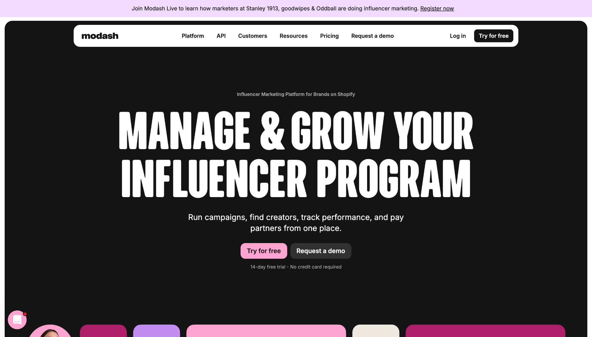
Modash’s website shows how great UX turns a complex, feature-heavy pitch into a more digestible and guided browsing journey. Instead of making visitors decode how the product functions, this site does much of that work for them.
Key UX choices:
- Clear workflow labels. Titles like “Manage,” “Discover,” “Track,” and “Pay” break the product’s features into simple categories so visitors can understand the basics faster.
- Multiple next steps. Information about free trials, demos, pricing, and product tours appears early, giving each user a path that matches their intent instead of using one CTA for everyone.
- Immediate social proof. Trial details and client logos appear near the top of the homepage, building trust and product confidence.
2. Outseta
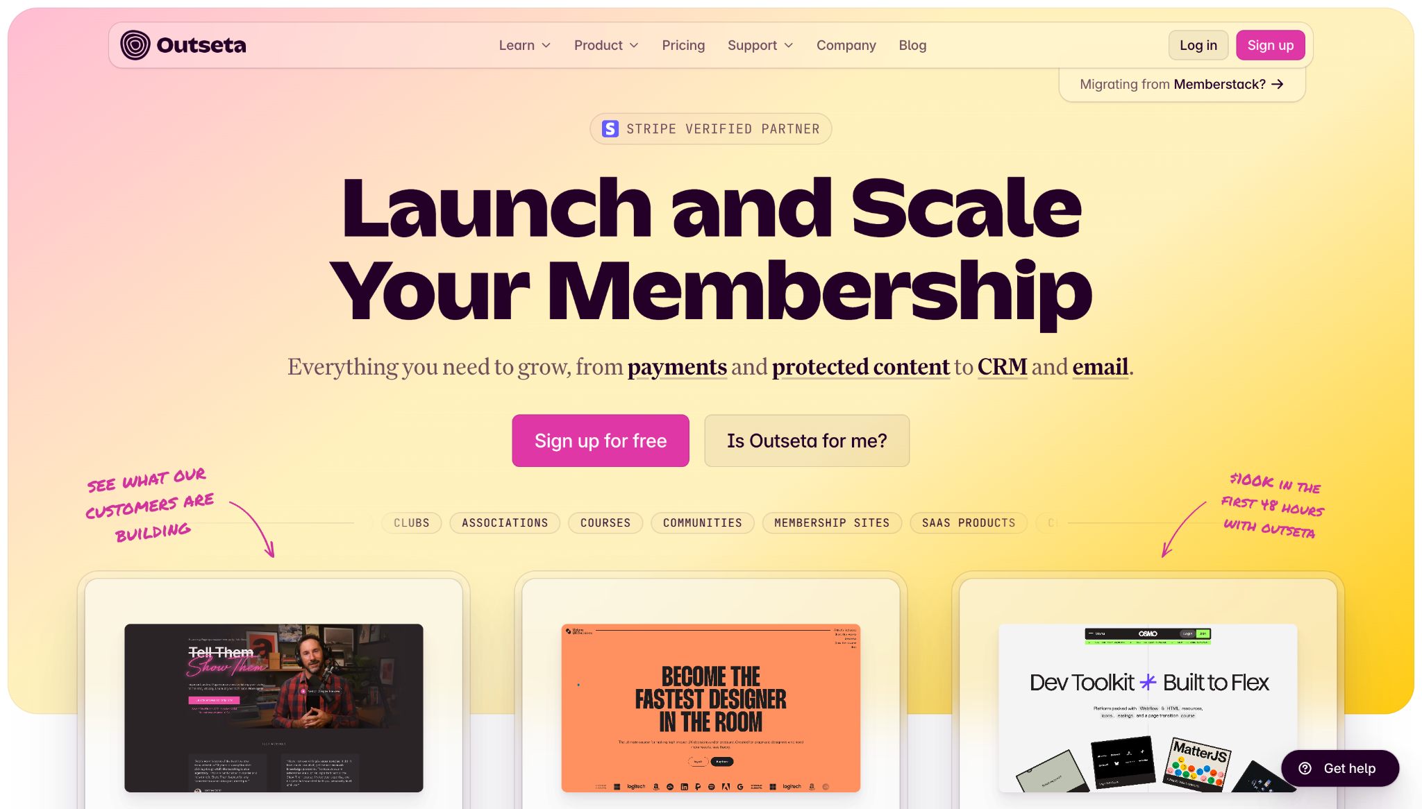
Outseta’s website demonstrates how SaaS and other membership-focused businesses can simplify a multi-tool product to make its value proposition clear.
Key UX choices:
- Workflow-based navigation. Clear workflow labels with corresponding links to relevant tools help people understand the product quickly and map features to their pain points.
- Outcome-focused elements. Customer testimonials sit between course offerings and contact forms, mixing sales copy with more plain-language examples of how real users benefit from the product.
- Self-qualification paths. The phrase “Is Outseta for me?” doubles as a button that takes users to a dedicated page outlining who the platform is best for to help with decision making.
3. January AI
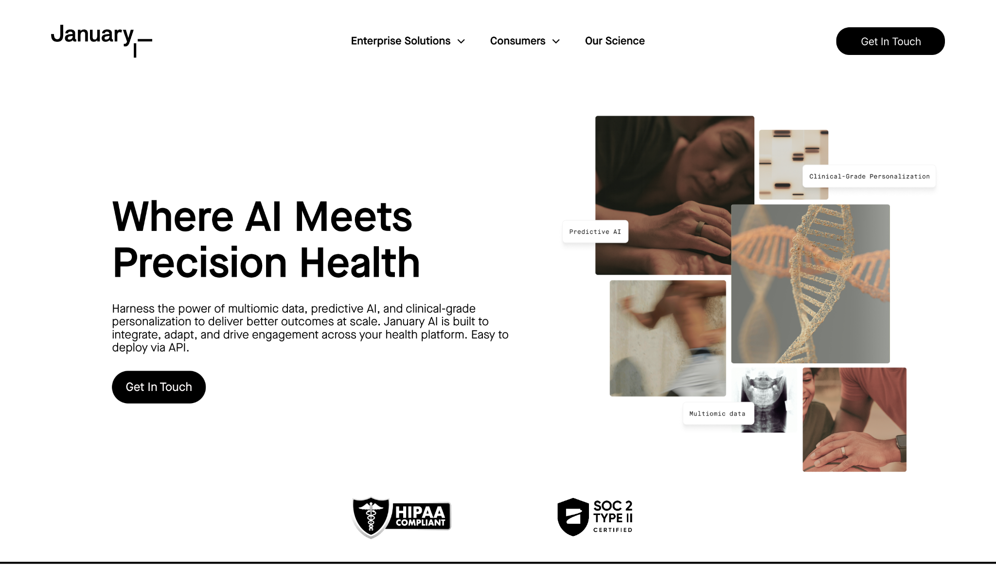
January AI’s website presents technical, medical-heavy content via a minimalist design that avoids overwhelming visitors with too much information too quickly.
Key UX choices:
- Audience segmentation. “Enterprise Solutions” and “Consumers” tabs split the target audience into distinct categories, helping each visitor understand where they belong before they explore further.
- Clear product ladder. A dedicated section highlights “January Mirror,” “Lifestyle Intelligence,” and the January app as core features. It also breaks the complex health platform’s functionality into smaller steps for non-technical visitors and anyone who’s simply in a hurry.
- Consistent CTAs. Each CTA button has the same simple black-and-white design and similar concise labels, so users see them immediately whenever and wherever they‘re ready to take action.
UX design websites from the Webflow community
Find inspiration from the Webflow community for your UX design website.
4. MarqVision
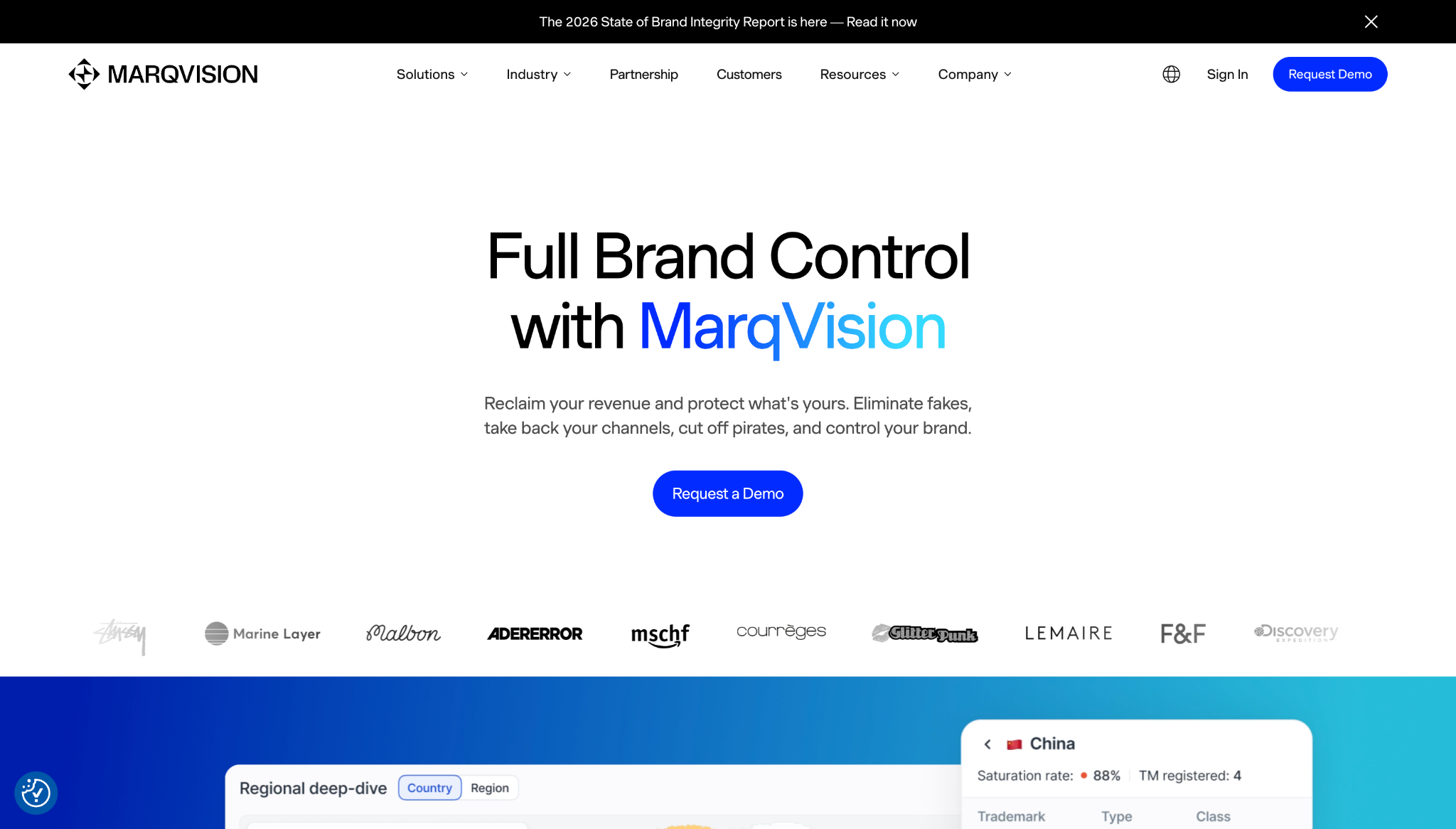
MarqVision’s website offers solutions to high-stakes problems like brand protection and unauthorized sales through fake products. Its UX focuses on reassuring visitors that the brand is trustworthy and can help with these sensitive needs.
Key UX choices:
- Problem-based navigation. Pain points like unauthorized sales, impersonation, content protection, and trademark management have separate links in the navigation menu, along with descriptions that provide context, so people can jump straight to the most relevant messaging.
- Industry pathways. The navigation bar also leads to landing pages for specific industries, such as fashion and pharmaceuticals, giving visitors an alternative way to narrow down their searches.
- Stats and badges. The homepage features case studies, customer logos, a 4.9-star rating badge, and key statistics like “24/7 monitoring” and “99% accuracy” — all of these elements help build credibility.
5. Anrok
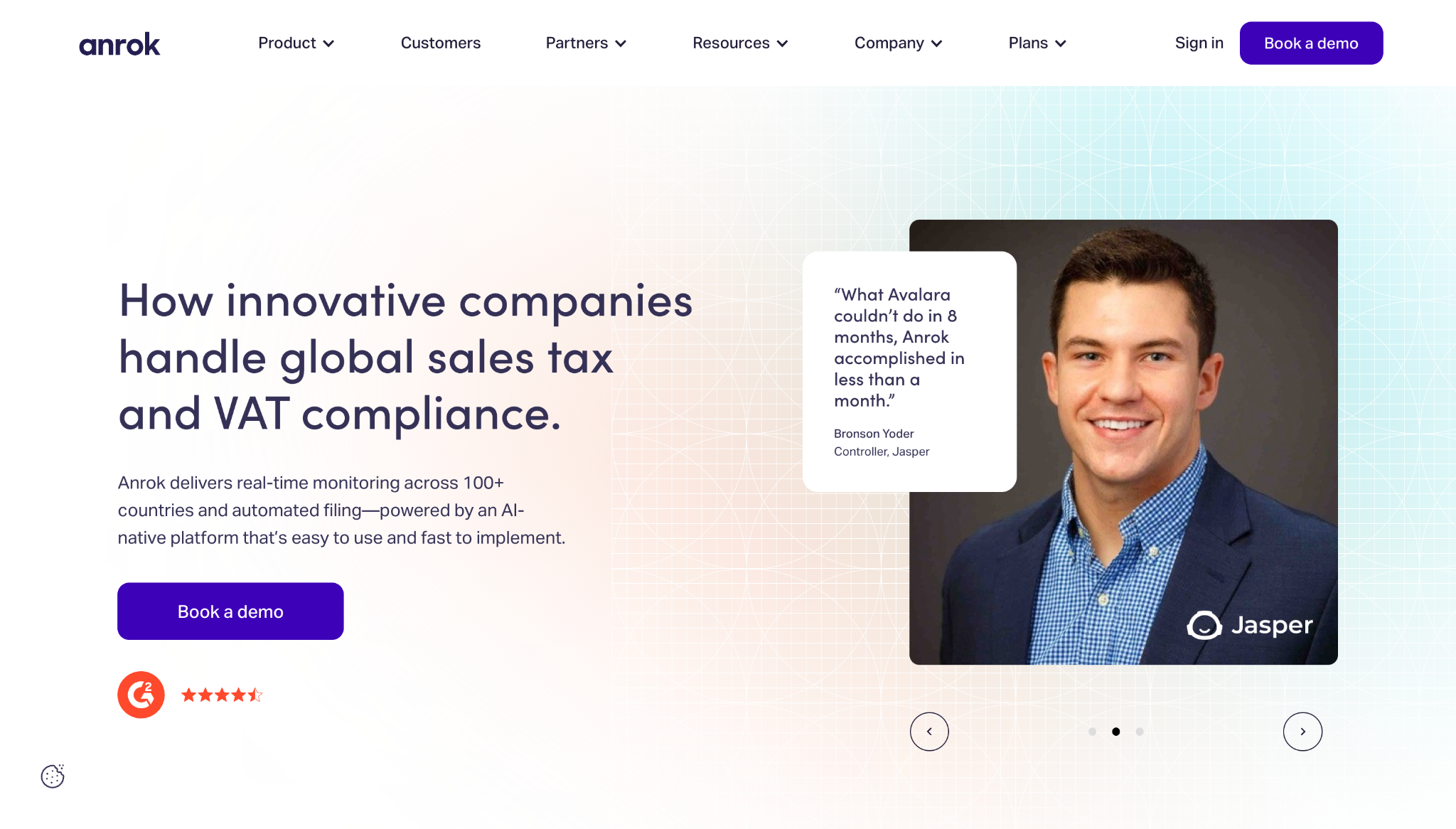
Anrok’s website shows how you can turn a stressful, compliance-related topic like sales taxation into an enjoyable user experience.
Key UX choices:
- Utility-first navigation. The site has an animated coverage map showing tax and VAT rates in the United States and Europe, helping visitors understand these key numbers at a glance.
- Clear workflow. Features like financial stack integration, tax calculation, and automated file reporting appear sequentially to demonstrate how customers can turn messy tax problems into manageable processes.
- Proof in the header. The hero section includes customer quotes with photographs of recognizable company executives, which adds social proof to Anrok’s core promise.
6. MA Quilts
MA Quilts’ website offers inspiration to anyone building portfolio sites for creative clients. Exploring this website illustrates how a simple structure can guide attention and convey a client’s visual identity.
Key UX choices:
- Clear navigation. There are only a few paths in the expandable hamburger menu, and they have straightforward labels like “Quilts,” “About,” “Process,” “Blog,” and “Contact.”
- Prominent product placement. The homepage quickly transitions from the brand statement to the company’s best pieces, along with a “See all quilts” button that leads to more featured products.
- Design that reflects the core offering. The minimal layout and short copy leave room for imagery to lead the experience, which is well-suited to such a visual-forward product.
7. Eleken
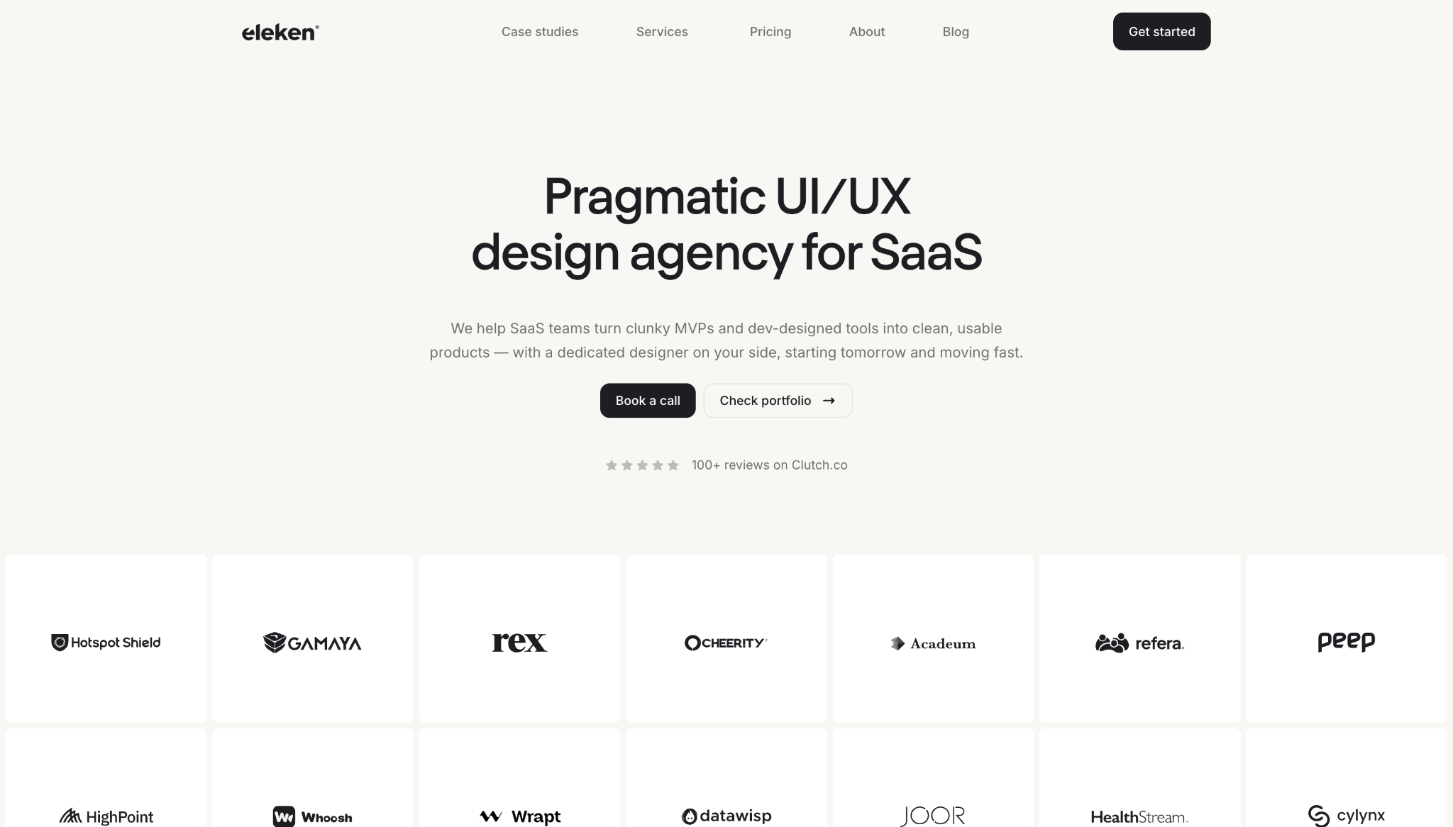
Eleken’s website speaks directly to visitors’ pain points by matching messaging, content structure, and conversion paths to user intent.
Key UX choices:
- Context-based client logos. Hovering over each client logo shows the company’s industry and project, such as “EdTech and Product Redesign” or “Recruiting and Team Extension,” so visitors can find relevant social proof fast.
- Outcome spotlights. Case studies highlight measurable results, such as lower dropoff rates and higher customer satisfaction, which builds on the client logo section’s messaging and encourages visitors to convert.
- Scroll-based interactions. An orange ball responds to scrolling behavior, showing a delivery timeline and step-by-step trial process while making the experience more engaging.
Build engaging user experiences with Webflow
A website with a good user experience design often looks impressive, but what really matters is that it helps people move forward without hesitation. When you take the time to create a clear content structure, helpful navigation, a brand-relevant design, and fluid interactions, you deliver user experiences that elevate your clients’ websites and get results.
Webflow gives you the tools to build effective UI/UX systems for all your projects. You can design visually and update quickly thanks to Webflow’s composable CMS. Built-in performance tools help pages load quickly and feel smooth to use, while workflow features support seamless collaboration and publishing.
Use Webflow to create a great user experience every time.
The modern web design process
Discover the processes and tools behind high-performing websites in this free ebook.
Try Webflow for as long as you like with our free Starter plan. Purchase a paid Site plan to publish, host, and unlock additional features.
What is Urban Density Design? A Clear Guide to How Cities Get Built Denser
Urban density design plans cities to fit more people and uses while improving livability and quality public spaces, not just building taller structures.
Summary
Decoder
- Floor Area Ratio (FAR): The ratio of a building's total floor area to the area of the plot it occupies, indicating the intensity of development on a specific land parcel.
- Missing middle housing: A range of medium-density housing types (e.g., duplexes, triplexes, townhouses) that bridge the gap between single-family homes and large apartment buildings, often fitting into established neighborhoods.
Original Article
What Is Urban Density Design? A Clear Guide to How Cities Get Built Denser
Urban density design is one of those terms that comes up constantly in city planning conversations but rarely gets a straight explanation. If you have heard phrases like “we need more density” or “densification is the answer to the housing crisis” and wondered what they actually mean in physical terms, you are in the right place. What is urban density design, really? It is the practice of planning and building cities so that more people, activities, and uses fit into a given area of land, while maintaining livability, access to services, and quality of public space. It is not just about stacking buildings taller. It is about how streets, buildings, open spaces, transit, and mixed uses all interact to create places that work for the people who live and move through them. This guide breaks down the concept from the ground up.
What Urban Density Actually Means
Urban density is a measure of how many people, dwelling units, or built floor area exist within a defined area of land. The most common measures are:
- Population density: number of people per square kilometer or square mile
- Dwelling unit density: number of housing units per hectare or acre
- Floor area ratio (FAR): the ratio of total building floor area to the area of the plot it sits on
A neighborhood with an FAR of 1.0 has as much total floor area as its land area. An FAR of 4.0 means the total floor area is four times the land area, which typically requires multiple stories. Manhattan’s midtown averages an FAR above 10 in its densest blocks. A typical suburban neighborhood might have an FAR below 0.5.
High urban density does not automatically mean tall buildings. Paris is one of the densest cities in the world, with large parts of the city sitting at population densities higher than New York City, despite a mostly six to eight story building fabric and no skyscrapers in the historic core. That density comes from courtyard building types, continuous street frontages, relatively small apartments, and a mix of uses that keeps the streets active across the day.
What Urban Density Design Adds to the Equation
Understanding urban density is one thing. Urban density design is the practice of shaping how that density is arranged, distributed, and experienced at street level.
Density on its own is a number. Urban density design is the set of decisions that determine whether that density produces a vibrant neighborhood or an inhospitable one. Two neighborhoods with identical FAR can feel completely different depending on how the built form is arranged: building heights, setbacks, ground floor activation, street width, the presence of trees, the location of parking, and the relationship between building entrances and the public realm.
This is why urban density design sits at the intersection of urban planning, architecture, landscape architecture, and transportation engineering. It draws on all four disciplines because density affects all of them simultaneously.
The Core Urban Design Principles Behind Density
Several urban design principles guide how density gets deployed in practice. These are not rules that apply uniformly to every city, but they appear consistently in successful high-density places around the world.
1. Mixed use at ground level High-density residential areas that have only residential uses at the ground floor tend to feel dead, especially in the evenings and on weekends. Activating the ground floor with retail, cafes, workshops, health services, and other non-residential uses creates the kind of constant low-level activity that makes dense places feel safe and pleasant to walk through. Jane Jacobs called this the “sidewalk ballet,” and it remains one of the most important principles in urban density design.
2. Fine grain street networks Small blocks with frequent intersections give pedestrians more route choices and distribute movement across a wider network. Large superblocks force foot traffic onto fewer paths, which concentrates congestion and reduces the range of movement options. Most successful high-density neighborhoods have blocks between 60 and 120 meters in length, giving walkers choices at frequent intervals.
3. Active building frontages Buildings that present blank walls, service entrances, or parking structures to the street deaden the pedestrian experience regardless of how dense the neighborhood is. Urban density design prioritizes building fronts with windows, doors, and transparent ground-floor uses that create visual interest and informal surveillance of the street.
4. Public space within reach As residential density increases, the private space available to each resident typically decreases. Smaller apartments mean less private outdoor space. This makes the quality and distribution of public open space more critical, not less. The principle is that no resident should be more than a five-minute walk from a usable park or public square.
5. Transit before density Density works best when it is supported by public transit. Adding population to an area without transit capacity pushes people into cars, which increases traffic and parking demand, which in turn consumes land that could have supported more density or better public space. The sequencing matters: transit investment should either precede or accompany densification, not follow it.
Densification: What It Looks Like in Practice
Densification is the process of increasing urban density in areas that are already developed. It is the central challenge in most established cities, where the alternative to densification is sprawl: pushing new development onto undeveloped land at the urban edge.
Densification takes several physical forms:
Infill development. Building on vacant or underused lots within an existing neighborhood. A parking lot replaced by a mixed-use building. An industrial site converted to housing and ground-floor retail. Infill adds density without demolishing existing fabric.
Vertical addition. Adding floors to existing buildings. Common in commercial areas, rarer in residential contexts because structural systems and planning rules often limit it. In some cities, rooftop additions to low-rise residential buildings are permitted and increasingly common.
Subdivision and small-lot development. Dividing large residential lots into multiple smaller ones and building additional dwellings. A single house on a large suburban lot becomes two or three townhouses, or a house with a separate accessory dwelling unit (ADU) at the rear.
Gentle densification or “missing middle” housing. Replacing detached single-family homes with duplexes, triplexes, townhouses, or low-rise apartment buildings. This form of densification is called “missing middle” because it fills the gap between detached houses and large apartment towers. It produces density at a scale that fits into established residential neighborhoods without requiring major infrastructure upgrades.
Transit-oriented development (TOD). Concentrating new density around transit stations. Areas within 400 to 800 meters of a train or rapid transit station receive higher development allowances, producing a cluster of density that supports the transit investment while keeping most residential areas at lower densities.
Why Urban Density Design Matters Now
Several pressures are making urban density design more relevant than it has been in decades.
Housing affordability. In cities around the world, housing costs have risen faster than incomes for years. One of the primary drivers is that many established urban areas have planning rules that prevent density from increasing in response to demand. When supply cannot grow where demand is highest, prices rise. Densification, when done well, adds supply and moderates price pressure.
Climate change. Dense urban environments have lower per-capita carbon footprints than suburban and rural environments. Dense neighborhoods support walking, cycling, and transit. They require less energy per dwelling to heat and cool because shared walls reduce heat loss. And they preserve rural and agricultural land by concentrating development in areas that are already built.
Infrastructure efficiency. Roads, water pipes, sewers, power lines, and transit routes all cost less per person to provide in dense areas than in sprawling ones. A city of one million people spread across 2,000 square kilometers spends far more maintaining infrastructure than the same population in 500 square kilometers.
Aging populations. As populations age, walkability and access to services become more important. Dense neighborhoods with mixed uses and transit allow older residents to remain independent longer without relying on cars.
Common Objections to Densification and What the Evidence Shows
Densification consistently faces resistance from existing residents in affected neighborhoods. The most common objections are worth examining honestly.
“It will destroy neighborhood character.” Character comes from a combination of building scale, street widths, materials, landscaping, and street life. None of these are uniquely tied to low density. Many dense neighborhoods have strong and distinctive character. The concern is legitimate when densification produces buildings that ignore local context, but this is a design quality problem, not a density problem.
“Infrastructure can’t handle it.” In areas with limited water, sewer, or road capacity, this concern has merit. But it argues for infrastructure investment alongside densification, not against density itself. In most established urban areas, existing infrastructure has more capacity than current utilization suggests.
“It will increase traffic.” Dense, mixed-use neighborhoods with good transit actually produce less vehicle traffic per resident than suburban areas. Residents who can walk to services and take transit generate fewer car trips. The traffic impact of densification depends heavily on how much of the new density is car-dependent.
Good urban density design accounts for all of these concerns. The goal is not maximum density but optimum density: the level at which a neighborhood functions well, supports the people who live there, and contributes to a city’s broader goals.
For a visual sense of how density, building scale, and street design interact, looking at how sports logos and identity design use space and proportion provides a useful design thinking parallel: scale, proportion, and context matter in every design discipline. Anyone involved in urban design projects benefits from understanding how home and interior design thinking applies to larger-scale built environments. And for professionals managing urban design projects across teams and disciplines, project management tools and approaches are directly relevant to keeping complex, multi-stakeholder work on track.
Key Takeaways
- What is urban density design? It is the practice of planning how more people and uses fit into existing urban land while maintaining livability through good street design, mixed uses, public space, and transit integration.
- Urban density is measured by population per area, dwelling units per hectare, or floor area ratio. High density does not require tall buildings: Paris demonstrates world-class density at six to eight stories.
- The core urban design principles behind density include mixed ground-floor uses, fine-grain street networks, active building frontages, nearby public space, and transit-first sequencing.
- Densification is the process of increasing density in existing areas, and it takes forms including infill development, vertical addition, subdivision, missing middle housing, and transit-oriented development.
- Density matters now because of housing affordability pressures, climate commitments, infrastructure efficiency, and the needs of aging populations.
- Common objections to densification are legitimate concerns but point to design and investment challenges, not to density itself being wrong.
Virality Predictor (Website)
Higgsfield.ai's Virality Predictor allows users to upload short video clips and receive AI-modeled insights on their hook strength, attention curve, and viral potential.
Summary
Original Article
Upload a short clip and get a modeled read on its hook strength, attention curve, and viral potential.
1,000 Record Covers: The Book that Proves Album Art is High Art
Michael Ochs's '1,000 Record Covers' by TASCHEN presents 574 pages of album art from the 1960s–1990s, arguing for its recognition as high art.
Summary
Original Article
"1,000 Record Covers" by Michael Ochs presents 574 pages of album art from the 1960s–1990s as a compelling argument that album cover design deserves recognition as high art.