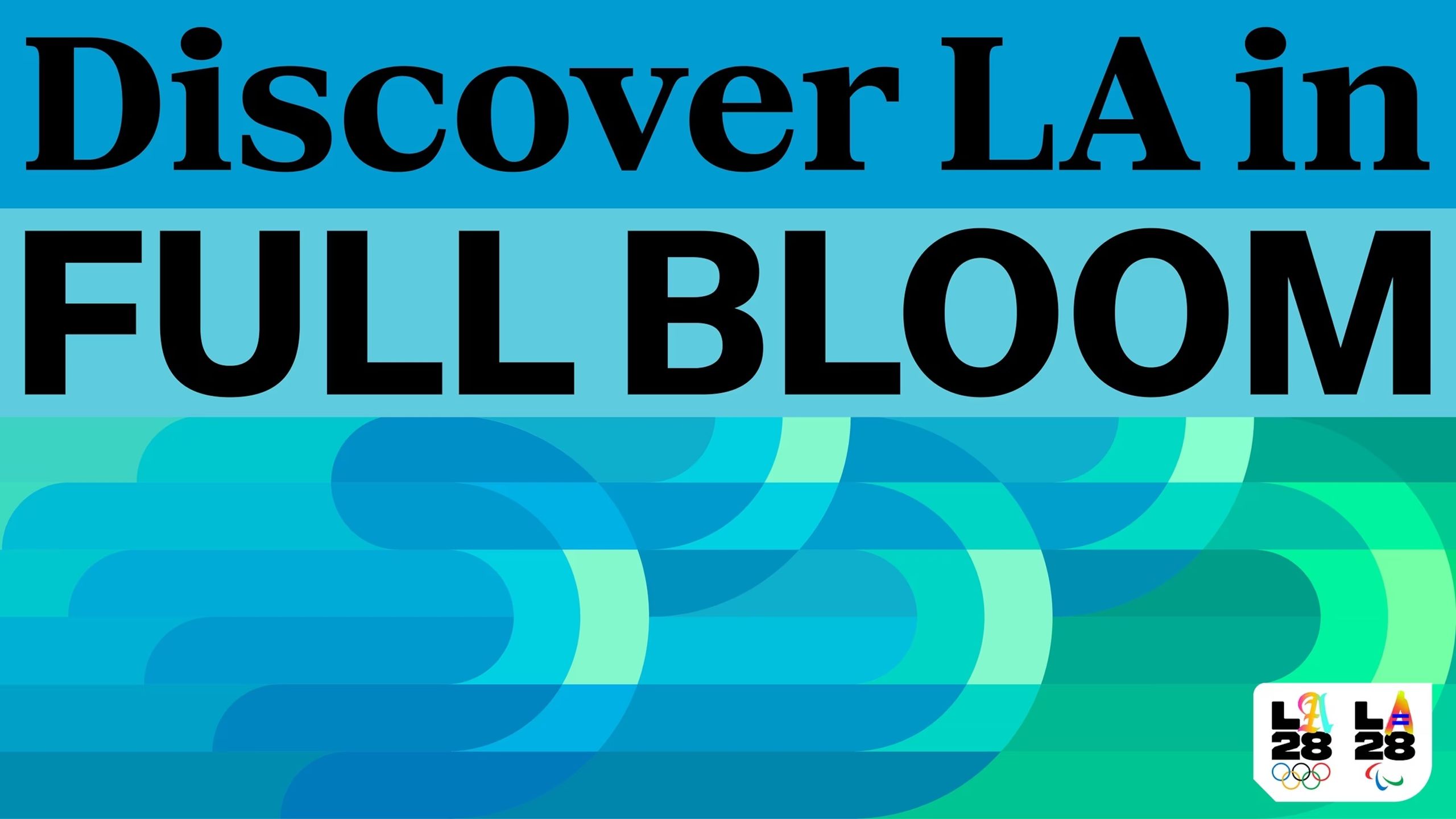
How LA28's "unapologetically type-forward" approach nailed Olympic branding (5 minute read)
The LA 2028 Olympics ditched a single fixed logo for a flexible typography-based identity system with dozens of versions of the letter "A" to represent the city's diverse visual culture.
What: The LA28 Olympic branding replaces the traditional single-logo approach with a typography-led system inspired by Los Angeles street signage, using multiple interpretations of the letter "A" as the core identity element that can adapt while maintaining cohesion.
Why it matters: This represents a fundamental shift in brand identity design from seeking a single "ideal" form to building flexible systems that can express variation and diversity without losing coherence, challenging the uniformity-focused approach of traditional corporate branding.
Deep dive
- The LA28 identity is described as "unapologetically type-forward" where typography isn't supporting the brand but IS the brand itself
- The variable "A" glyph turns a single letter into a system with dozens of interpretations that reflect how LA actually works neighborhood by neighborhood
- The design philosophy separates structure from expression: build a system that sets the rules, then decide where to break them for cultural moments
- Charles Nix compares it to "a façade with a few open/active windows" - rhythm and clarity with life, avoiding the noise that comes when every element is expressive
- In LA where architecture often fades, typography does the heavy lifting through signage, tone, and presence
- Typography is described as "the art that preserves all arts" - it both carries words that document culture and has become a cultural artifact in its own right
- The system can operate at global scale without flattening the city, channeling variety and texture rather than trying to unify everything
- This represents a shift away from International Style where neutrality and uniformity were the goal
- Nix notes the system is "a Hollywood version of LA expression - an imitation of diversity" which is "ironically, very on brand"
- Flexible typographic systems assume variation from the start rather than trying to iron it out, holding multiple voices while feeling coherent
Decoder
- Type-forward: An approach where typography is the primary or central element of a design identity, not just a supporting component
- Glyph: A single character or symbol in a typeface, in this case referring to the letter "A"
- International Style: A mid-20th century design philosophy emphasizing neutrality, uniformity, and minimalism with single fonts and grid systems
- Typographic system: A flexible set of typography rules and variations that work together as a cohesive identity rather than a single fixed typeface
Original article
The LA 2028 Olympics branding uses a bold, typography-led system to reflect the diversity of Los Angeles, replacing a single fixed logo with a flexible identity built around multiple versions of the letter “A.” This approach draws from the city's street signage and visual culture, making typography the central expression of the brand. By balancing a clear structure with room for variation, the system captures multiple voices while staying cohesive, showing how design can both represent and embody a city's cultural identity.