Koto just proved that design for enterprise platforms doesn't have to be beige (6 minute read)
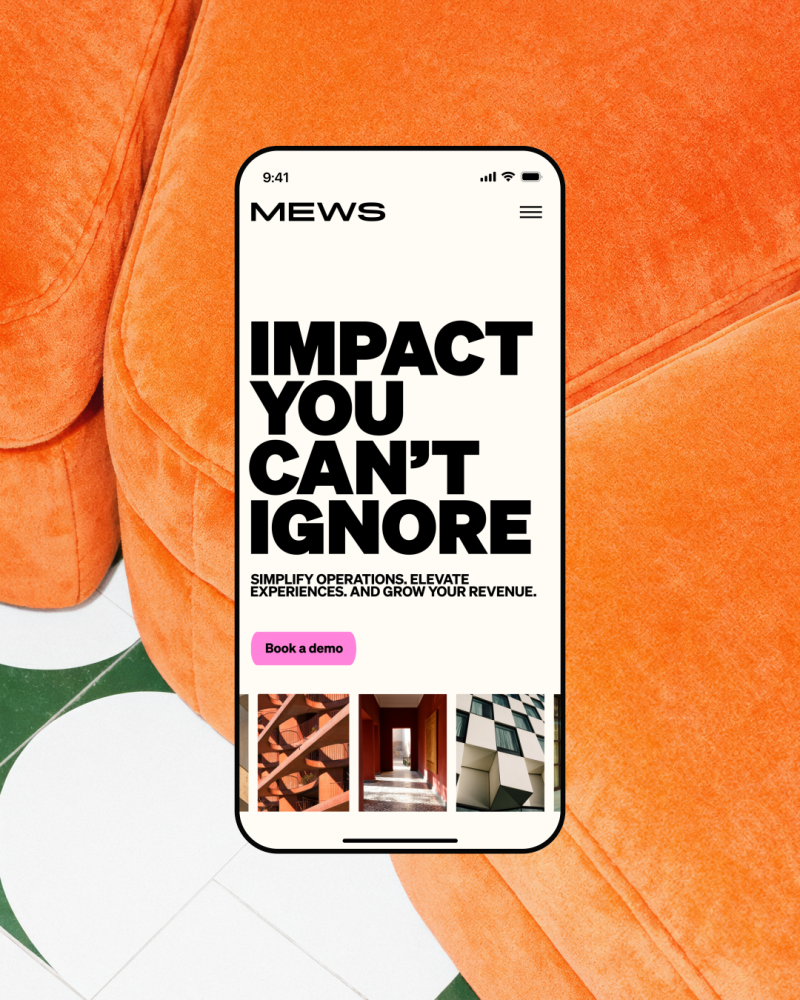
Mews, a hotel management platform, ditched conservative SaaS aesthetics for bold pink and striking typography, challenging the assumption that enterprise software needs boring design to win trust.
What: Design studio Koto rebranded Mews, a hotel property management system serving 15,000+ customers across 85 countries, moving from generic corporate look to a distinctive identity built on hot pink, condensed typography, and a confident "concierge-like" voice.
Why it matters: This challenges the persistent belief in B2B software that enterprise clients require visual restraint and that boldness undermines credibility, demonstrating that distinctive branding can be a competitive positioning tool rather than a risk in crowded markets.
Takeaway: If you're building B2B or enterprise products, consider that bold, distinctive design can help you stand out in saturated markets where everyone claims the same benefits in the same voice.
Original article
Hospitality platform Mews worked with Koto to rebrand itself, moving away from generic SaaS aesthetics toward a bold, highly distinctive identity that balances clarity with complexity. The new brand uses striking pink, expressive typography, and a confident “concierge-like” tone of voice to stand out in a conservative industry, showing that even enterprise software can win attention and trust through creativity, personality, and strong design systems rather than playing it safe.