Starwind UI (Website)
Starwind UI brings the shadcn/ui approach of CLI-installed, copy-paste components to the Astro ecosystem with 45+ animated, accessible components.
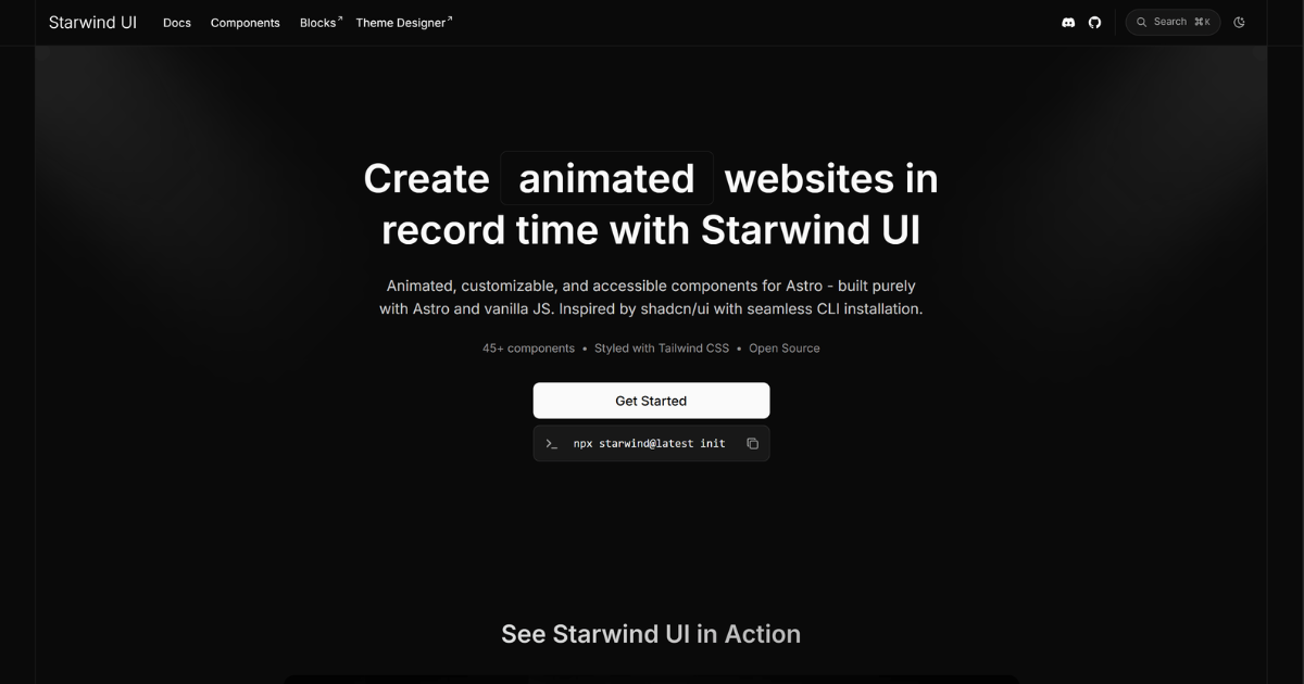
What: Starwind UI is an open-source component library offering 45+ animated, customizable components built specifically for Astro websites using vanilla JavaScript and Tailwind CSS styling. It follows the shadcn/ui model where components are added directly to your codebase via CLI rather than installed as dependencies.
Why it matters: This fills a gap in the Astro ecosystem by providing a shadcn/ui-style component library, giving developers full ownership and control over component code rather than depending on external packages.
Takeaway: Install via `npx starwind@latest init` to add components to your Astro project.
Decoder
- Astro: A modern web framework optimized for building fast, content-focused websites with partial hydration
- shadcn/ui: A popular React component approach where CLI tools copy component source code into your project rather than installing as npm dependencies
- Tailwind CSS: A utility-first CSS framework that provides low-level utility classes for building custom designs
Original article
Create animated websites in record time with Starwind UI
Animated, customizable, and accessible components for Astro - built purely with Astro and vanilla JS. Inspired by shadcn/ui with seamless CLI installation.
See Starwind UI in Action
Key Features
Own The Code
Easy-to-use CLI to add component code directly to your projects.
Customizable
Full control over each component. All styling, functionality, and behavior can be modified.
Accessible
Designed with keyboard navigatable and accessible components.
Open Source
Completely open source and MIT licensed.