Why Pentagram's Samar Maakaroun designed a logo that just won't settle (7 minute read)
Pentagram partner Samar Maakaroun designed a logo for London's Mosaic Rooms that intentionally never settles, using fluid letterforms and movement to express the experience of living between cultures rather than resolving into traditional brand stability.
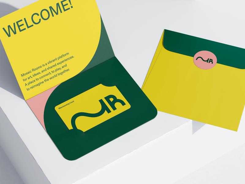
What: The new visual identity for The Mosaic Rooms, a West London space for contemporary Arab and SWANA region culture, centers on an M-R monogram where the M extends fluidly in both left-to-right and right-to-left directions simultaneously, refusing to settle into a fixed form and embodying the condition of being between languages and cultures.
Why it matters: The project challenges fundamental assumptions in branding that logos must be stable and consistent, demonstrating how conceptual rigor can turn instability itself into an organizing principle that holds cultural tension rather than simplifying or resolving it.
Takeaway: When clients request branding that feels "dynamic yet consistent," consider whether intentional instability handled with clarity and conviction might serve the concept better than traditional consistency.
Deep dive
- The monogram's extended M moves in both reading directions (Arabic right-to-left, English left-to-right) without committing to either, making the letterform itself describe the journey of living between cultures rather than planting a flag
- The design draws on Ece Temelkuran's concept of being "unhomed" where home becomes permanently negotiated rather than fixed, a lived reality for much SWANA region cultural production shaped by displacement
- The color palette makes a provocative statement by including dusty pink alongside yellow and forest green, deliberately using a color often avoided in SWANA political and cultural discourse as frivolous or misaligned
- The Mosaic Rooms reopened in February 2026 after major refurbishment, transitioning from a privately funded initiative founded in 2008 to a public institution expanding beyond gallery space into talks, learning and gathering
- Building architecture by A Small Studio echoes the brand's wave-like forms in perforated metal railings, creating genuine conversation between physical space and visual identity rather than separate executions
- The identity extends the oscillating logic across the full system with circular forms becoming ovals and interlocking shapes, suggesting entanglement and relation rather than arrival at a fixed point
- The project succeeds because the mark isn't a visual metaphor applied to a concept but rather the concept made visual, with the idea of in-betweenness described by the identity itself
- Demonstrates that instability handled with clarity is not a design failure but can be the organizing principle when the brief genuinely calls for holding tension rather than resolving it
Decoder
- SWANA: South West Asia and North Africa, the collection of countries spanning the Arab world and surrounding regions
- Unhomed: Term from Turkish author Ece Temelkuran describing the experience of living between cultures where home becomes permanently negotiated rather than a fixed place
- Monogram: A design combining or overlapping initials or letters into a single unified mark
Original article
The Mosaic Rooms' new identity by Samar Maakaroun intentionally rejects stability, using a fluid monogram and bold color choices to express movement, cultural duality, and the idea of being “in-between” rather than fixed. The rebrand reflects the institution's evolving role and shows how strong design can embody unresolved tension and complex identity instead of simplifying it.