DEVOURED
Color is finally OK
OKLCH, a perceptual color system created by a game developer in a 2020 blog post, has quietly replaced HSL in major frameworks and browsers by fixing decades-old problems with how digital color matches human vision.
What: OKLCH is a color format now default in Tailwind v4, modern browsers, and design tools that maintains consistent perceived brightness across different hues, keeps colors from drifting when lightened or darkened, and simplifies building accessible color systems without manual tweaking.
Why it matters: HSL has a fundamental flaw where colors at the same lightness value look drastically different in brightness (yellow glows, blue looks nearly black), forcing designers to manually compensate for years. OKLCH mathematically aligns with human perception, making tasks like even color scales, smooth gradients, and accessible contrast pairs straightforward arithmetic rather than iterative guesswork.
Takeaway: Rebuild one color scale in your design system using OKLCH with evenly spaced lightness values and constant chroma/hue to see how it naturally produces perceptually uniform results without tweaking.
Deep dive
- HSL's lightness is a mathematical midpoint of RGB channels, not perceived brightness—a yellow and blue both at 50% lightness look wildly different in actual brightness to the human eye
- Designers have spent years manually compensating for HSL's broken math through contrast checking, palette adjustments, and dark mode fixes, treating this labor as normal rather than questioning the tool itself
- Björn Ottosson, a Swedish game engineer at EA DICE (not a color scientist), published a blog post in December 2020 introducing Oklab because existing color spaces failed at simple tasks like darkening colors without hue drift
- The W3C's Chris Lilley and Apple's Simon Fraser championed the format, getting it into CSS Color Module Level 4 by 2021 and implemented in all major browsers by 2023
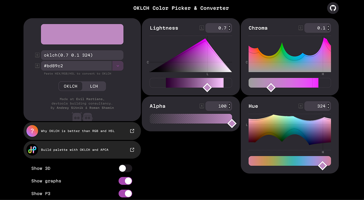
- OKLCH (Ok Lightness Chroma Hue) provides three perceptually meaningful dimensions: lightness that matches perceived brightness, hue that stays stable when adjusted, and chroma that honestly represents available color intensity
- Building accessible contrast pairs becomes simple arithmetic—pick two lightness values differing by 0.4 or more; five-step ramps need even L-axis spacing; gradients interpolate cleanly without dead gray middles
- The intellectual foundation traces directly to Albert Munsell's 1905 perceptual color system and CIELAB (1976), but Ottosson's implementation solved known issues like the "blue turn" with just ten lines of code
- Tailwind v4 shipped OKLCH as the default for all palette colors in early 2025 with no announcement, migration guide, or apology—just new values as if they'd always existed
- Most designers missed the shift despite three years of browser support because the problems OKLCH fixes (broken gradients, drifting hues, inconsistent contrast) had become normalized pain compensated for with elaborate tooling
- Photoshop adopted Oklab for gradient interpolation, Unity and Godot integrated it into their engines, shadcn/ui uses it for theming, and AI coding assistants now output OKLCH by default from training data
- One engineer's side project effectively replaced sixty years of institutional color science in mainstream design tools because the simple implementation solved practical problems academic models left unaddressed
Decoder
- OKLCH: Ok Lightness Chroma Hue, a perceptual color space where numeric values match how colors actually look to human vision rather than mathematical channel calculations
- HSL: Hue Saturation Lightness, the older color model where lightness is a mathematical average of RGB values, not perceived brightness
- Chroma: The colorfulness or intensity of a hue; OKLCH reports the actual maximum available rather than pretending all hues reach full saturation equally
- Perceptual uniformity: A color space where equal numeric differences produce equal perceived differences—a 10-point change looks the same whether you're adjusting red, blue, or gray
- CIELAB: The 1976 color space from the International Commission on Illumination designed for perceptual uniformity, which OKLCH improves upon by fixing issues like blue-to-purple drift
- Blue turn: A known CIELAB flaw where blue gradients drift toward purple due to hue nonlinearities, familiar to anyone who's built a dark mode and watched blues go purple
Original article
OKLCH is emerging as a replacement for older color systems like HSL because it aligns with human perception—maintaining consistent brightness, stable hues, and more accurate color intensity. Created by Björn Ottosson, it simplifies tasks like building color scales, gradients, and accessible contrast, removing much of the manual tweaking designers have long relied on. Although already adopted in modern tools, browsers, and frameworks, the shift has gone largely unnoticed—even as it quietly fixes long-standing issues in digital color design.
Explore all 66 articles in today's digest
Fresh dev news, AI-digested daily. Never miss a trend at devoured.fyi