DEVOURED
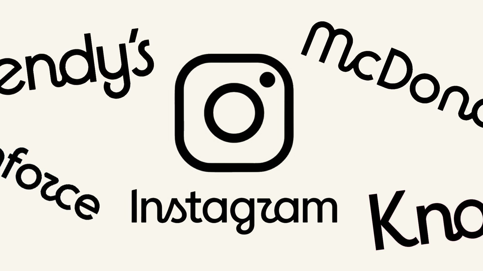
Other brands are throwing shade at the new Instagram logo
Design
Creative Bloq
Instagram's minor wordmark update has triggered widespread mockery from other brands claiming it's time for their own unnecessary 'refreshes'.
What: Instagram changed its 10-year-old wordmark to a 'cleaner' digital version, leading to criticism regarding its legibility and blandness. Brands like McDonald's, KitKat, and ChatGPT joined the conversation by posting satirical updates to their own long-standing logos.
Why it matters: The backlash highlights a growing fatigue among users and brands toward minimalist, homogenized logo redesigns that prioritize technical scalability over distinct brand personality.
Original article
Instagram has replaced its 10-year-old wordmark with a cleaner, more digital-looking version, a change that has sparked criticism for being less distinctive and harder to read. The company says the update was simply due to the logo's age, prompting jokes from other brands about redesigning their own long-standing logos for the same reason. While some users welcome the refresh, many see it as a cosmetic change that does little to address broader perceptions of the platform.
Explore all 72 articles in today's digest
Fresh dev news, AI-digested daily. Never miss a trend at devoured.fyi