DEVOURED
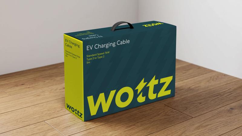
This clever rebrand finds its entire personality in one tiny flourish
Lark Design Studio's rebrand of Wottz demonstrates how a single, subtle typographic detail can create a more durable identity than complex systems.
What: The studio added a hidden lightning bolt into the 'tt' of the Wottz logo, emphasizing the company's focus on detail rather than relying on standard tech-adjacent visual cliches.
Original article
Lark Design Studio created a minimalist new identity for Wottz, centred on a custom wordmark with a subtle lightning bolt hidden in the double "t" to reflect the company's attention to detail. Rather than relying on an elaborate brand system, the identity uses a restrained colour palette, custom icons, and consistent application across packaging, products, and vehicles to create a distinctive, durable brand. The project demonstrates how a single, well-executed idea can be more effective than a complex visual identity, especially for smaller businesses.
Explore all 42 articles in today's digest
Fresh dev news, AI-digested daily. Never miss a trend at devoured.fyi