DEVOURED
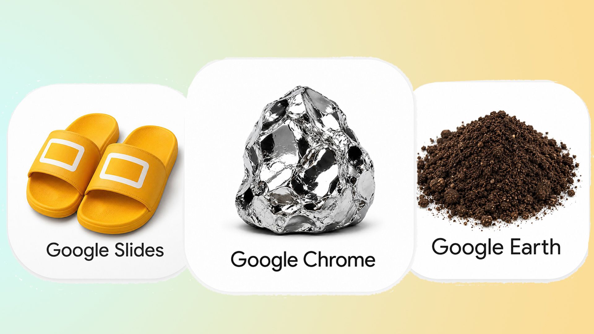
These Parody Google Icons are Better Than the New Update
A viral trend on X is mocking Google's recent app icon redesigns by reimagining them as literal, skeuomorphic objects like piles of dirt or crumpled sheets.
What: Following Google's recent icon updates, users including Amichai Mantinband began sharing hyper-realistic, literal icons for Google services. The movement highlights a growing public interest in skeuomorphic design as a reaction to modern minimal UI standards.
Why it matters: This trend signals a growing frustration with minimalist 'unified' branding that renders product interfaces indistinguishable from one another, suggesting a future pivot toward more distinct, tactile design languages.
Decoder
- Skeuomorphism: A design style where digital interfaces mimic the textures and appearance of physical objects, such as a trash can icon looking like an actual metal bin.
Original article
Google's recent app icon redesign sparked a creative trend on X, where users began sharing humorously literal, skeuomorphic alternatives — turning Google Sheets into crumpled bed sheets, Earth into a pile of dirt, and Slides into sandals.
Explore all 68 articles in today's digest
Fresh dev news, AI-digested daily. Never miss a trend at devoured.fyi