DEVOURED
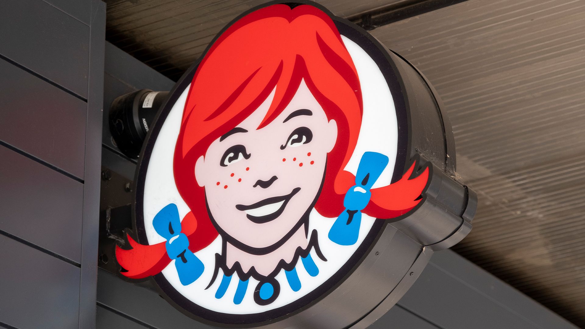
Wendy's New Branding Commits a Cardinal Design Sin
Wendy's is abandoning its traditional red branding for a light blue palette in international markets as part of a "Future Fresh" digital-first overhaul.
What: Under its "Future Fresh" initiative, Wendy's is rebranding global locations with a light blue scheme, breaking the industry standard of using red to trigger hunger, while simultaneously updating stores with digital ordering kiosks and loyalty programs.
Why it matters: The shift highlights a move toward "digital-first" store experiences where atmospheric branding is increasingly secondary to technological integration, even at the cost of traditional color psychology.
Deep dive
- The "Future Fresh" initiative aims to modernize the customer experience globally.
- The shift to blue directly contradicts established color theory in the food industry, which posits that red and yellow induce appetite.
- Wendy's CFO Ken Cook claims the change is necessary to differentiate the brand from competitors like McDonald's and KFC.
- New store layouts emphasize self-service ordering and loyalty program interaction over traditional counter service.
Decoder
- Color theory: A set of rules and guidelines that designers use to communicate with users through appealing color schemes in visual interfaces and physical spaces.
Original article
Wendy's is swapping its signature red for light blue across global locations as part of its 'Future Fresh' initiative, which debuted in the Philippines.
Explore all 42 articles in today's digest
Fresh dev news, AI-digested daily. Never miss a trend at devoured.fyi