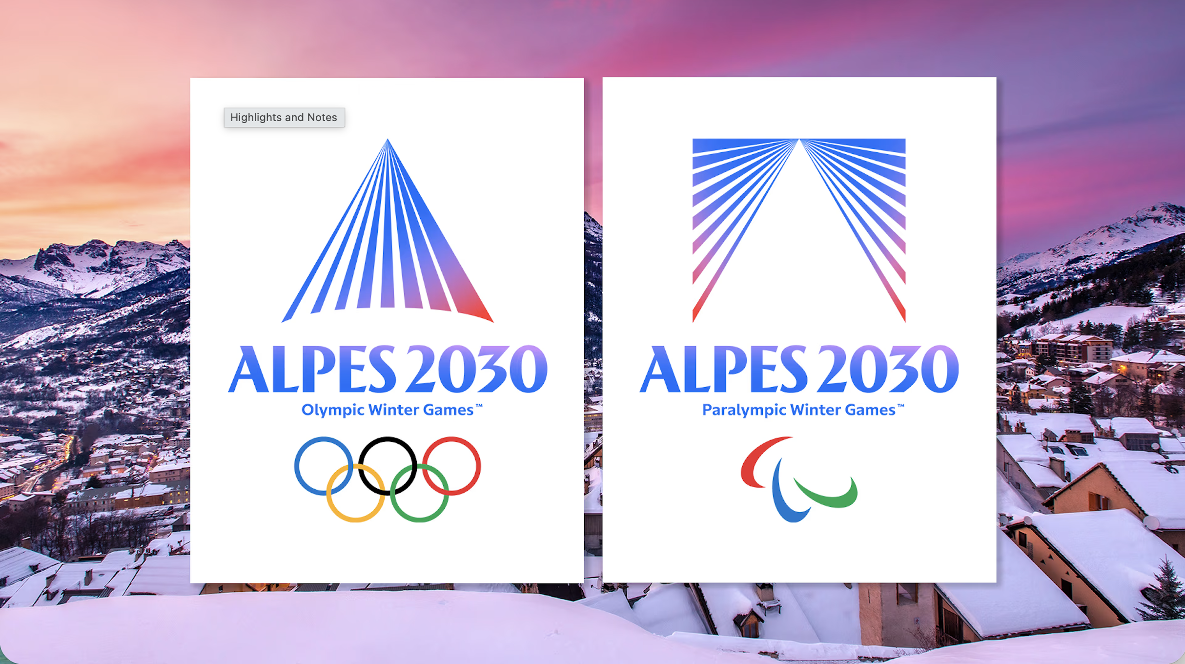
No, you haven't accidentally downloaded a banking app – that really is the new Winter Olympics 2030 logo
The Alpes 2030 Winter Olympics logo is a masterclass in modern geometry, yet its aesthetic feels more like a fintech startup than a sporting event.
Original article
The new Alpes 2030 Winter Olympics logo has been widely praised for its elegant, modern design, thoughtful symbolism, and versatile branding system, with separate but related Olympic and Paralympic marks inspired by a mountain revealed by light and the colours of the Alps. Despite its strong execution and French Modernist influences, the minimalist, geometric design feels more like the branding of a fintech company or cultural institution than a sporting event, making its connection to the Winter Olympics and the French Alps less immediately recognizable. While this abstraction sacrifices some sense of place compared to earlier Olympic identities, it creates a distinctive, timeless visual system that is likely to age well and succeed across digital, physical, and merchandising applications.
Fresh dev news, AI-digested daily. Never miss a trend at devoured.fyi