DEVOURED
Red Stone rebrands Explorer Scouts for a generation worn out by expectation
Red Stone has rebranded Explorer Scouts with a minimalist 'Grow up' identity to better appeal to modern teenagers navigating digital-age pressures.
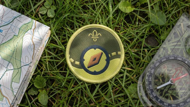
What: The rebrand replaces aging visuals with a compass-themed logo, 40 new badge designs, and a more flexible system that emphasizes curiosity and belonging over traditional achievement metrics.
Why it matters: Legacy organizations are increasingly forced to adopt 'straight-talking' or slightly irreverent branding to remain relevant to younger demographics.
Original article
Explorer Scouts has introduced a new brand identity and refreshed programme to better resonate with today's teenagers, emphasizing curiosity, belonging, practical skills, and adventure rather than performance or achievement. Built around the tagline "Grow up", the identity uses a compass-inspired logo, bold graphics, authentic photography, and flexible branding that allows local groups to express their individuality while remaining consistent. Designed with input from young people, the rebrand positions Explorers as an inclusive, fun, and supportive community that feels relevant to a generation navigating increasing social and academic pressures.
Explore all 42 articles in today's digest
Fresh dev news, AI-digested daily. Never miss a trend at devoured.fyi