DEVOURED
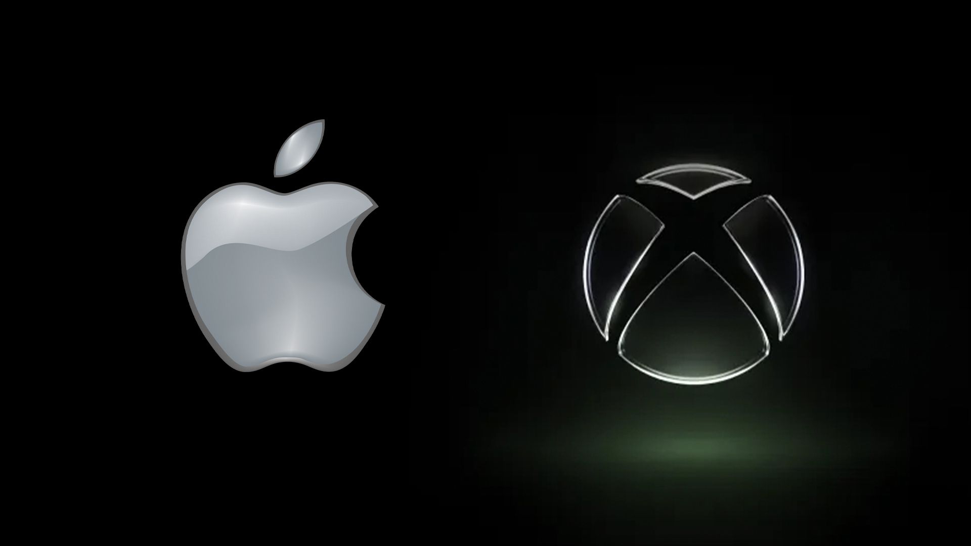
Did Apple inspire the new Xbox logo?
Microsoft's Xbox unveiled a glossy, translucent logo reminiscent of Apple's Liquid Glass design language that Microsoft previously mocked, signaling a broader industry retreat from flat minimalism toward skeuomorphic aesthetics.
What: Xbox revealed a new logo featuring a shiny, translucent sphere with neon green coloring that evokes both early-2000s Xbox branding and Apple's recent Liquid Glass design approach. The timing is notable given Microsoft ridiculed Apple's Liquid Glass when it launched less than a year ago.
Why it matters: This represents a wider shift across the tech industry away from the decade-long dominance of flat, minimalist design toward more textured, three-dimensional visual styles, echoing how Apple's 2013 shift to flat design influenced the entire UI landscape.
Decoder
- Liquid Glass: Apple's design language featuring glossy, translucent, reflective surfaces and textures
- Skeuomorphism: Design approach using realistic textures and 3D effects to mimic physical objects
- Frutiger Aero: Early-2000s Windows design aesthetic characterized by glossy, translucent elements and bright colors
- Flat design: Minimalist visual style using simple shapes, solid colors, and no depth effects
Original article
Microsoft's Xbox has unveiled a new glossy, translucent logo that leans heavily into early-2000s nostalgia, closely resembling Liquid Glass—a design approach it previously mocked when introduced by Apple. While some see it as a throwback to classic Xbox aesthetics, the timing suggests broader influence, reinforcing a wider industry shift led by companies like Microsoft and Apple away from flat minimalism toward skeuomorphic, textured, and more expressive visual styles.
Explore all 52 articles in today's digest
Fresh dev news, AI-digested daily. Never miss a trend at devoured.fyi