DEVOURED
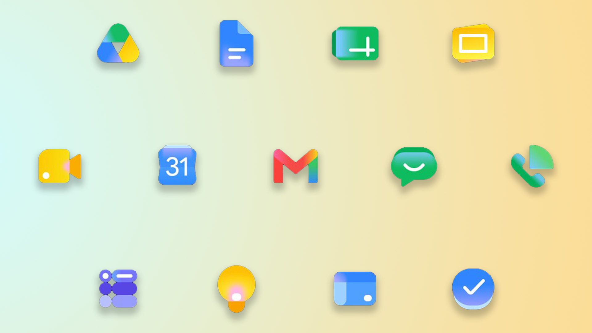
Google's new app icons were desperately needed
Google is rolling out redesigned Workspace app icons that offer clearer distinctions and improved legibility after widespread criticism of their previous "unified" and indistinguishable designs.
What: Google is deploying new Workspace app icons that maintain a consistent gradient style but feature more unique shapes and colors, aiming for better clarity and accessibility. This update follows years of user complaints that the old "unified" icons were too similar, often prioritizing brand aesthetic over legibility.
Why it matters: This redesign demonstrates a company responding to user feedback regarding usability and accessibility, highlighting the critical balance between consistent brand identity and functional clarity in interface design, especially for widely-used products.
Original article
Full article content is not available for inline reading.
Explore all 58 articles in today's digest
Fresh dev news, AI-digested daily. Never miss a trend at devoured.fyi