DEVOURED
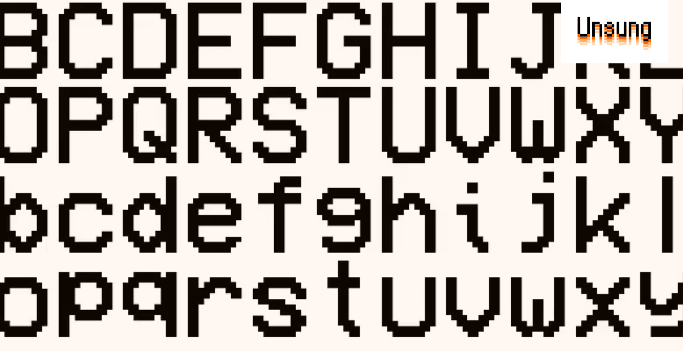
A few interesting modern pixel fonts
Modern pixel fonts like Andrew Gleeson's Analog Mono and Vercel's Geist Pixel are evolving beyond novelty, offering typographic rigor and fixing classic issues while evoking nostalgia.
What: The article showcases several pixel fonts: Analog Mono by Andrew Gleeson, which fixes baseline issues of 90s pixel fonts; Coral Pixels by Kumiko Yoshida, a color font with built-in 90s fringing; Two Slice by Joseph Fatula, a 2-pixel tall readable font; and Geist Pixel from Vercel, designed for functional system use.
Why it matters: The renewed interest and sophisticated development in pixel fonts indicate a blend of nostalgia and a desire for robust, functional design elements that can maintain visual texture while scaling correctly in modern digital interfaces.
Decoder
- Subpixel rendering: A method of increasing the apparent resolution of a display by rendering pixels using the individual red, green, and blue components of each pixel, which are physically distinct.
- Chromatic aberration: A type of optical distortion where a lens fails to focus all colors to the same convergence point, resulting in color fringes. In design, it can be simulated for aesthetic effect.
- Kerning: The process of adjusting the spacing between individual letter pairs in a font to improve readability and visual appeal.
Original article
Analog Mono was designed to fix the crimes of the classic pixel font that was ubiquitous in the 1990s. Coral Pixels is a color font with 1990s and 2000s colorful fringing baked in. Two Slice is a font that's only 2 pixels tall while remaining somewhat readable. Geist Pixel is a font that maintains the visual texture that teams want while reserving the typographic rigor that products require.
Explore all 49 articles in today's digest
Fresh dev news, AI-digested daily. Never miss a trend at devoured.fyi