DEVOURED
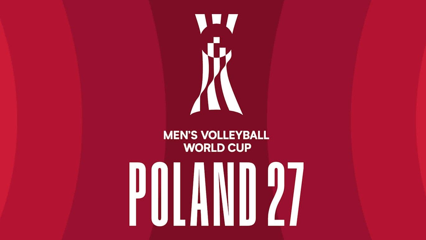
The volleyball World Cup logo looks... wrong
Design
Creative Bloq
The FIVB 2027 Men's Volleyball World Cup logo illustrates the risk of excessive symbolism, resulting in a design that lacks immediate visual clarity.
What: The logo attempts to represent the tournament trophy, the Earth, a net, players, and fans, which Tom May argues makes the design difficult to parse at a glance despite individual elements being present.
Why it matters: This case highlights the tension between the desire to pack complex brand narratives into a single mark and the functional necessity of immediate legibility in sports branding.
Original article
The identity for the 2027 FIVB Men's Volleyball World Cup in Poland features an abstract white emblem inspired by the tournament trophy, surrounded by concentric red circles. Its design combines several symbolic references, including the trophy's silhouette, the Earth, a volleyball net, players reaching for a ball, and fans represented by a wave at the base. Although these elements are individually identifiable, their combination produces an ambiguous mark that raises questions about how much symbolism a logo can communicate before losing immediate visual clarity.
Explore all 45 articles in today's digest
Fresh dev news, AI-digested daily. Never miss a trend at devoured.fyi