DEVOURED
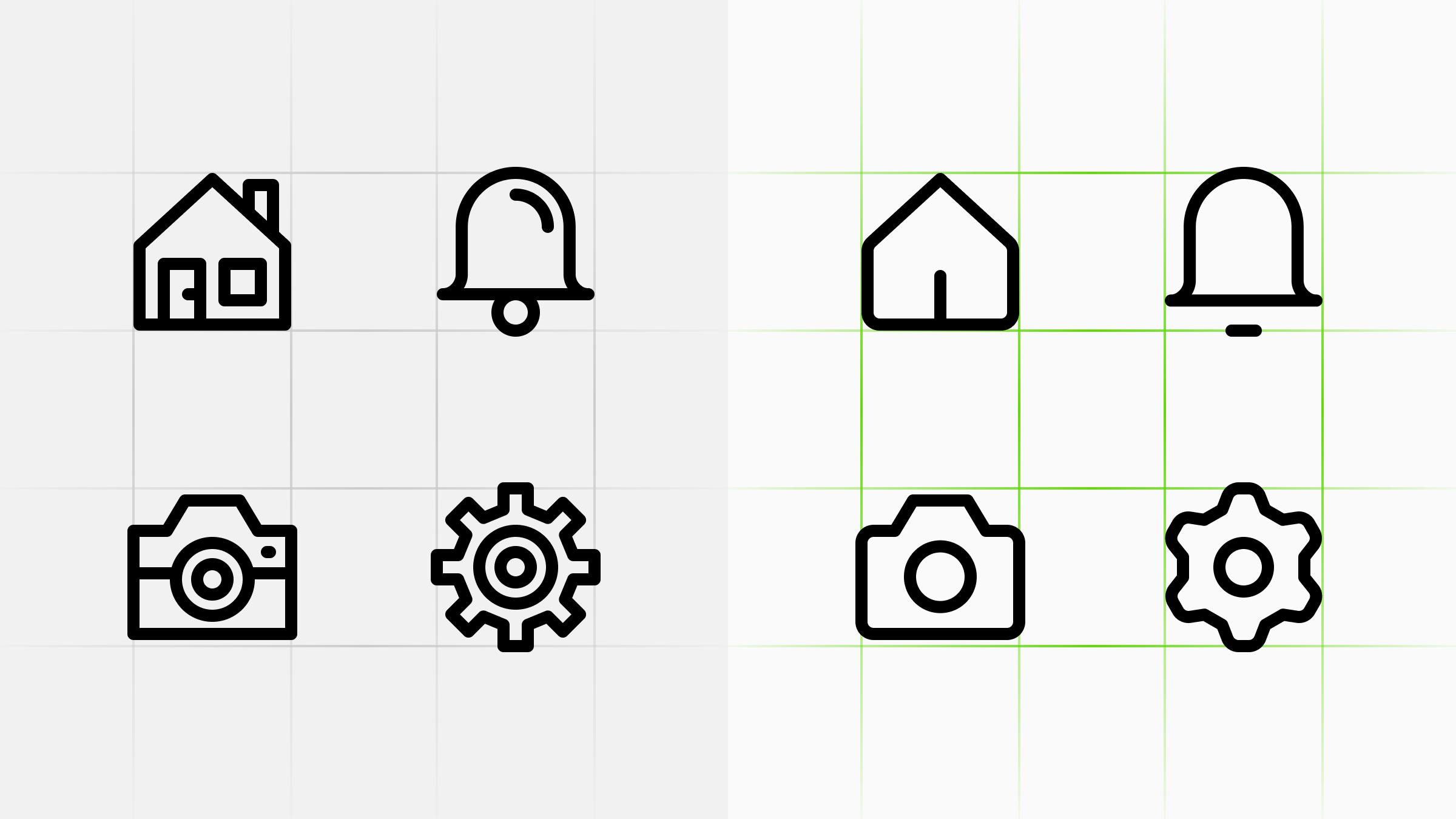
What Makes Icons Feel Professional
Professional-grade icon sets succeed through deliberate restraint and a consistent conceptual point of view, rather than just technical alignment.
What: The Streamline team details that high-quality icon sets are defined by a specific 'point of view' (e.g., brutalist vs. soft), the intentional removal of non-essential detail, and rigorous peer review. They highlight the importance of library depth, where having a deep, growing, and comprehensive collection prevents teams from using inconsistent 'workaround' icons.
Why it matters: Professional design assets are increasingly judged not by their individual complexity, but by their ability to remain invisible and consistent within a broader, evolving design system.
Deep dive
- Consistency is a baseline requirement, not the differentiator for professional quality.
- A 'point of view' guides decision-making before technical grids are even applied.
- Excessive detail creates noise; professional icons keep only what makes them recognizable at a glance.
- 'Finished' icons require refinement of small details—such as curves and spacing—that a basic consistency check might miss.
- A reliable library must provide variants and specific actions to prevent 'workaround' drift.
Original article
Consistency alone does not make icons feel professional - a clear point of view, restraint, careful finishing, and a growing library do.
Explore all 55 articles in today's digest
Fresh dev news, AI-digested daily. Never miss a trend at devoured.fyi