DEVOURED
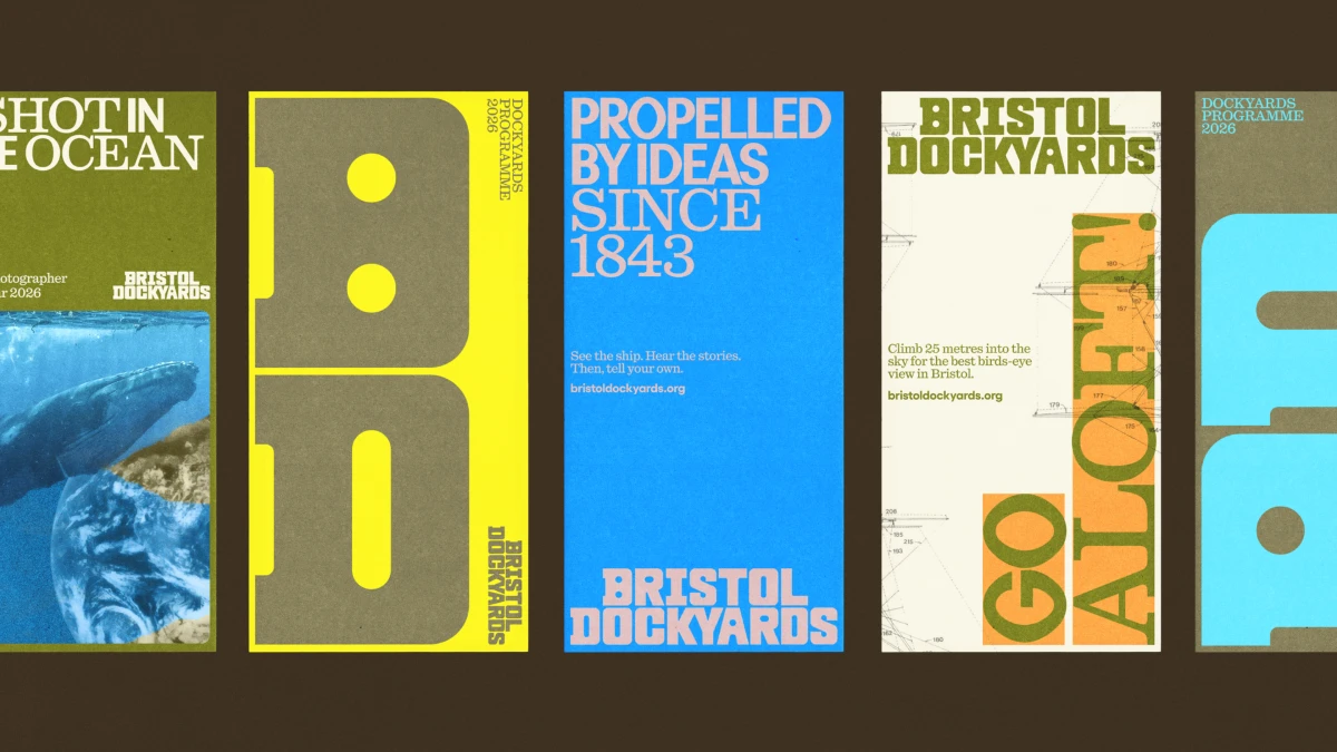
The Top 10 Graphic Design Trends for 2027 Are About Process, Not AI
Design
We and the Color
Graphic design in 2027 is moving away from purely aesthetic output toward 'provable craft' to combat the saturation of AI-generated content.
What: Dirk Petzold argues that designers should shift from delivering static assets to providing 'Proof-of-Process' documentation, 'Range Sheets' for dynamic identities, and 'Dial-Ready' designs that adapt to UI glass effects. He defines these trends using a 'Heat-and-Slope' ranking method, noting that while grain and retro effects are suffering from 'signal decay' due to overuse, transparency regarding human-made work and machine-readable provenance is gaining momentum.
Why it matters: This signals a structural change in the design industry where the value of a deliverable is no longer tied to the final visual asset—which is now trivially easy to generate—but to the provenance, rules, and technical flexibility of the design system.
Takeaway: Document your design process with screen recordings or photographs for your next project and transition from delivering single static logo files to 'Range Sheets' that define how an identity behaves across various constraints.
Deep dive
- Proof-of-Process Work: Capturing and presenting the human labor behind a design to build trust.
- Provenance Strip: A metadata-containing band in a layout that lists the author, tools used, and iteration count.
- Range Sheet: A replacement for traditional static logo files that provides a set of valid outputs and forbidden combinations.
- Dial-Ready Design: Optimizing assets for UI systems that allow users to adjust interface transparency, such as Apple's 'Liquid Glass'.
- Base-and-Spike Color: A design strategy using a neutral, warm white base combined with a single saturated accent color.
- Signal Decay: The concept that specific aesthetic cues, like halftone textures or serif headlines, lose their impact and trustworthiness once widely adopted by AI-generated content.
Decoder
- Liquid Glass: An interface design style used by Apple that involves semi-transparent, blur-heavy panels that adapt to background content.
- Variable Font: A font format that allows for custom weights, widths, and slants within a single file, controlled by parameters.
- WCAG: Web Content Accessibility Guidelines, which specify a minimum contrast ratio (4.5:1) for body text to ensure readability.
Original article
Full article content is not available for inline reading.
Explore all 55 articles in today's digest
Fresh dev news, AI-digested daily. Never miss a trend at devoured.fyi